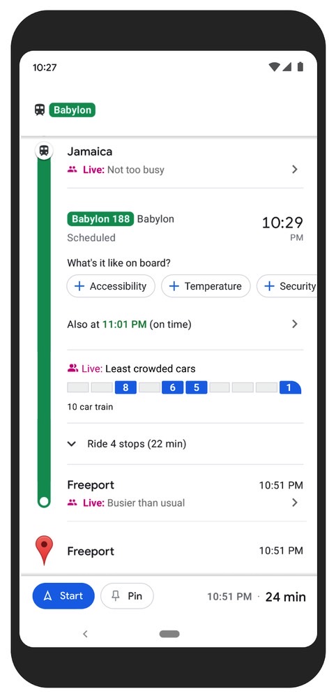
Google launched a brand new crowdedness prediction feature for Google Maps a couple of years ago. The app can already tell you how heavy traffic is and predict crowdedness for businesses. Figuring out how many people are riding in a bus or train seemed like the logical next step. Google hasn’t stopped improving the Google Maps public transit experience there. The company just announced that the crowdedness prediction tool is expanding to more markets. Better yet, some cities will offer real-time information about how crowded your bus or train will be.
Public transit crowdedness in Google Maps
Google explained in a blog post that public transit ridership took a “drastic plunge” during the early days of the pandemic. People are returning to public transit, with Google Maps directions increasing 50% in the US compared to last year.
Safety remains a priority; that’s why Google is expanding the crowdedness prediction to over 10,000 transit agencies in 100 countries. That’s great news for people who rely on public transit to get around.

Google said that the predictions are possible thanks to a combination of AI technology, Google Maps users’ contributions, and historical location trends. The projections are designed with privacy in mind. “We apply world-class anonymization technology and differential privacy techniques to Location History data to make sure your data remains secure and private,” Google said.
Down to transit car level precision
The crowdedness prediction tool will cover plenty of public transit routes in Google Maps. But users in New York and Sydney will get an even better experience. That’s where Google will deliver live crowdedness information down to the transit car levels (as seen above). More cities will follow.
Google offers an example about crowdedness trending in the US:
New York City, Atlanta, San Francisco, Boston, and Washington D.C. lead the pack as some of the cities with the most crowded lines. Nationally, you’re most likely to get a seat at 9 a.m, whereas cars may be standing room only between 7-8 a.m. In the evening, leaving earlier than rush hour will up your chances of grabbing a seat, with lines being far less crowded at 3 p.m. than they are between 4-5 p.m.
Other new Google Maps features
Aside from the improved and expanded crowdedness prediction tool for public transit, Google Maps will also offer users a couple of other great features.

One of them is the new Timeline Insights, which we’ve already seen around. It’s rolling out more widely to users, offering them more details about their travel trends. It’s Android users getting it first. They’ll have to have Location History enabled to access stats about their Google Maps-related travels. The feature will provide detailed information about public transit use, distance and time you’ve driven, flown, or biked, and the time you’ve spent at various places. Also, it’s a great feature to make you realize how much location data Google can store about you.
The same Location History data powers the Timeline’s Trips menu. Available on Android, Trips will provide stats about your vacations. This includes hotel and restaurant information about past vacations. You can export the data and share it with others.

Finally, Google Maps will support more detailed reviews. You’ll see prompts to share details about price ranges and order types (takeout or deliver). The feature is live in the US on Android and iPhone, and it’s rolling out to more categories and countries.


