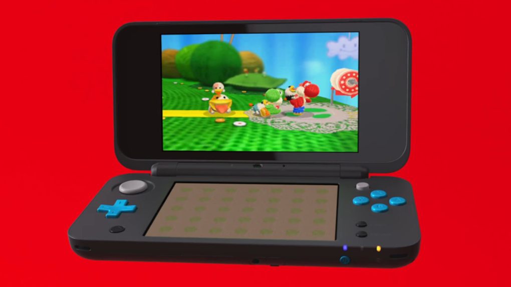
Six years to the day after launching the original 3DS in the US, Nintendo is going to launch the sixth iteration of the handheld console. That’s a whole lot of releases for a single machine, but no matter how many times Nintendo changes the look, adds new features or takes features away, people keep lining up to get their hands on the 3DS. It’s been a long road, filled with far more success than failure, but with the New 2DS XL, Nintendo might have finally perfected the design of the clamshell console.
Back in February 2015, I wrote an article about my experience upgrading from the first 3DS to the New Nintendo 3DS XL. As far as I’m concerned, the New 3DS XL was and still is the quintessential model of the 3DS, especially if you’re upgrading from the original 3DS or the budget-friendly 2DS. But if portability and price are more important to you than 3D functionality, the New 2DS XL might be the better choice.
Slated to launch on July 28th for $149.99 in the US, the New 2DS XL combines the clamshell design of the 3DS with the 2D display of the 2DS, in a package that is lighter, sleeker and far more attractive than that of the New 3DS XL. It plays all the same games as the New 3DS models too — the only thing it lacks is face-tracking 3D. But let’s talk about all of the design changes Nintendo made with the New 2DS.
At a glance, the New 2DS XL is almost unrecognizable sitting next to the New 3DS XL. The massive slab that constitutes the top flap of the New 3DS XL has been replaced with an incredibly thin piece of plastic on the New 2DS XL. In fact, the top flap is so thin that it almost feels too fragile, bouncing slightly on its hinge any time I moved the console around while I was playing a game on it. That’s not to say that I expect it to snap off, just that it could be a little sturdier.
All of the buttons and sliders are in basically the same place, but they’ve been revamped as well. Unlike the volume slider that sits next to the display on the 3DS XL, the slider on the 2DS XL is on the side of the bottom flap. There’s no room for anything but the display on the top flap, but the slider itself is more difficult to operate than the one on the 3DS, which is frustrating, but not a deal-breaker.
On the front of the New 2DS, the power button and the Wi-Fi/power indicators are sitting in the same place, but the stylus and the 3.5mm audio jack have been squished together. To the left of the audio jack is a new enclosed flap that you have to pry open to get to the game card and the SD card. As a result, the device is smooth and cohesive all the way around… and you no longer have to remove the entire back plate of the console in order to get to the SD card, which was completely insane.
Opening up the New 2DS, you’ll immediately notice two things: the displays are the same size as the displays on the New 3DS XL and the face buttons and the control pad are bright blue. There’s less room to work with on the New 2DS, but I generally found the form factor to be more comfortable than the 3DS XL. I don’t like the buzzword “ergonomic,” but Nintendo is justified using it here. Oh, and the Home button has been moved from below the screen to below the control pad.
Without any new features or functionality, there’s really not a whole lot else to say about the New 2DS XL. It’s a better looking, slightly more portable version of the 3DS XL with the same displays. While there are a few minor elements of the 3DS XL that I prefer, if I were recommending a model to someone who didn’t currently own a 3DS, I wouldn’t think twice before suggesting the New 2DS XL.


