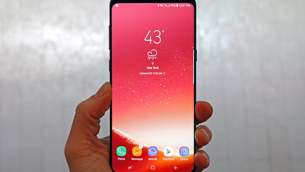
With just three days to go before the Galaxy S8 and Galaxy S8+ are officially released, the buzz surrounding Samsung’s next-generation flagship phones has reached new heights. I published my in-depth Galaxy S8 review earlier on Tuesday, and I made my feelings perfectly clear: Samsung’s new Galaxy S8 and S8+ are the best Android phones of all time, hands down. In terms of hardware and design, they’re the best smartphones, period. That’s right, Samsung managed to pull off the unthinkable and out-design Apple for the first time ever.
For a deep dive into Samsung’s new Galaxy S8 and Galaxy S8+, definitely be sure to check out BGR’s full review. In this supplemental post, we’ll cover five key ways the Galaxy S8 is better than the iPhone 7.
Display Design
The screen is obviously one of the most important components in any smartphone since it’s still the primary means of displaying content and interacting with content. And in the case of the Galaxy S8 and Galaxy S8+, the display is the star of the show in so many ways.
Beginning with the phone’s design, Samsung has managed to increase the screen-to-body ratio on its new phones to an impressive 83%. That compares with a screen-to-body ratio of just 66% on the iPhone 7 and iPhone 7 Plus. Are these ratios really that important? You won’t be able to fully appreciate it until you experience it for yourself, but the answer is yes.
Apart from looking much better, the user experience on the Galaxy S8 is so much more immersive than it is on the iPhone 7. It feels like you’re holding content in your hand, not a phone. Apple’s upcoming new iPhone 8 is expected to adopt a similar design that is nearly all screen but until then, the Galaxy S8 has the upper hand in a big way.
Display Quality
This won’t come as much of a surprise to anyone who has ever used a Samsung flagship phone before, but the Galaxy S8’s screen advantage extends well beyond design. In terms of display quality, the Galaxy S8 and S8+ have no equal.
Samsung’s Super AMOLED screens on the Galaxy S8 and Galaxy S8+ are simply stunning. They both have the same QHD+ resolution so the 5.8-inch screen on the smaller Galaxy S8 model actually has better pixel density than the larger 6.2-inch display on the Galaxy S8+. The difference is pretty big on paper — 570 ppi vs. 529 ppi — but I doubt even someone with 20/20 vision would be able to notice any difference at a normal viewing distance.
In terms of comparing these screens to the displays on the iPhone 7 and iPhone 7 Plus, it couldn’t be easier: Samsung’s screens are better in every way. Blacks are deeper, colors are more vivid, the resolution is better, the contrast is better, and the clarity is better. Samsung has absolutely hit yet another home run with its Galaxy S8 and S8+ screens.
Curved Edges
Samsung’s first curved smartphones was a total gimmick that should not have existed. The Note Edge was the company’s first smartphone with a curved screen (on one side only), and it was also a gimmick that was next to useless. The curves on the Galaxy S8 and Galaxy S8+ are far from useless, however. They’re awesome.
In terms of software features, the only benefit afforded by the curved screen on the S8 is an option that makes the exposed edges light up with incoming calls when the phone is face-down on a table or desk. Yeah, it’s not exactly Earth-shattering. The real benefit of the curved sides on the front and back of the phone is usability.
The Galaxy S8+ is about the same width as the iPhone 7 Plus, and it’s actually a bit thicker than the 7 Plus at its center. But with one hand, I can comfortably reach from one side of the S8+’s display to the other. And Samsung’s rounded sides on the front and back don’t just extend the user’s reach, hey help the S8 and S8+ sit comfortably in the hand. It’s an awesome design.
Charging
Charging certainly isn’t the first thing that comes to mind when you weigh the pros and cons of a smartphone. But if you stop for a moment and really think about it, this is a hugely important part of the user experience. We charge our phones each and every day, so the speed a phone can charge and the convenience with which it can be charged are actually a very big deal.
The Galaxy S8 supports multiple fast charging standards. The iPhone 7 does not. The Galaxy S8 supports wireless charging, and even fast wireless charging. The iPhone 7 does not. Long story short, Samsung’s Galaxy S8 and Galaxy S8+ charge much faster than their iPhone counterparts, and they also have bigger batteries.
Google Assistant
Siri has come a long way since it was first introduced, and there’s no question that Apple’s virtual personal assistant is solely responsible for the recent explosion in similar solutions from rival companies like Amazon, Google, Microsoft, and Samsung. As an iPhone user, however, I really enjoyed the personal assistant on Samsung’s Galaxy S8+ while I was reviewing it.
No, not Bixby. Sure, Samsung’s own personal assistant solution shows promise, but its inability to support English-language voice commands at launch makes it a non-starter for the time being. I’m talking about Google Assistant, the latest evolution of Google’s assistant software.
These AI driven assistants are always evolving, but Google’s young Assistant solution has already surpassed Siri in many ways. I often find that Siri gets confused, has trouble with context, or just flat-out gets things wrong when I ask it a question or speak a command. Google Assistant, on the other hand, is far more consistent and accurate. This is a big check in the Galaxy S8’s box for me.


