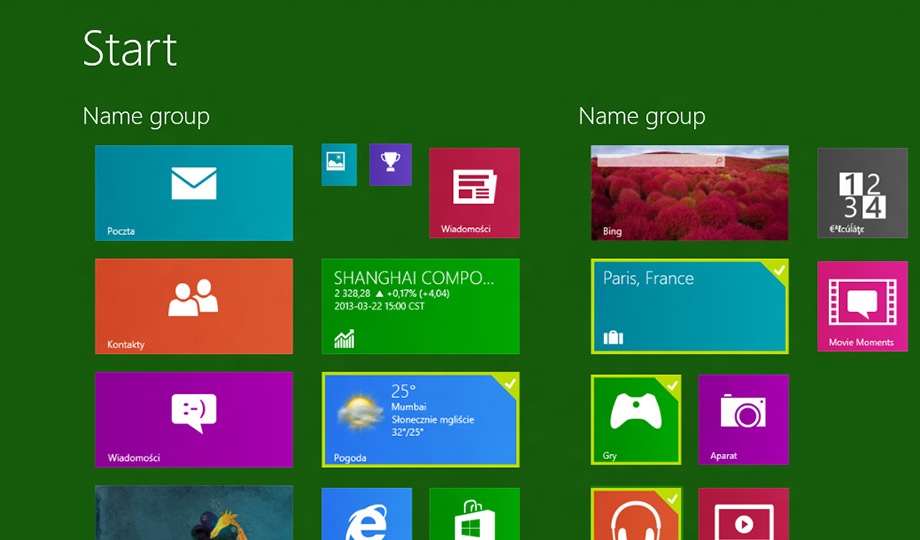
Microsoft’s (MSFT) next major Windows update will be crucial for the company because it will show how well it has listened to feedback provided by Windows 8 users who may have found the touch-centric operating system difficult to use at first. The Verge this week got the opportunity to do a hands-on preview with an early version of the upcoming Windows Blue operating system and found that Microsoft has made some important changes to the user interface that should help users make an easier transition from the more traditional desktop version of Windows.
Among other things, The Verge found that Windows Blue will shrink the tiles on the Start screen to make it easier to fit more applications in one place and reduce the need to scroll through several screens to find what you need. The new operating system will also let users choose what size their tiles are on the screen, so you can either have relatively few larger tiles, several smaller tiles or some combination of both.
The Verge also found that “SkyDrive looks like it’s going to play a bigger role in Windows Blue” since a “new settings panel shows options for backing up devices to SkyDrive and automatically uploading photos or videos that are taken with the camera.”
The one thing missing from Windows Blue so far, however, is a traditional Start button that is often cited as the feature that users miss most from older versions of Windows. So as much as Microsoft seems willing to change its approach to crafting a touch-centric OS, the company doesn’t want to give users the option of bypassing the tiled interface in favor of a Start button security blanket.


