Android 12 was officially unveiled at Google I/O earlier this year. Since then, we’ve seen a handful of developer previews and three beta versions of the software as Google attempts to prepare the forthcoming update for a widescale release. According to Google’s developer dashboard, another beta is on track for August. And if all goes well, the update may be ready for primetime sometime in September.
That said, a new design tweak that first made its appearance with the second Android 12 beta is stirring up frustration in the Android community. Specifically, the Android 12 Power Menu looks different and users are not happy.
The new Android 12 Power Menu
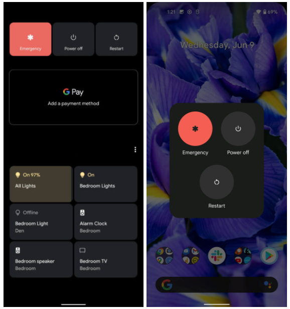
The main issue users have with the new Android 12 power menu is that it removes a lot of functionality. Whereas the old power menu included G Pay controls and various options to control Home devices, the new power menu simply houses the Emergency, Power Off, and Restart options.
A photo comparing the old and new power menu can be seen below via AndroidPolice.

Where did the missing controls go?
The missing power menu controls are now accessible in Quick Settings. In fact, the third beta of Android 12 includes a notification about the design change. The notification reads: “To access GPay and Home controls, swipe down from the top of your screen.”
AndroidPolice adds:
The new notification might ease the initial confusion for those used to the “old” way, but it still doesn’t rectify a change that most of our readers see as a mistake, and the notification itself is pretty hard to read, as the background-dimming effect applies to it as well.
It’s clearly a significant change if Google is providing users with instructions on how to navigate the new UI.
Android users are unhappy
While it’s possible that a majority of users won’t care, the folks that do are quite vocal. In fact, one Googler on a bug tracking forum for the power menu bluntly stated that if the design “is intentional, our product is doomed.”
Google naturally hasn’t addressed the negative feedback, but criticism of the design change is mounting. All the same, Android 12 is still in beta. It’s therefore still possible we’ll see Google reverse course before the final version becomes available to consumers.


