The iPhone 8 will have a design unlike anything we’ve seen before, which means we should expect many user interface changes in iOS 11. The device will not have a physical home button, but that doesn’t mean the many functions associated with the home button will go away. Furthermore, the top region of the phone will have an unusual bezel that will affect the status bar designs and its features.
The major HomePod leak that revealed many details about the smart speaker Apple will launch later this year, but also about the incoming iPhone 8, indicates that Apple has already “fixed” the worst thing about the iPhone 8.
The company has apparently devised a different status bar for the phone that will take into account the bezel in the middle of the screen, which will contain various elements including the phone speaker, the FaceTime camera, and the 3D facial recognition system. But can Apple make it look good?
Flanking the middle bezel are two display corners that will display information, which will probably include cellular and Wi-Fi connectivity on the left, and battery status on the right. Max Rudberg explored Apple’s various design options for the iPhone 8, coming up with a few solutions.
First up, we’ve got the UI interface that makes the most of the screen.
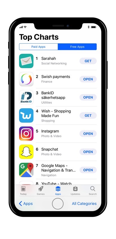
The second version seems more elegant, as it hides the middle bezel area, though it makes the iPhone 8 look like it has a bigger top bezel than the bottom one.
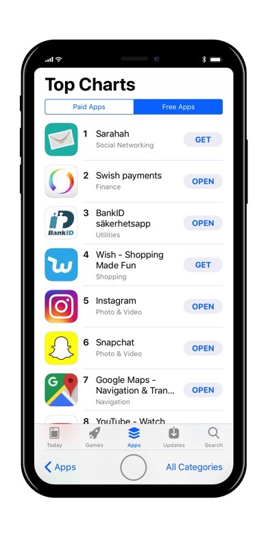
Then, there’s a version where both the upper and lower sides of the screen are turned into digital bezels. They stay dark except for the pixels needed to activate to display certain icons or menu options.
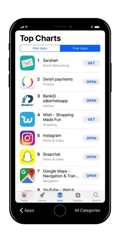
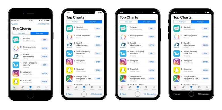
Here’s a side-by-side comparison that shows these iPhone 8 UI options compared to what the iPhone 7s UI will look like.
