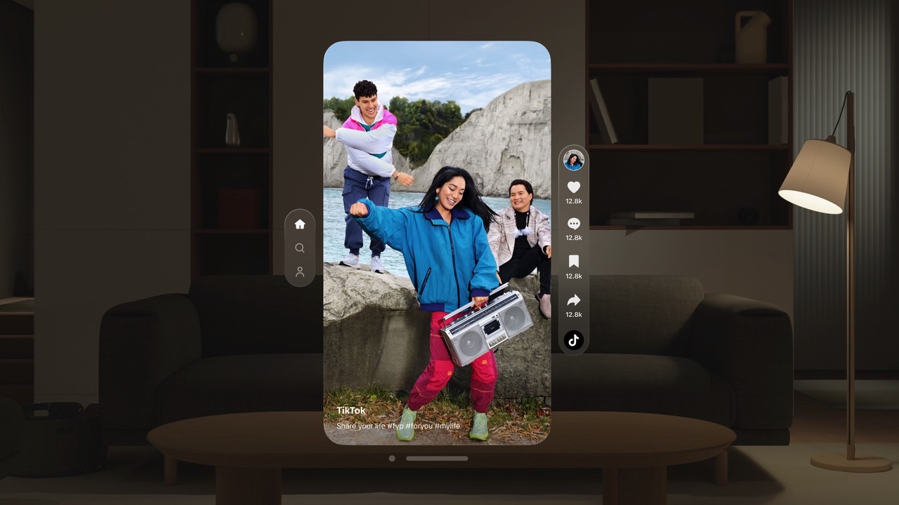
I’m not the biggest fan of TikTok, as I have enough doom-scrolling going on in my life without it as it is. However, I am impressed with the TikTok app redesign for the Apple Vision Pro. As you’ll see below, TikTok looks better, more refined, and less cluttered than ever. If I were to spend more time on TikTok, I would definitely want to do it on the Vision Pro.
TikTok is a social app made for mobile phones. It’s made for watching vertical videos on a tiny screen. I mean, sure, smartphones these days have massive all-screen displays. But TikTok crowds those big displays with plenty of UI elements, and too many buttons sit on top of the video. Plus, if the clip has text, which is usually the case, it can become too much for the viewer.
By the way, it’s not like you get more screen space on Instagram, YouTube, and others. They all have to work within the confines of a device that we mostly use in portrait mode.
The Vision Pro fixes all that for TikTok and other similarly crowded apps. All of a sudden, these social apps get access to a virtually limitless display. You’re no longer dealing with the confines of a finite smartphone screen.

Put the Vision Pro on, and everything you can see becomes the display. You can have as many open windows (apps) as you like and place them wherever you want them to be. You can zoom in and out and enjoy apps like never before.
TikTok realized that, redesigning the app to take advantage of the larger canvas.
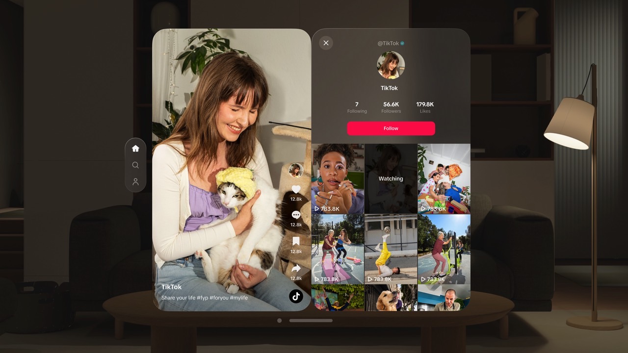
The result is a much cleaner interface, where you can watch the video without worrying about all the buttons in the way. Those buttons are still there. They’re just moved off-screen, which is where they belong.

Well, most of the time, that is. That’s because the creator profiles and comments section appear as secondary screens right next to the video you are watching. This leads to some button overlay.
Still, it all happens on a much bigger display. You can zoom in and enjoy those clips in a way that’s not available on iPhone, Android, or other devices.
That said, TikTok still looks and feels like TikTok. The company might have redesigned it for a spatial experience, but TikTok hasn’t lost its personality.
TikTok also works with Apple’s immersive locations to give you a more immersive doomscrolling experience. You know, if you feel like you need to focus on TikTok in a way that wasn’t possible before.
Also, you can have TikTok playing in a section of your Vision Pro display while you work on other apps in a different window. That’s not something you get from your smartphone.
While I’m impressed by the transformation of TikTok for Vision Pro, I won’t hurry to install the app whenever I can finally get my hands on the spatial computer. But if you have a Vision Pro and you’ve been dying to get an official TikTok app, you can download it immediately.


