- The Galaxy Fold 2 design has been leaked as we get closer to the foldable phone’s launch.
- The new handset will look better than the ill-fated original, but Samsung’s phone will hardly be perfect.
- The leaked render reveals another controversial design decision that Samsung forced upon itself.
The Galaxy Fold 2 will have a much better design than the first-gen model I told you a few days ago when an insider provided details about some of the foldable display’s characteristics. The handset will have a thin bezel and a small hole-punch display camera opening in the screen, the insider said. At the time, I argued that a foldable display that opens into a tablet doesn’t need a selfie cam on the inside. The one on the phone’s external screen should suffice for all your selfie needs. I mean, think about how you take selfie photos. Do you see yourself performing the same gestures with a tablet-like device that has a fragile glass display that might brake with ease if dropped or mishandled? The only other need for a selfie cam would be chat apps, which are really popular during the pandemic. Using a tablet for video conferencing can be convenient in a variety of instances, but if your rock a foldable, you probably have a laptop or desktop nearby. Let’s make it clear that the Galaxy Fold 2 will not replace your computer. That may e the dream for the future, but it won’t happen right now.
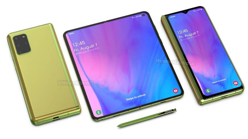
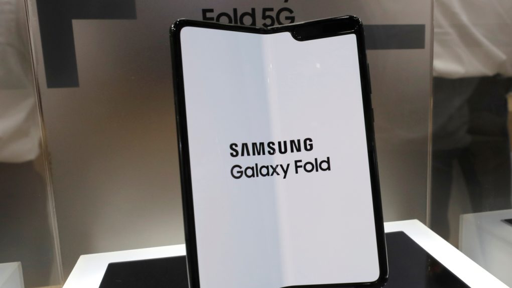
Why all the talk about the selfie camera, you ask? Well, the same leaker posted an image that shows the purported design of the Fold 2. And I was wrong to believe the phone could look good. If this is the actual design of the phone, then it’s less ugly than the original Fold (seen in the image above). But that doesn’t make it look good.
Let’s start things off with a concept image of the Fold 2 based on rumors. The render below shows a foldable phone that features a hole-punch main display on the inside, with the selfie camera placed in the top right corner. On the outside, we have an Infinity-V(U) screen) that extends from edge to edge, featuring a selfie camera inside a notch-like bezel at the top. On the back, we have a large camera module similar to the Galaxy S20 Ultra’s camera. As for the S Pen, you can ignore the stylus, as Samsung has dropped support for it.

Now let’s move to Ice Universe’s new render of the Galaxy Fold 2, which only shows the foldable screen:
Fold 2 pic.twitter.com/ysdw6oIjqc
— Ice universe (@UniverseIce) June 24, 2020
Yes, that selfie camera placement is very annoying, looking all out of place like that. We’re going to assume the design above is the real deal in what follows.
It’s not in the corner, and it’s not in the center. It’s not that Samsung went for asymmetry with the design. It’s just how phone design works. Or better said, it’s all Samsung’s fault for barricading itself inside design constraints that forced it to put the camera there. Ice followed up with a secondary image that shows the unfortunate placement of the selfie camera.
At first, I thought the hole location was strange, but then I thought about it carefully. This might be the most suitable location. pic.twitter.com/r0PBtQGkhl
— Ice universe (@UniverseIce) June 24, 2020
It’s all about the real estate available inside the phone. If Samsung wants an all-screen design for the external display, then the hole-punch camera can’t go anywhere at the top of the left half of the foldable screen. The two sides of the phone need to be as thin as possible, so the selfie camera might not have enough space because it would bump against the external display.
What about the middle? Foldable phones that turn into tablets have a hinge in the middle, and the Fold’s original one was quite problematic. Samsung has to reinforce that area against debris ingress. And the last thing you’d want to do is pierce the part of the screen that folds for a camera. Also, the camera module itself is way too bulky for the middle.
The selfie camera needs to be mounted on the right side of the handset. But it can’t go in the top right corner, because there’s a massive camera module on the back at that exact location. It can’t go in the left corner of the right half, because that’s where the hinge resides. That leaves Samsung with limited options, and that’s how you end up with the asymmetric selfie cam design above.
Again, it’s Samsung’s own choices that are backing designers in this corner. The external display will be bigger than on the original Galaxy Fold, and that’s good news. But it doesn’t have to be an all-screen display like what’s available on other Galaxy phones. A bezel at the top could make room for a better hole-punch camera on the inside. The rear camera placement doesn’t have to be similar to the Galaxy S20 and Note 20. Place it lower, and you can move the internal selfie cam to the right corner. But then Samsung needs to take into account economies of scale. The Fold 2 will recycle parts from other devices. Not to mention that Samsung has to make the most of the internal space to bump up the battery capacity of the phone. In other words, messing with the rear camera design is a no-go.
The simplest, most courageous thing Samsung could do to offer the best possible Fold 2 design is to kill the internal selfie cam altogether.
The Galaxy Fold 2 will be unveiled in early August alongside the Note 20 series, and the phones should be released in the weeks after that.


