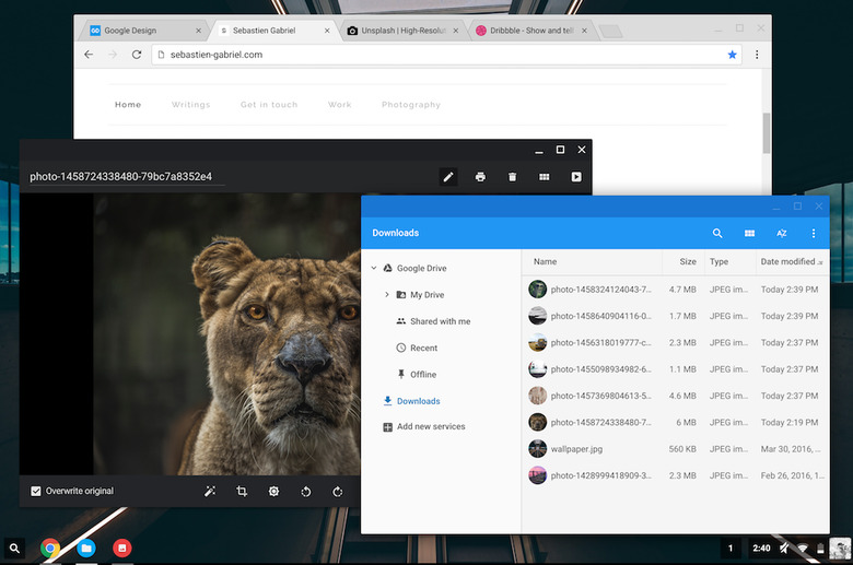
See The Major Design Overhaul Coming To Chrome Courtesy Of Material Design
Over the past few months, Google has been steadily adopting some of the styles and principles from Material Design in order to give its Chrome browser a major visual overhaul. We've highlighted some of the most significant changes in the past, but with Chrome 50 finally rolling out, even more updates are on the way.
DON'T MISS: Is this how Microsoft Windows finally dies?
Last week, Google designer Sebastien Gabriel published several examples of how the new design would affect Chrome. We've seen many of these changes before, including the dark incognito theme and the sharp edges of tabs, but there are several additions that we didn't have a chance to see until now.
Along with the visual alterations, the new Canary release of Chrome also brings a "hybrid" layout to the browser which is supposed to be more comfortable on touch-enabled and convertible devices. The hybrid layout will be activated by default on any Chromebooks with touchscreens.
If you want to try Chrome's Material Design update on your Windows or Mac computer right now, you can do so by heading to https://www.google.com/chrome/browser/canary.html and clicking the download button. Once Canary is installed, you'll need to head to about:flags URL bar and turn on "Material design in the browser's top chrome."
Here are some of the best pictures that Gabriel shared on his blog:
