As the Earth gradually warms up due to human activity like the burning of fossil fuels, whatever city or town you call home will eventually feel the effects. That might be hard to imagine if you’re sitting in a foot of snow right now, but localized weather patterns only tell part of the story, and the average temperatures across the board will indeed continue to spike unless we can curb our thirst for pollutants.
Visualizing those changes can be hard, but a new interactive map of the U.S. does a great job of showing what kind of changes are in store for you by drawing a direct comparison between a city’s future and a present-day analog.
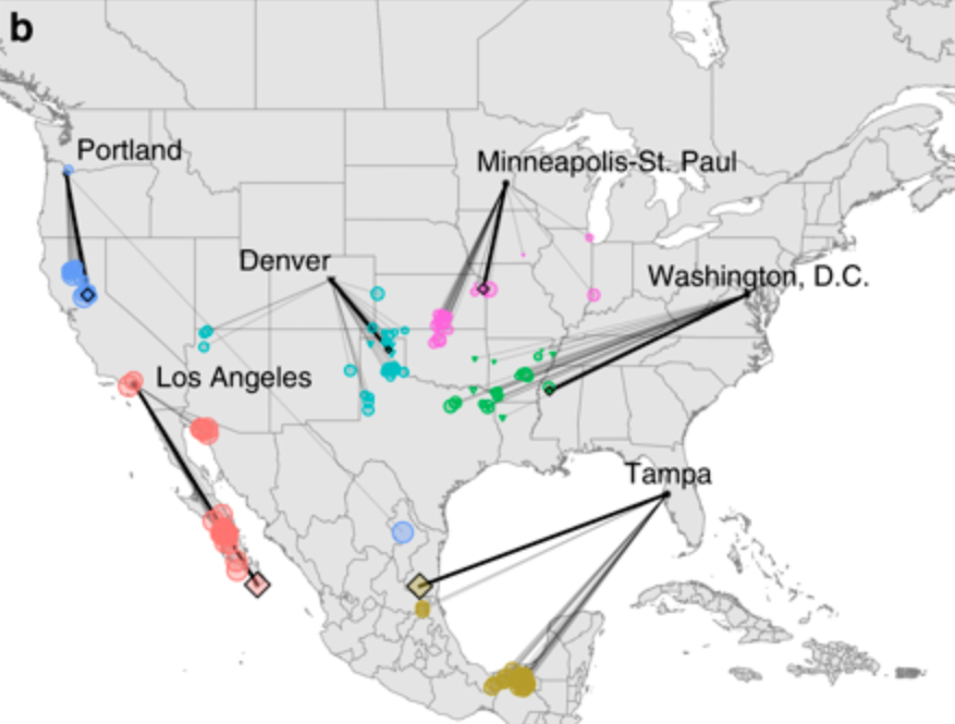
The idea here is simple but very effective: Just click on your location on the map and through the magic of climate forecasting models, the site will draw a line to a different city that represents what the climate in your location will be closest to in the year 2080.
If you call the Midwest home, you’ll find that your climate will be more like the south in 2080, while folks who already live in the southern states are going to be dealing with weather more like present day Mexico. New Yorkers in 2080 will see weather more like present day Arkansas, while those in Florida will feel more like they’re near the border to Central America.
The map also offers hard data on the changes that each location will experience, including the percentage of temperature change and precipitation amounts. The data was gathered from several climate studies based on the most accurate climate forecasting models that are available today.
The map’s creators published a new paper in Nature explaining how they built the map and offering some insights into the data that drives it. It’s definitely worth a read.


