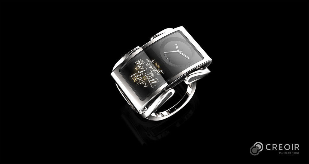
Pretty much every smartwatch that has been released so far has been ridiculously ugly. Most of them feature a rectangular screen that many consider to be too large for a wrist. Both the Pebble smartwatch and the Samsung Galaxy Gear suffer from this problem. To fix this, Engadget noted that the design firm Creoir, which has worked with both Nike and Jolla, created its own concept smartwatch to prove that they don’t have to be ugly.
But the result, called Ibis, isn’t much better.
Although it looks more like a fine piece of jewelry than any other smartwatch we’ve seen, it also looks like a piece of jewelry no one would actually wear.
The device’s band and casing are made out of an admittedly nice-looking metal, but it is still too bulky, and the rectangular display is poorly situated. Half of the display is an actual watch face, while the other half shows the “smart” part of the watch, where notifications, incoming calls and calendar entries are viewed. The display looks nice, albeit confusing and too small.
A video of the concept device is embedded below:


