Every time I think I’m in the right place with Apple Music, Spotify fights back with a sweet redesign to one of its apps, and I get sent into another internal battle over which music streaming service to use. Today is another one of those days after seeing the redesign of Spotify’s TV app.
Today, Spotify announced that it is rolling out a major redesign to its TV app. In a blog post, the company revealed the new design, which takes a lot of inspiration from the desktop version of the music streaming app. It appears that the company wanted to update everything, considering that it has also rolled out updates to its mobile and desktop apps this year as well.
The new version of the TV app brings the experience of using Spotify on television closer to the experience on the mobile and desktop experience — especially the desktop experience. The new Home page looks almost exactly what the desktop app looks like with its shortcuts, recently played, and recommendation sections.

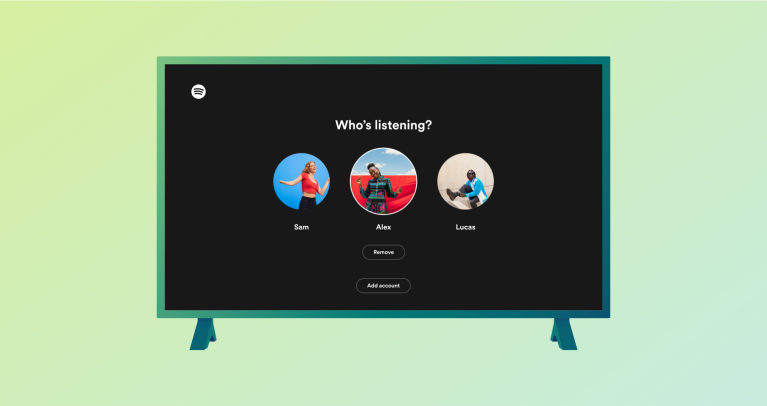
The company is also rolling out a new “Up Next” queue to see all of the songs that will play next, a new Dark mode to dim the screen at night, and an easier way to switch between accounts so everyone can easily play their favorite music — no matter who is using the TV.
You can check out all of the new features listed below:
- New Home design: We’ve redesigned the Home page, bringing the big-screen experience in line with our Mobile and Desktop apps. You can now easily find familiar shortcuts to favorites, recently played audio, and personalized recommendations right on top of the Home page.
- ‘Up next’ listening queue: Previously it was only possible for TV listeners to view the next song lined up. Now, with the newly introduced Now Playing view, you can better manage your listening session by viewing and controlling what plays next through the easily accessible queue.
- Dark mode: For those occasions where the TV is not meant to be the center of attention, simply turn on Dark mode through Now Playing view. This will dim the screen and tune down the visuals to display a minimal amount of information so you can listen and still keep the mood.
- Account switching: Since multiple people in your household probably use the TV, account switching is a key feature for TV app users. We’ve made it easier to switch accounts by always showing the active profile in the top-right corner of your screen. Changing profile accounts can be done at any time by selecting your profile image, keeping the experience tailored to your preferences and listening habits.

After checking out the announcement video, it seems that Spotify is trying to blend the long-beloved audio experience with the video one as well. Spotify has recently made a push to get video podcasts on its service, so I wouldn’t be surprised to see the company highlighting video versions of podcasts — especially on the TV app. I’m sure the company would love for you to watch them there instead of on YouTube.
I’m really interested to dive into this new experience and compare it to what I currently experience with the Apple Music app on the Apple TV. Spotify says that the new TV app is starting to roll out to Free and Premium users today to “supported Smart TVs, gaming consoles, and media-streaming devices.”


