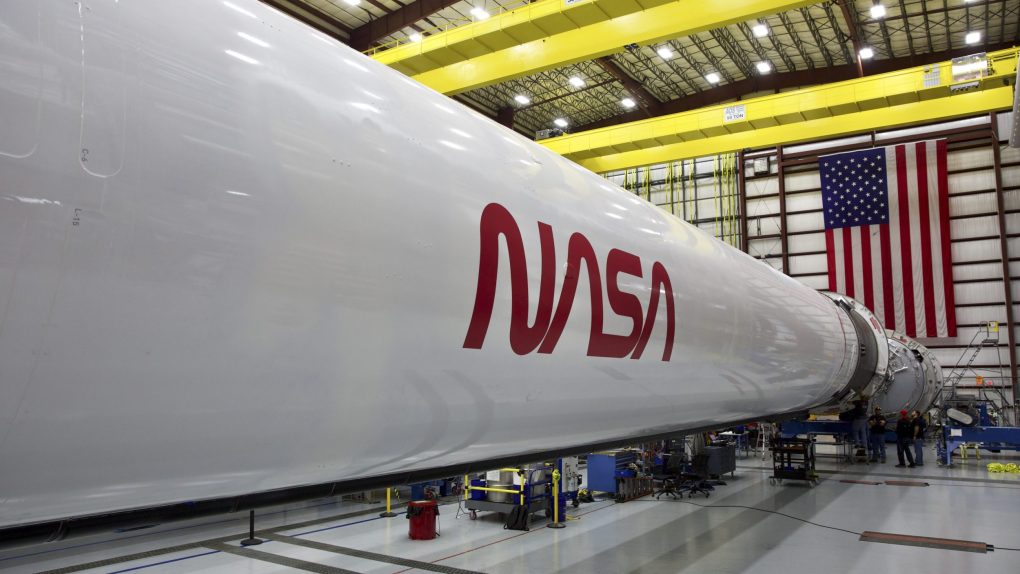
- NASA has revived a classic logo and will use it again for the upcoming SpaceX Crew Dragon mission to the International Space Station.
- The red, wavy logo is dubbed “the worm,” and it’s instantly recognizable as a piece of NASA history.
- NASA says it will continue to use the revived logo in various ways, though it didn’t offer any details as to where it might appear.
- Visit BGR’s homepage for more stories.
NASA is bringing back one of its most beloved and iconic logos that hasn’t been officially revived in almost three decades. The glorious NASA “worm” logo is officially back, and it will make its re-debut on the Demo-2 flight that will see a SpaceX Crew Dragon capsule carry a pair of astronauts to the International Space Station for the very first time.
The mission, which is scheduled for May, is the ultimate test for SpaceX, which is part of NASA’s Commercial Crew program that sought to produce crew-capable spacecraft that could be launched from US soil. NASA and Boeing were both tasked with the job, and SpaceX is the first of the two that is ready to carry NASA astronauts into space. Now, thanks to the spectacularly retro worm logo, we know that they’ll be flying in style.
The current NASA logo — a blue orb, red slash, and the letters NASA spread across the center — is the original, and has been in use for decades. However, NASA decided to freshen up its image a bit in the 1970s due to some very specific limitations, and thus came the worm. NASA explains:
The original NASA insignia is one of the most powerful symbols in the world. A bold, patriotic red chevron wing piercing a blue sphere, representing a planet, with white stars, and an orbiting spacecraft. Today, we know it as “the meatball.” However, with 1970’s technology, it was a difficult icon to reproduce, print, and many people considered it a complicated metaphor in what was considered, then, a modern aerospace era.
Enter a cleaner, sleeker design born of the Federal Design Improvement Program and officially introduced in 1975. It featured a simple, red unique type style of the word NASA. The world knew it as “the worm.”
NASA was able to thrive with multiple graphic designs. There was a place for both the meatball and the worm. However, in 1992, the 1970s brand was retired – except on clothing and other souvenir items – in favor of the original late 1950s graphic.
Sure, the original NASA logo has plenty of history attached to it, and it’ll surely be around for many decades to come, but you really can’t deny that the red, wavy worm logo is obviously superior in every way. It fits anywhere, and it looks absolutely stunning on the side of the SpaceX Falcon 9 rocket currently waiting to carry astronauts to the International Space Station.
“There’s a good chance you’ll see the logo featured in other official ways on this mission and in the future,” NASA says. “The agency is still assessing how and where it will be used, exactly.”


