After a few years of trying to swim against the tide, Apple finally relented back in 2014 and released new iPhone models with larger displays. The iPhone 6 and iPhone 6 Plus marked the start of a new era for Apple’s iPhone lineup, and people couldn’t wait to get their hands on those new larger iPhones. But 2014 also marked the start of a different kind of change for Apple, one that Apple fans still have mixed feelings about: Instead of reusing iPhone designs for just two years, Apple began to use the same iPhone designs for three years in a row.
On one hand, a three-year design cycle makes sense. Smartphones are so expensive now that people are waiting longer and longer to upgrade. They’re also so powerful these days that using a three-year-old iPhone or even a four-year-old model doesn’t have the same performance limitations that it used to. On the flip side of the coin, however, hardcore Apple fans and early adopters continue to upgrade their iPhones each and every year, so they’ve had to come to terms with the fact that they’re going to get the same design for three years in a row on their $1,000+ smartphones. The iPhone 6 series, iPhone 6s series, and iPhone 7 series all shared the same design. Then, the iPhone X, iPhone XS series, and iPhone 11 series all looked the same. Now in 2020, we’re finally due for a new iPhone design — and from what we’ve heard so far, the iPhone 12 will feature a massive design overhaul that Apple fans are going to love.
The three-year iPhone design cycle is here to stay, so Apple fans will have to learn to live with it. In fact, aside from the switch from aluminum to glass on the back, Apple actually used its iPhone 6 design for a fourth consecutive year thanks to the iPhone 8 and iPhone 8 Plus. Apple’s top brass simply doesn’t think that it’s necessary to overhaul the iPhone’s design every other year. The fact that iPhones still sell by the tens of millions each quarter suggests that they’re probably right. Still, the new design cycle makes iPhone refreshes that much more exciting when they finally do come around, and word on the street is that there’s a huge design refresh coming in 2020.
TF International Securities analyst Ming-Chi Kuo is the most accurate Apple insider in the world. He regularly shares accurate information about unreleased Apple products months or even a year before any official announcement. He has already leaked plenty of info about the iPhone 12 series, but for the purposes of this post, we’re only concerned with what he had to say about Apple’s new design.
According to Kuo, Apple is giving its upcoming iPhone 12, iPhone 12 Pro, and iPhone 12 Pro Max a massive redesign that’s reminiscent of the iPhone 5 design that everyone loved so much. Instead of smooth, curved edges like all iPhones other than the iPhone SE have had for the past six years, the iPhone 12 series will supposedly have flat metal edges like older iPhone models. Considering nearly every flagship smartphone out there right now has the same basic shape, this could be a great way to further distinguish Apple’s iPhone models from rival devices.

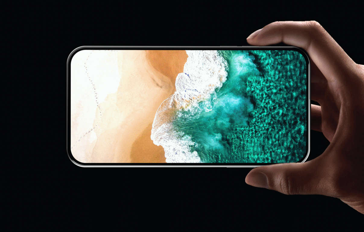
With that in mind, graphic designer Pallav Raj whipped up a gorgeous concept that takes design cues from the iPhone 5 and modernizes them for 2020. The result is a stunning iPhone 12 Pro that could end up being pretty close to the real iPhones Apple unveils in September. The one major issue is the display, which Raj has rendered as an all-screen design with no notch. Apple is indeed rumored to be working to shrink down the various Face ID sensors in its TrueDepth camera array so they’ll fit in a narrow bezel, but we’re not sure the new design will be ready for this year’s iPhones.
The video below showcases Raj’s stunning iPhone 12 Pro design, and you can see more on his Behance page.


