In an article published on Monday, I shared some renders made by a graphic designer that showed us what the new Galaxy S9 would look like if Samsung had copied Apple’s iPhone X display design. In my opinion, a notched display design like the iPhone X would make Samsung’s new flagship look even better than it already does.
The Galaxy S9 display could extend almost all the way to the bottom of the phone like it does on the iPhone X thanks to Apple’s nifty method of hiding the display controller, and the top corners would extend just as far. Then the ear speaker, front-facing camera, and sensors could reside in the centrally located notch at the top of the screen. This is a design that remains controversial — people either love it or hate it. Personally, I like the design a lot, and as I wrote, I think it would improve the look of Samsung’s Galaxy S9 by allowing Samsung to cover more of the phone’s front side with screen.
It was a rather simple little article that I thought was innocuous. But holy moly, Android fanboys were triggered.
Shortly after that article was published, I began receiving dozens of emails from whiny Android fanboys. OK wait, calm down. I’m not suggesting all Android fans are whiny, and I’m not suggesting that Apple fanboys are not whiny. In fact, Apple fanboys are often even more whiny. All I’m saying is that these particular Android fanboys were ugly-crying into my inbox. I stopped checking Twitter long ago, but I’m sure my mentions and DMs were just as colorful.
Now, I didn’t read all of the emails I received yesterday. I get somewhere between 300 and 500 emails on a normal day without fanboy rage, so I never have time to read all my emails. The ones I did read, however, can be split into two main groups.
The larger group shared the opinion that I am a fool because Apple’s notched iPhone X display design is ugly. Had Samsung used the same design on the Galaxy S9, they argued, it too would have been ugly. This is obviously a very valid opinion that is no more or less valid than my own. The notch is divisive, and it’ll continue to be controversial for the foreseeable future.
Some of the people who emailed me accused me of being a liar. Similar to far-right conservatives and far-left liberals, they’re so convinced that their opinion is the only one, they simply cannot comprehend any sane, intelligent person disagreeing. A few people even cited an earlier article I wrote, in which I basically called the iPhone X’s notch an abomination. It is absolutely true that I hated the look of Apple’s notched display design in photos before the phone was released. Sadly, these emailers must have missed all the articles like this one where I changed my mind and ate crow once I actually began using the iPhone X.
Wait, what? Opinions can change!?!
Of course, that’s neither here nor there. Android fanboys are entitled to their opinions just like everyone else, and if they hate the notch, then so be it. Of course, they had better get used to it since so many Android phone makers are copying the design. In fact, Apple’s iPhone X display design is being copied by so many Android phone makers that Google is actually building notch support into the next version of Android.
And that brings us to the second group of whiny emails I received. This group was far smaller than the first, but it was far angrier as well. According to this group, a Galaxy S9 with a notch wouldn’t be copying Apple at all. Instead, it’s actually Apple that’s the copycat.
Yes, we’ve all seen this song and dance plenty of times before.
These cute folks have managed to convinced themselves that all this hubbub over notched displays isn’t because of Apple and the iPhone X. Instead, all these companies out there embracing the concept of a notch are doing so because of another company. A true trailblazer and pioneer: Essential.
Hey, come on. Stop laughing. Let’s at least hear them out!
Long, long before Apple had the idea to release a smartphone with a notch cut out of the screen, Essential released the PH-1 with a notch at the top for the front-facing camera. Apple’s designers saw this, the story goes, and rushed to copy the design for the iPhone X. You see, Apple is a follower when it comes to design, not a leader. And all these other Android vendors out there that have released phones that look exactly like the iPhone X are actually copying Essential, not Apple. Get it?
Of course, we all know that this is absolutely ridiculous. Essential unveiled the PH-1 in mid-2017, long after Apple began developing the iPhone X. In fact, the iPhone X was so far along at that point that dummy models featuring the final iPhone X design — notch and all — had already been leaking for months.
But the Essential PH-1 was released in August, and August comes before November, so Essential clearly did it first. The logic is unassailable.
Let’s take a quick look at the designs to refresh our memories.
Essential’s notch
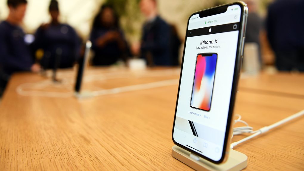
Apple’s notch
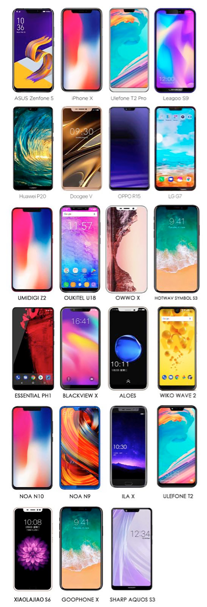
Every other copycat Android vendor’s notches
 They all look just like the Essential phone, right!?
Look, no one is arguing that Apple was the first smartphone maker on the planet to release a smartphone with a chunk sliced out of the screen. But “first” is often meaningless in this industry. Apple is a trend-setter, and the entire industry has been chasing Apple’s iPhone designs for a decade now.
Was Apple the first smartphone maker to release a phone with a big touchscreen and no physical keyboard? Nope, definitely not. But once Apple did it, every other big vendor copied the new design and companies like BlackBerry and Nokia that initially refused to were destroyed. Was the iPhone the first smartphone on the planet to feature a fingerprint sensor? Of course not, but Apple did it better than any company that came before it, and then the entire market rushed to follow Apple’s lead. Now, fingerprint authentication is on almost every smartphone out there. It’s not because Motorola put a fingerprint scanner on some crappy phone no one bought, it’s because Apple introduced Touch ID on the iPhone 5s.
In the end, of course, none of this really matters. Pick the phone that’s right for you and enjoy it. And as for smartphone designs, liking a display that is almost bezel-less aside from a notch at the top isn’t right or wrong, it’s a matter of preference. Personally, I think the Galaxy S9 would look better with almost no bezel at the bottom and a notch at the top. Many of the hundreds of thousands of people who read that article yesterday agree with me. Others do not. You know what — who cares either was? Time marches on.
You know what, though? People who refuse to embrace the notch are going to see their options severely limited for a while, until vendors find a good way to hide cameras, speakers, and sensors under display panels. Dozens of little Android companies have copied Apple’s notch, and now big companies like Huawei, Asus, and even LG are stealing the design. With Android P fully embracing notch support, haters are going to have a rough couple of years ahead of them.


