The Pixel 2 phones are not quite here yet, but we already know almost everything there is to know about the new Google handsets. They’re going to have similar specs, including some unexpected surprises, and offer a bunch of novel features, which is only to be expected of any new smartphone.
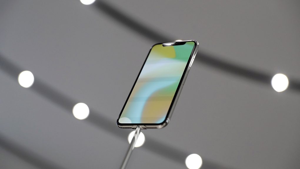
But the phones aren’t exactly equals when it comes to design, as it was the case with the original Pixels. HTC is making the Pixel 2, while LG is in charge of the Pixel 2 XL. And recent leaks proved that the Pixel 2 is the uglier of the two. In fact, it’s so ugly that it makes the iPhone X’s notch look totally adorable.
I recently said I can’t defend the ugly iPhone X notch. But what bothers me isn’t the phone’s design. It’s the way Apple handles it in software.
Fast-forward to this week’s Pixel 2 leak. Check out this image right here:

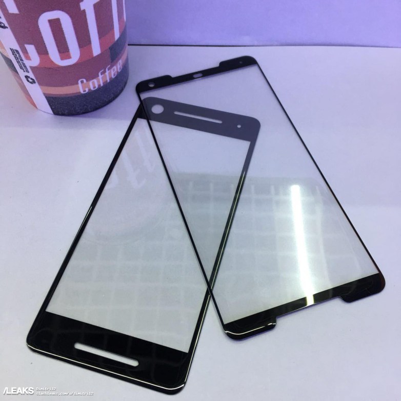
We’re looking at alleged Pixel 2 and Pixel 2 XL protective covers that make one thing clear: The Pixel 2 will be hideous compared to the XL version and to every 2017 smartphone that embraces the all-screen design mantra.
For some reason, Google thinks that dual front-facing speakers are features that will be appreciated more than more screen real estate. What year is this? Don’t we already have great sound solutions, including wireless speakers that Google sells? Or wireless headphones that everyone is making — and Google is rumored to launch its own models for the Pixels.
Headphone jack or no headphone jack on the Pixel 2, I’m pretty sure most people would appreciate a bigger screen than dual speakers.
Look at those ugly top and bottom bezels, and then look at the iPhone X:
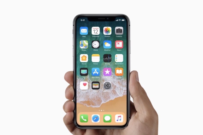
Yes, I often said the Pixel is an iPhone clone. Given that the Pixel 2 looks like last year’s Pixel, it sounds as if I’m saying now the iPhone design that Apple used for the last three years is incredibly ugly. It is, but only because we have an iPhone X to look at.
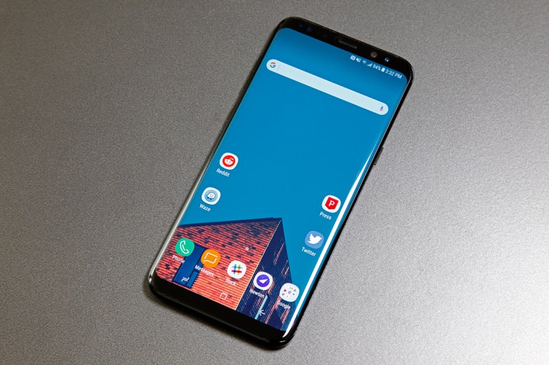
The Galaxy S8 doesn’t look bad either:
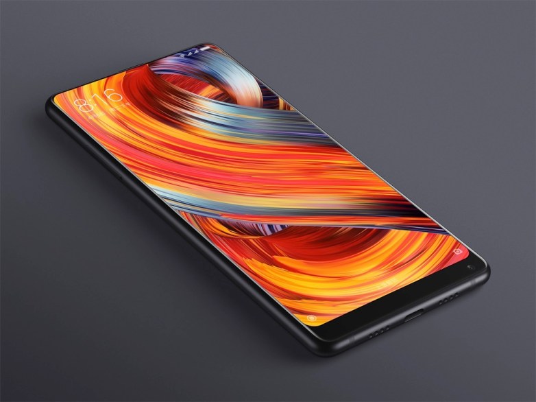
Let’s check out the Mi Mix 2 from Xiaomi:
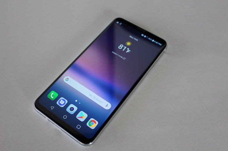
What about LG’s V30, which will compete directly against the Pixel 2 XL?
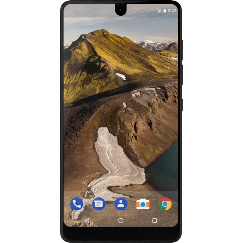
Compared to the Pixel 2, even the Essential Phone looks great.
On top of those unsightly speakers, let’s not forget that the Pixel 2 doubles down on ugly with the glass-and-metal rear shell which isn’t going anywhere.
Smartphone beauty is, of course, completely subjective, and standards change every few years. But the Pixel 2 isn’t even here and it’s already stuck in the past, while everyone else is moving forward. Just look at those screen protectors one more time, and then look at some of this year’s phones that have embraced all-screen designs.
