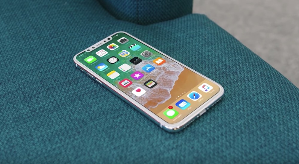
We’ve had a long look at the iPhone 8’s final design now, thanks to all the recent leaks from Apple-published HomePod firmware. Recent code discoveries also brought to the surface details about the screen, including its actual size, and the way the virtual home button will behave. Developers have already come up with a few iPhone screen designs that are probably getting closer to what Apple has actually done.
The iPhone 8 will offer buyers and edge-to-edge screen, but that’s not the entire story. The phone’s almost-perfect design is ruined by a bezel protrusion at the top that’s a necessary evil. The iPhone has various components that need to face the user, including the selfie camera, the phone speaker, the new 3D facial recognition system (a bunch of extra cameras), and various sensors. That’s why the top notch is there.
But that notch ruins the phone’s perfect symmetry, which is why the iPhone 8’s design is such a hotly debated story.
Following the discoveries made by developer Steve Troughton Smith, designers came out with various screen concepts that show how Apple might deal with the top Notch. Designer Maksim Petriv has a pretty good idea:
Final Final* look at iPhone 8 UI concept rendering with all front screen. Home button is a bit smaller then before. It’s persistent. pic.twitter.com/gm1jQyZIsz
— Maksim Petriv (@talkaboutdesign) August 5, 2017
This particular design solves two problems, it covers the corners of the notch and provides symmetry.
But that home button placement isn’t set in stone. The virtual button will appear and disappear, making room for extra real estate for apps:
Updated iPhone 8 UI based on latest leaks from @stroughtonsmith Downloadable file coming soon. #iPhone8 @9to5mac @macstoriesnet @viticci pic.twitter.com/HGZp06O2pA
— Maksim Petriv (@talkaboutdesign) August 10, 2017
Here’s what apps will probably look like on the new iPhone:
How some of your fav apps might look like on iPhone 8. #iPhone8 #ui. Based on leaked info by @stroughtonsmith @Spotify @instagram @twitter pic.twitter.com/9511Haj0Fh
— Maksim Petriv (@talkaboutdesign) August 10, 2017
Here’s a mockup showing the copper iPhone version: https://twitter.com/talkaboutdesign/status/895825430225223681
And here’s what a white iPhone 8 would look like:
Rumor is that there might be a version of #iphone8 with white front. Here is a quick render of that. @instagram @stroughtonsmith @viticci pic.twitter.com/axuV0yZBlq
— Maksim Petriv (@talkaboutdesign) August 11, 2017
But white is a terrible color for the phone, as it brings extra attention to the notch.
The same Petriv imagined what happens in a video playing app if Apple does decide to fully embrace the notch:
Some of you asked if I did landscape mockups. Here is a video player mockup. Home button hidden until he rest of controls are visible. pic.twitter.com/J1LJrySAkR
— Maksim Petriv (@talkaboutdesign) August 10, 2017
Yes, Drogon, burn that bezel with fire if you can.
Petriv did come up with ways to hide the notch:
Three ways Apple could do this. I picked “bunny” ears version since it’s in their own images from the leak. #iphone8 pic.twitter.com/fiCFWoC9kC
— Maksim Petriv (@talkaboutdesign) August 11, 2017
But Apple will likely use those display “ears,” so don’t count on them to quietly go into the dark.


