- A coronavirus map from Google and Stanford makes it easy to visualize the severity of coronavirus outbreaks in specific areas across the U.S.
- These coronavirus maps can easily be embedded, thus making it easier for local journalists to provide readers with up to date visualizations of coronavirus outbreaks in their area.
- The coronavirus pandemic is still impacting the entire country, but there are early signs that the virus may have peaked in some populated U.S. cities.
- Visit BGR’s homepage for more stories.
With coronavirus statistics being updated on an hour by hour basis, it can sometimes be challenging to accurately interpret some data points. As an obvious example, the implications stemming from an outbreak of 15 coronavirus cases in a densely populated city like New York City isn’t the same as a similar outbreak occurring in a small suburban town.
One strategy researchers have come up with to better inform the public about coronavirus outbreaks is an immersive mapping tool that helps visualize the severity of the coronavirus pandemic across U.S. states and cities.
Specifically, the Case Mapper Project — which is a joint effort undertaken by Google and Stanford’s Big Local News program — allows journalists to easily embed up-to-date coronavirus maps into their stories. What makes these maps uniquely instructive is that the maps show the number of coronavirus cases relative to a given population. This, in turn, makes it easier for readers to assess the severity of a coronavirus outbreak in a given area. While coronavirus data is easy to come by, the Case Mapper Project makes it a lot easier to digest.
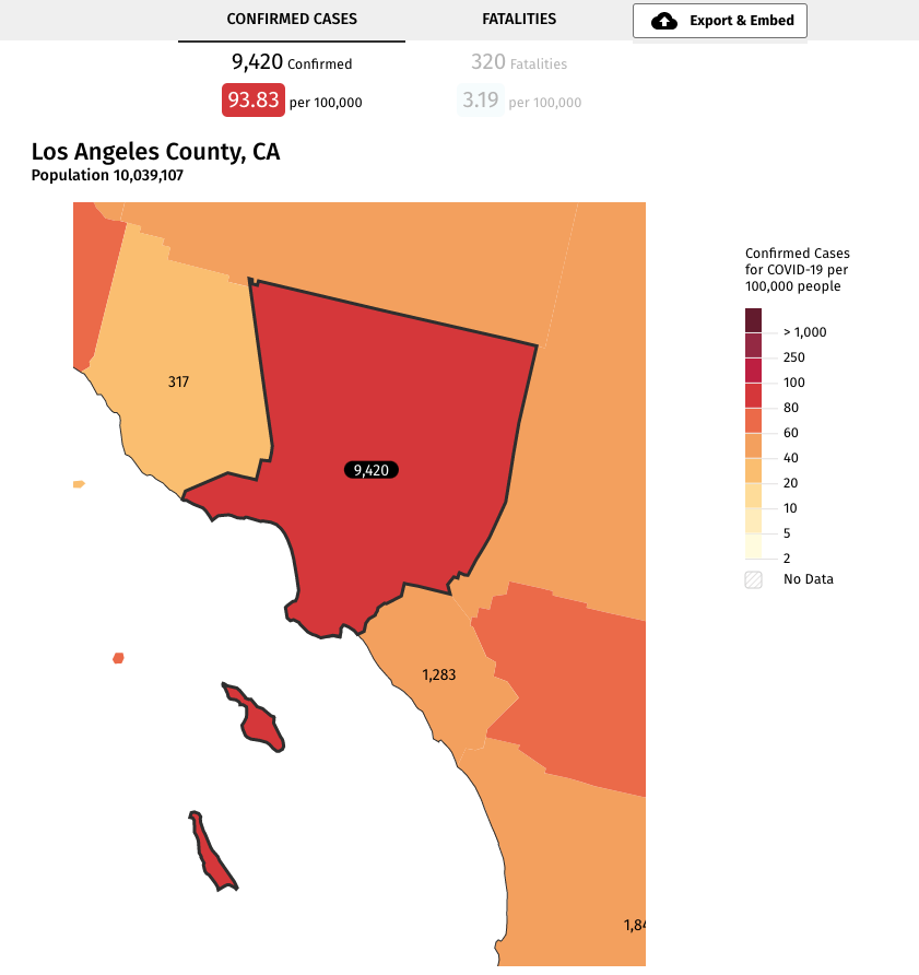
If you go to the Big Local News website and type in a city or zip code, you can see the type of information the software provides. As a quick example, I typed in California’s famous 90210 zip code and this is what popped up. As evidenced below, the color coding makes it easy — even at a quick glance — to see which parts of the state are experiencing the most severe outbreaks.
And we can then drill down right into Los Angels County for more information. And note the “Export & Embed” button on the right which makes it easy to add these charts right into a story:

A snapshot of the entire United States provides us with an interesting look at coronavirus hotspots across the country. Note that I used the embed tool below so the map here is actually interactive:
As to the current state of the coronavirus pandemic in the United States, well, that seems to be something of a mixed bag. While the virus seems to have peaked in some cities, there are now reports indicating that the virus has the potential to re-activate within patients who seemingly already recovered from infection. Additionally, a new strain of the virus found in India may make coming up with a vaccine that much harder.


