Welp, It Looks Like The iPhone 8 Interface Is Going To Be Ugly
Earlier this morning, we relayed news from a report that finally reveals how the iPhone 8 interface will handle the lack of a home button. As anyone reading this knows all too well by now, Apple's upcoming new iPhone 8 will feature a ground-up redesign that includes a display that covers almost the entire face of the device. The only way to accomplish that, as we've learned from other "all-screen" phones like the Galaxy S8, is to remove the home button on the face of the device. There were a few interesting tidbits in that report regarding the interface and gestures that will replace home button taps, but there was also a troubling detail buried in there: It appears as though the UI on the iPhone 8 is going to be ugly.
Back in June, we published an article about how ugly Apple's compromised iPhone 8 display design would be if the company decided to use the portions of the screen on either side of the "notch" at the top as part of the main UI. Apple chose to switch to an "all-screen" design this year, perhaps in part to keep pace with other smartphone makers that already have devices with this trendy new design. The problem is that the tech needed to hide things like sensors and speakers beneath the screen isn't yet ready for primetime, so Apple chose to leave an area at the top of the screen that will house the speaker, front-facing camera, and other sensors.
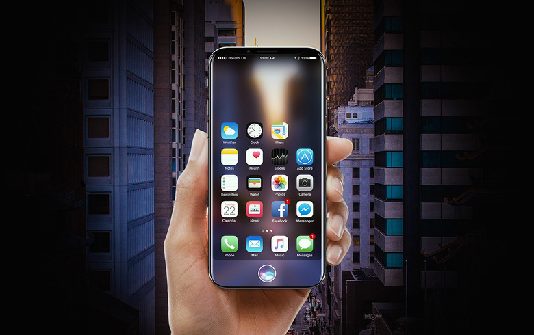
From a software standpoint, there are two ways to approach this design. One is to only release iPhone 8 models with black front sides, and reserve the top area of the display on either side of the notch for the status bar. This would actually be a brilliant way to design the device, keeping the app UI below and moving status bar icons off that portion of the screen. You can see how elegant this solution would be in the images in this article.
The hideous way to approach the new display design is to just have a big notch cut out of top of apps. Sadly, this is apparently the option Apple decided to go with.
"Apple has opted to not hide the notch area at the top of the screen, showing a definitive cutout at the top of apps with non-black backgrounds," Bloomberg said in a report on Wednesday morning. "The cutout is noticeable during app usage in the middle of the very top of the screen, where the status bar (the area that shows cellular reception, the time, and battery life) would normally be placed, according to the images. Instead, the status bar will be split into left and right sides, which some Apple employees call "ears" internally."
Ugh.
Apple's iPhone 8, which may be released with the name "iPhone Pro," will be unveiled on September 12th alongside the iPhone 7s, iPhone 7s Plus, Apple Watch Series 3, and a 4K Apple TV. The new iPhones should become available for preorder that Friday, September 15th, before being released a week later on September 22nd.