It’s mid-October, which means all the high-end phones we were waiting for have been unveiled. The Galaxy Note 8 and iPhone 8 are already available in stores, the Pixel 2 is up for preorder online, and the iPhone X will be released in early November. That means you can expect various comparisons between these devices once they reach consumers’ hands.
But if smartphone design is all that matters for you this year, then you can already compare the top Android and iPhone models right now. And one thing is clear: Google’s Pixel 2 is surprisingly ugly when compared to the iPhone X.
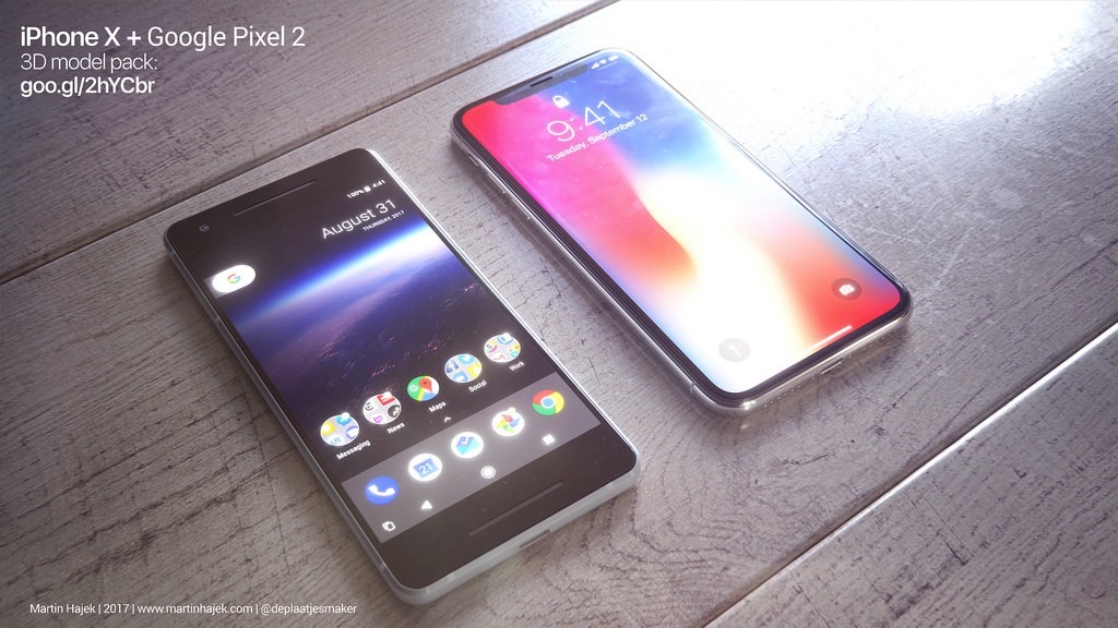
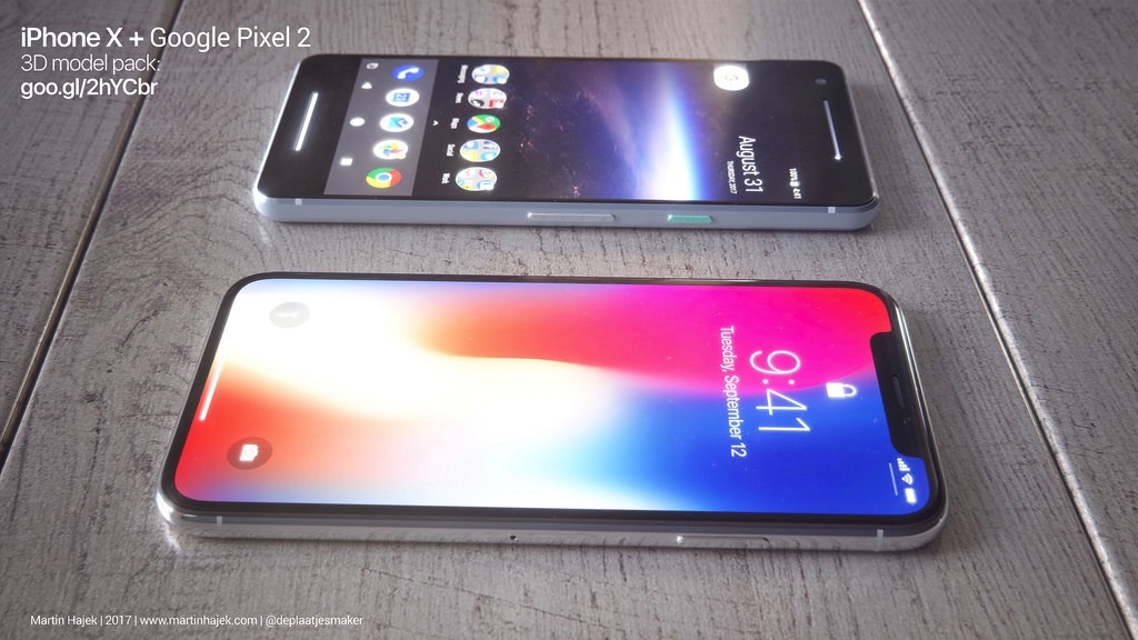
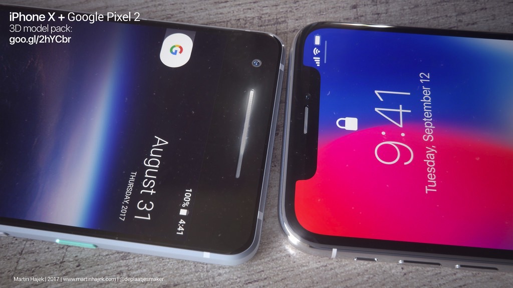
Designer Martin Hajek has created renders that show the two smartphones side by side from various angles. There’s no denying that the iPhone X’s notch is unsightly, but its almost-all-screen design is so much better than what Google and HTC have done with the Pixel 2.

Both designs are heavily influenced by certain features. Apple wanted to sell customers a full-screen iPhone that also had an advanced 3D facial recognition system this year. The notch makes Face ID possible, and it’s a design compromise Apple is more than willing to make right now.

Google, on the other hand, did not perfect its all-screen smartphone design in time for the Pixel 2 release, although it confirmed that’s the future of the Pixel. Instead, it placed two forward-facing speakers to compensate for the lack of a 3.5mm headphone jack. And the whole thing is seriously ugly.
The Pixel 2 may very well have one of the best cameras around, and it’ll receive timely Android updates for three years. But the Pixel 2 is incredibly ugly, which makes the iPhone X look even better than it already does.

These are only some of Hajek’s renders, so you can click this link to see more. Until the first reviewers get their hands on both devices, this is the best iPhone X vs. Pixel 2 comparison we have.


