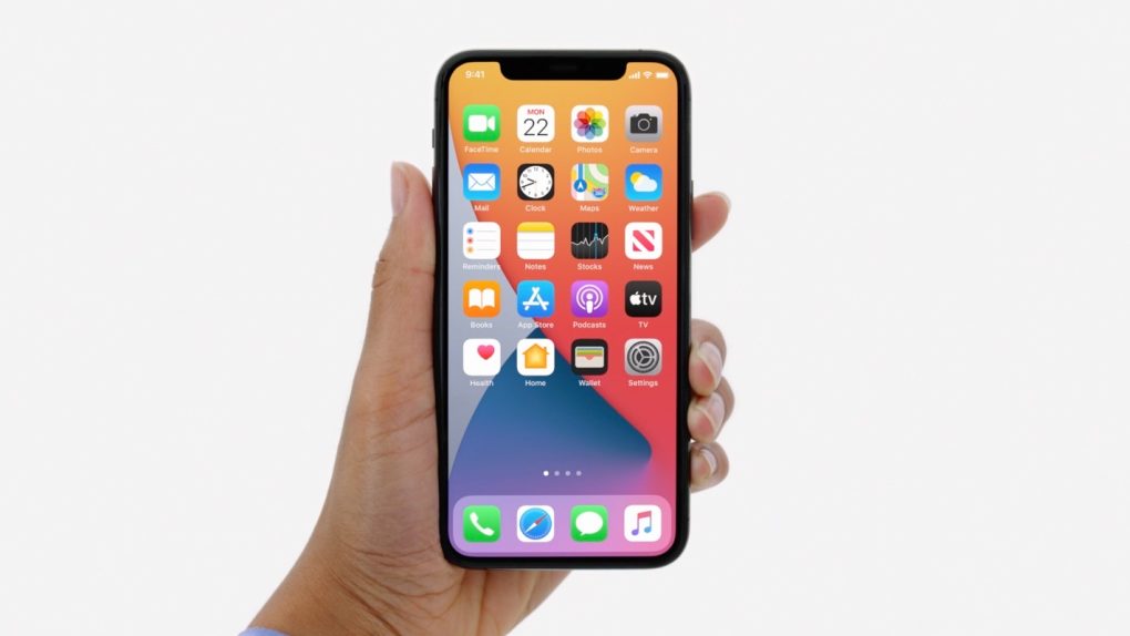
- Apple introduced several new iOS 14 features during its WWDC 2020 keynote last week, including a few significant user interface changes.
- The macOS Big Sur update is Apple’s most significant Mac software redesign in years, aligning the Mac to the iPhones and iPad when it comes to the user interface.
- A uniform UI design language would benefit the rumored Apple AR Glasses the most, and the following concept shows what an iOS-14-based glassOS would look like.
The Mac will look and feel like an iPhone or iPad once you install macOS Ben Sur. Apple isn’t going to merge the Mac and iPad lines anytime soon, and its decision to move the Mac line from Intel to its own Apple Silicon speaks volumes to that. I think that the major macOS redesign is part of something much bigger. Apple is laying the groundwork for the future of computing, which will include a brand new device, augmented reality (AR) smart glasses. Apple is already working on its own AR Glasses, which will require a connection to the iPhone to work, at least the first generations. I saw after WWDC 2020 that a cohesive design language for macOS and iOS would also benefit the glasses. Apple will probably come up with a user interface for the AR devices that’s very similar to the iPhone and Mac.
A designer imagined exactly a glassOS operating system for Apple Glasses that’s based on the iOS 14 user interface that Apple introduced last week.
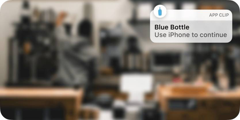
iOS 14 brings several UI changes that will benefit the AR glasses, including the more compact design for calls and Siri, the expanded Widget support, the picture-in-picture video playback mode, and the new App Clips that offers only a part of a key app when you need it.
Designer Jordan Singer turned these iOS 14 features into UI elements that would work on Apple Glasses.
Before we look at the concept images, I’ll remind you that any AR glasses operate similarly. They project digital UI elements directly on the user’s retina, merging them with real-life. As you’ll see in the following images, that’s precisely what the designer did with his concepts. Various iOS 14 elements are placed atop reality, as seen via a pair of AR glasses.
Notifications for Messages.

Call notification.

Apple Maps navigation directions.

iOS 14 Widgets.

Apple Maps location of a parked car.

Picture-in-picture FaceTime call with visual notification that the camera and/or microphone are in use.

App Clips in use.
New Siri minimal UI.

This is just a concept, of course, and we’d expect Apple to deliver an even more polished UI for the glasses. Even so, Singer’s full blog post, complete with comparisons between iOS 14 on the iPhone and his glassOS on AR glasses, is worth a full read.
