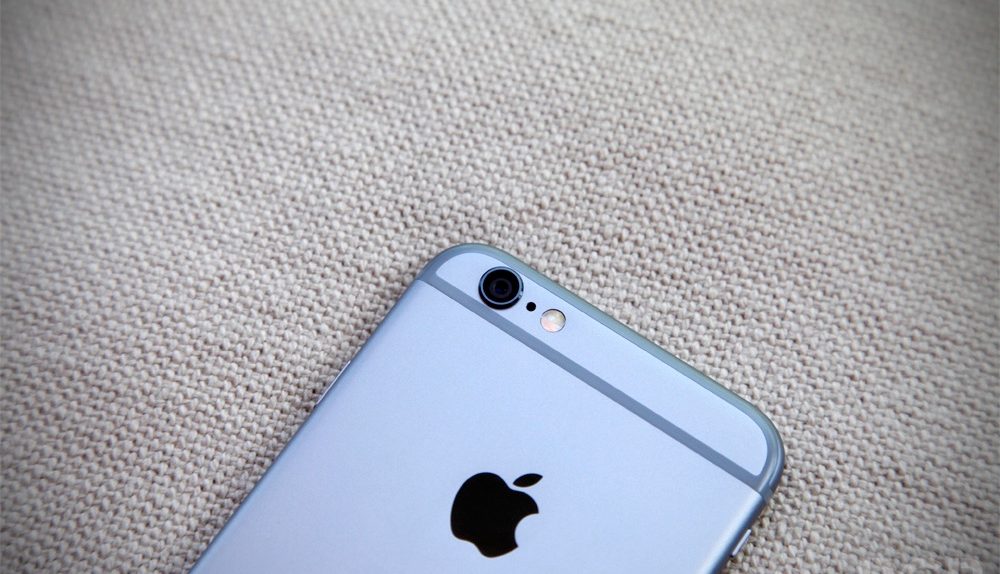
It’s safe to say that the iPhone 6 is the biggest smartphone hit of 2014, which is entirely to be expected given the wide acclaim it’s received and the enthusiasm that iPhone users have for the product. However, there are always things to improve with every device and these pictures posted by Gizmodo show that Apple could actually learn a thing or two when it comes to maximizing display size while minimizing extra space used for side bezels, cameras and microphones.
RELATED: This infographic shows why bezel-free smartphones aren’t as crazy as you think
As we’ve seen in a previous comparison between the LG G3 and the iPhone 6 Plus, LG actually does a better job than Apple does of getting a display of the exact same size onto a device that’s more compact than Apple’s flagship phablet. The Gizmodo pictures incorporate a lot more types of devices and they show that it’s not just the G3 that is more efficient than the iPhone 6 when it comes to maximizing screen space.
Here, for example, is a comparison between the 2013 Moto X and the iPhone 6:
As you can see, the 2013 Moto X features a 4.7-inch display just like the iPhone 6 does but it also uses a lot less space at the top and the bottom of the device. Some of this is inevitable since we can’t imagine Apple getting rid of the iPhone’s iconic home button but we can also imagine the company shaving some space off at the top in future releases.
Gizmodo’s full gallery of pictures is worth checking out and can be found at the source link below.


