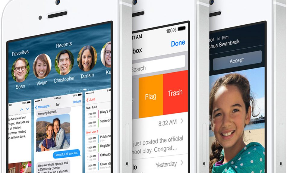
iOS 8 was a huge update for Apple’s mobile operating system. It didn’t include a big visual overhaul like iOS 7, but it likely included more behind the scenes updates than any other iOS update before it. One thing it did not include, however, was a substantial update to the notifications functionality in Notification Center on the iPhone and iPad.
Apple initially “borrowed” some ideas from Android to create its Notification Center, and it’s certainly miles better than Apple’s old notification system in iOS, which was absolutely terrible. But there is still a long way to go before Notification Center reaches its full potential, and a new concept video shows us a few ways Apple could make notifications infinitely more useful.
DON’T MISS: Why Samsung fell
Swedish university students Petter Andersson, Friðgeir Torfi Ásgeirsson and Jonas Jerlström noticed that the Notification Center on their iPhones gets little or no use. So, as part of a school project, they were given the task of redesigning it.
As you’ll soon see, the team did a pretty outstanding job.
“We were given the task to identify and redesign an, in our opinion, flawed or badly designed interaction pattern in an app or function of our choosing,” Andersson wrote in a blog post. “We chose to work with the iOS notification center for a couple of reasons, the main reason being it affects or could at least affect the majority of iPhone users.”
He continued, “Our redesign is based on the up and coming idea of card UI, and makes use of some of the already existing UI/UX patterns within iOS. We chose the card approach to simply because it’s a current design trend and a good way to compress and display a lot of information.”
The video of the team’s vision for Notification Center speaks for itself, and it’s embedded below along with a few images of the concept. Hopefully Apple gets a few ideas for iOS 9.


