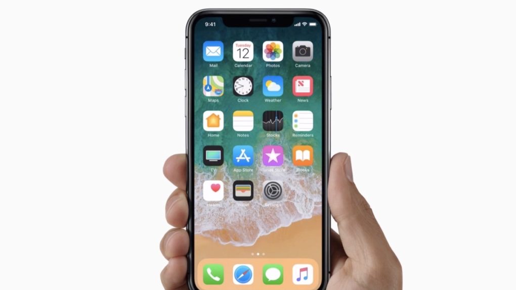
The iPhone X is the best thing that has happened to the iPhone since the iPhone. Yet all everyone seems to be talking about is that unsightly notch. There’s no denying that the notch brings technological advancements to the iPhone not available on other smartphones. But Apple’s way of implementing the notch makes the user interface ugly. It’s the exact opposite of what we expected Apple to do. But hey, at least there was one surprise during the keynote.
I already showed you why I can’t defend the notch’s hideousness even though I’m buying the iPhone X on November 3rd when it’s released. I’m hardly alone in this fight though, and most people agree that Apple’s notch isn’t cool. In fact, even some of Apple’s strongest defenders hate the notch.
John Gruber is a respected Apple blogger who often gets access to information way ahead of everyone else. That was not the case for the iPhone X and iPhone 8 series, however, and he failed to accurately predict any of Apple’s plans for this year’s iPhone launch.
In his review of the events of the past few days, Gruber minced no words when dealing with the notch. Why is that important? Because the more respected people who speak ill of the notch — especially insiders that Apple pays attention to — the better our chances are of having the prominence of the notch toned down in future software updates.
The notch “offends” Gruber. “It’s ungainly and unnatural. Clearly, the ideal of an ‘all-screen’ design — to use Apple’s own words — has no notch at all.”
He makes the same case as I did that it’s not the main purpose of the notch that’s disturbing. Face ID is a great invention, and you’ll soon see why. The software is the problem, like we’ve all been saying.
“What I dislike more than the notch isn’t the notch itself but that Apple is fully embracing the notch in software,” the blogger continued. “I really wish their software design rendered the ‘ears’ with black backgrounds while using apps. I’d be fine with embracing the notch on the home screen and lock screen.”
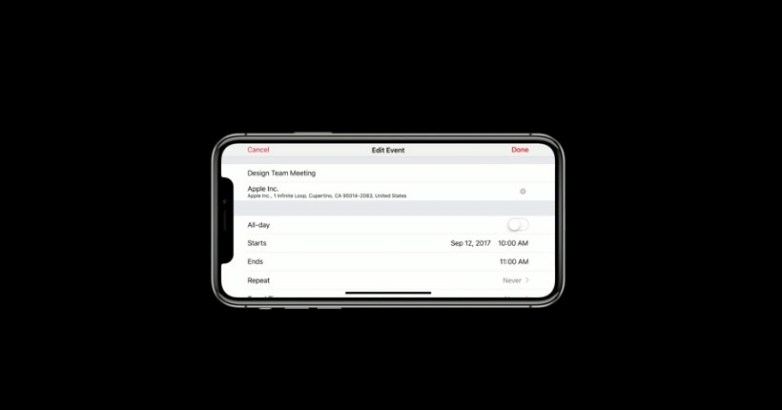
“In landscape, the notch looks like a joke,” he said. “I think Jony Ive either lost a bet or lost his mind. It looks silly, and to pretend otherwise is nonsense.”

“But this looks just awful — and that screenshot was taken from Apple’s own video advising developers on how to handle the notch in their UIs” he said, referring to the image above, which we previously referenced.
Exactly!
I concluded my rant against the notch with this: “I will buy the iPhone X.”
Gruber shares the same feeling. “Notch be damned, I know already that I would rather own an iPhone X than an iPhone 8 or 8 Plus,” he wrote. You can read his entire take at this link.


