Jony Ive Discusses The iPhone X And Apple's Decision To Remove The Home Button
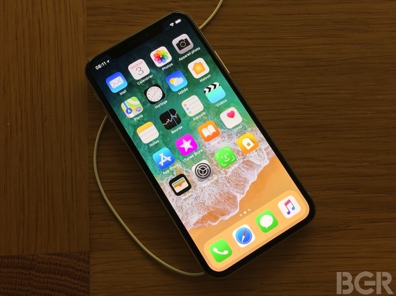
The iPhone X is as close as Apple has ever come to delivering upon Jony Ive's vision of the ideal smartphone design, which as he famously would "appear like a single sheet of glass." The iPhone X is essentially just that, though there's no getting around the fact that there's a notch at the top of the display. Nonetheless, once the iPhone X began arriving in customer hands, it became overwhelmingly clear that the controversy surrounding Apple's design decision to "embrace the notch" was completely overblown.
All told, the iPhone X is without question the most advanced iPhone we've ever seen, and is arguably the best smartphone the world has ever seen. From the device's OLED display — which DisplayMate said was the best display they've ever tested — to the revolutionary feature that is Face ID, the iPhone X is, at the same time, both an engineering and design marvel.
The iPhone X has been in development for years, and Apple design guru Jony Ive recently sat down with TIME for a rare interview where he talked about some of the challenges involved in bringing the iPhone X to market. Of course, one of the biggest hurdles Apple faced centered on what to do without the home button, a cornerstone of the iPhone user experience since the original launched back in 2007.
Interestingly enough, Ive notes that blindly holding onto a technology or a design solely because it's familiar can hinder progress.
"I actually think the path of holding onto features that have been effective, the path of holding onto those whatever the cost, is a path that leads to failure," Ive explained. "And in the short term, it's the path the feels less risky and it's the path that feels more secure."
Indeed, it's not hard to hear a bit of Steve Jobs' influence in Ive's statement here. Jobs, if you recall, was notorious for his willingness to say goodbye to successful products and technologies in the pursuit of even better alternatives.
As it all turned out, Apple's decision to develop edgeless display and get rid of the home button, with the benefit of hindsight, now looks like a stroke of genius. The gestures Apple has incorporated in place of the tactile home button are intuitive and feel even more natural the pressing on a physical button.
"It's not necessarily the most comfortable place to be in when you believe there's a better way," Ive added. "[Because] that means moving on from something that has felt successful."
Ive's interview with TIME can be read in its entirety over here.
