- Various coronavirus map projects provide accurate details about the COVID-19 pandemic in real-time, having followed the illness from its early days.
- Researchers from Harvard are leading a new effort to offer a unified method of mapping the coronavirus spread in America, and measuring risk objectively all the way down to county level.
- The mapping tool is already available online, offering users a way to assess COVID-19 risk for a particular state and county.
- The system looks at the daily number of cases per 100,000 people and can provide an accurate comparison between COVID-19 outbreaks in different US communities.
We’ve been following the progress of the novel coronavirus pandemic with the help of all sorts of online resources that have mapped the spread of the illness from day one. The Johns Hopkins tool is a popular choice to follow COVID-19 stats, as is the Coronavirus App, each of which offers various levels of granularity.
An Institute for Health Metrics and Evaluation tool doesn’t just provide a variety of stats for countries and communities, but also data projections for the near future based on the current evolution of the pandemic. Then there’s Worldometer with its straightforward stats and graphs that map the progress of COVID-19. But what if you wanted to know precisely how bad the coronavirus spread is in your county? There’s a new tool for that.
Harvard professor Danielle Allen and researchers at the Harvard Global Health Institute lead a collaboration of top scientists at institutions around the country. The researchers came up with a new way to measure the spread of COVID-19 at the local level and determine the risk level. The team created a unified set of metrics as well as a standard definition of risk that can be applied at the state or county level. The new tool can provide more accurate information about the local evolution of the pandemic than most others that we’ve seen.

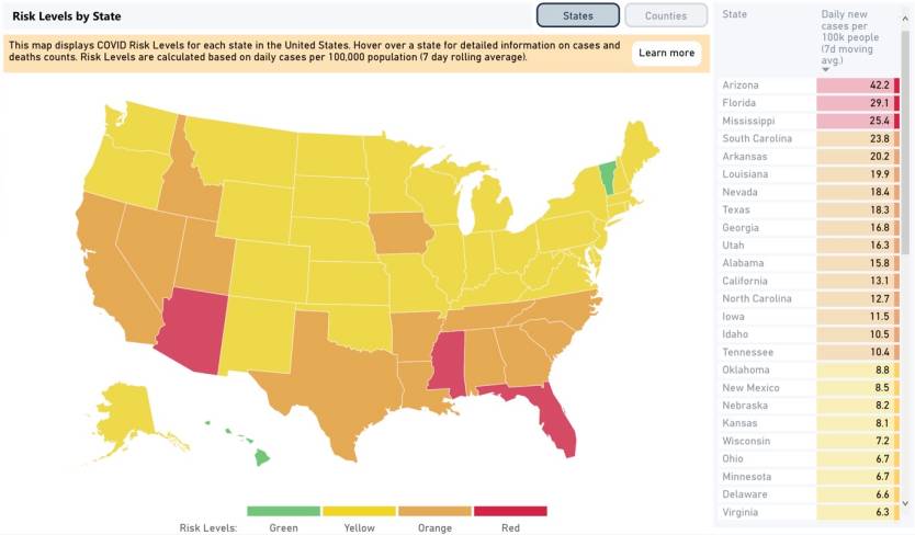
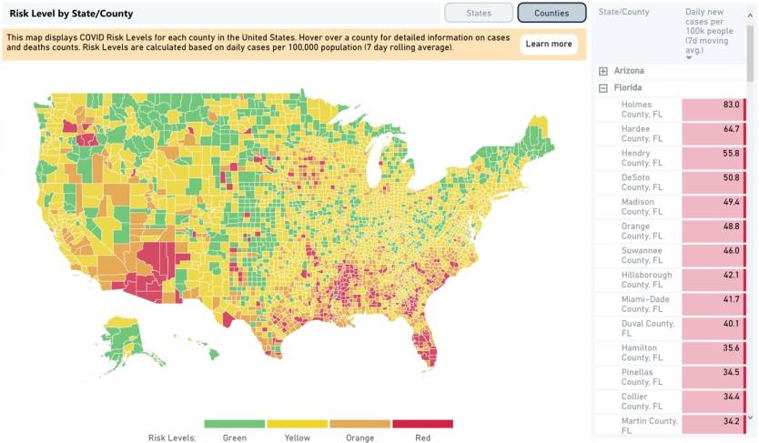
People can check for themselves how much of a problem COVID-19 spread might be in their county, and plan their activities accordingly. The map offers a color-based risk rating, progressing from green to yellow, then orange and red, depending on the number of new daily cases per 100,000 people.
“When you get into that orange and red zone, it means, in all likelihood, you’re seeing a lot of velocity, a kind of fast upward trend,” Allen told NPR.
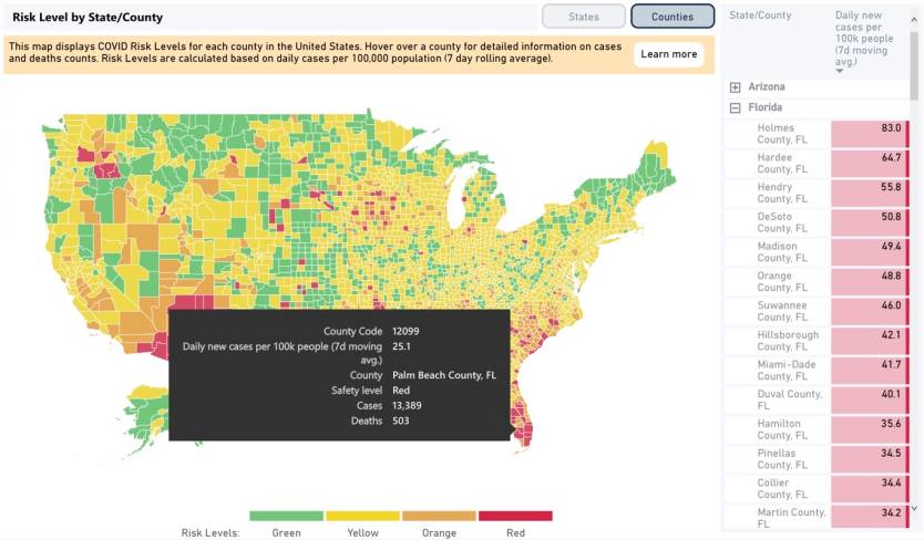
Communities with fewer than a daily new case per 100,000 people are green. One to 10 cases means yellow, and 10 to 25 is orange. Anything above 25 turns the region in red.

The tool will not show you the total number of cases for a county or state, though that figure isn’t especially vital. Instead, it lets you assess the risk of a county relative to other places. “It allows you to compare a rural area in upstate New York compared to New York City and have an apples to apples comparison for relative impact and relative caseload,” Georgetown University’s Ellie Graeden told NPR. Graeden is a part of the Talus Analytics and the Center for Global Health, Science, and Security at the university, which was involved in developing the metrics for the new COVID-19 mapping system.
The tool could be useful if you’re planning on visiting other states or counties to try to determine how contained the local COVID-19 outbreak is. You should keep in mind that the tool uses publicly available data, which does not account for asymptomatic carriers. The CDC said recently that confirmed cases may account for just 10% of the total number of infections.

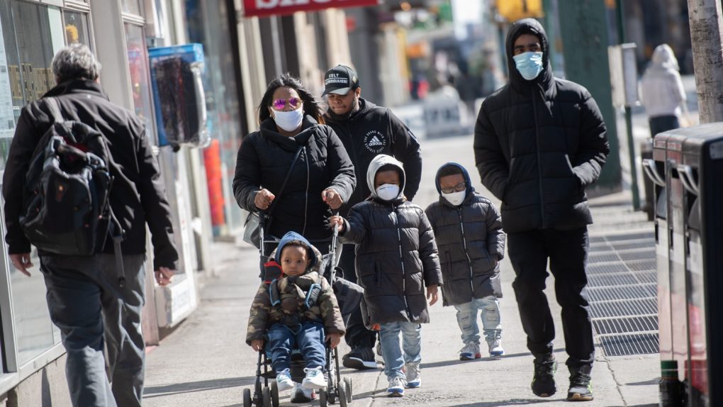
The researchers who developed it said that green means a community is containing the virus. At yellow, counties should implement more restrictions, like face masks and social distancing, as well as more testing and tracing. Orange is “dangerous” and would need surging testing and tracing efforts combined with stay-at-home orders.
Red is when it’s really bad. “Jurisdictions have reached a tipping point for uncontrolled spread” once they hit red. “You really need to be back at a stay-at-home [advisory],” Graeden said about red.
As you can see in these screenshots, the map is interactive, allowing you to move between state and county levels. You can also hover over a region to obtain more data. The new mapping system will be included in a number of COVID-19 initiatives, including Covidlocal.org, and CovidActNow.


