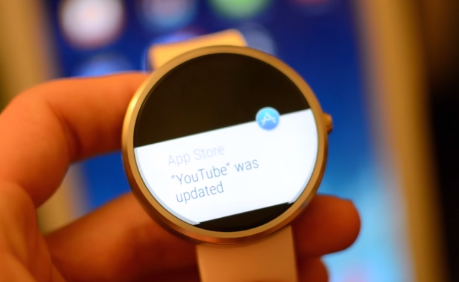
Even though there wasn’t a lot of competition, the Moto 360 was definitely the hottest Android Wear watch released last year. Droid Life has posted a video swiped from Motorola’s Instagram account that seems to show us what the next-generation Moto 360 will look like, although before you watch this video you shouldn’t go in expecting a major design overhaul.
DON’T MISS: iPhone 7 concept imagines a sleek future for Apple’s iPhones
One thing you’ll notice about the watch shown in the video is that its button is placed nearer to where the strap is, whereas the original Moto 360 had a button that was placed directly in the 3 o’clock position. And sadly, it appears as though this new device still has the “flat tire” of the original in which a chunk of the display at the bottom is essentially blacked out.
We also don’t get to see the new device from the side so it’s difficult to say how much slimmer, if at all, the new device is compared to its predecessors. While the original Moto 360 was very stylish, it nonetheless had a very thick overall frame that we expect Motorola has worked to slim down over the past year.
Check out the full video below and decide for yourself whether this is really the next-gen Moto 360.


