Bored at work? Counting down those hours until you’re free? Hopefully this will help take your mind off of things. The biggest request we’ve been getting so far regarding the Bold is to post a browser walk through. We’re about to take you on a magical journey, friends, to BlackBerry Bold browser land. Somewhere you’ve never been before. Just for kicks we included some screen shots of the iPhone’s browser loading the same web pages, but as you can see, the Bold does a pretty decent job at banging sites. Hit the jump for all the pics and our comments!

As you can see, the browser renders pages worlds better than previous browsers on the BlackBerry OS. It’s a welcome change, but it’s still not perfect. It doesn’t do a great job with our header.
This is still in the initial view mode. All you have to do to zoom in is press in the trackball. You can do this as many times as you’d like until you get the desired zoom level.
Don’t get too freaked out with the jaggedness of the text here. It looks very clean and sharp on the device itself. Images also look better than in the screen shots.
Like eBay? Well then, you’d obviously like to check it out from your BlackBerry Bold.
While the browser handles a lot of pages with no problem, there are some sites that the Bold doesn’t play nice with. As you can see, the Bold didn’t render anything in the upper left box, the lower right box, and there’s still a decent amount of content missing.
This is the default browser screen you are greeted with. Anyone running a semi-recent version of the BlackBerry OS will be perfectly accustomed to this.
Here’s where things get a little tricky… Since the BlackBerry has a huge following, many sites have created BlackBerry-optimized versions of their web pages. The issue is that since the Bold is still seen as a BlackBerry, it serves up the optimized pages instead of what you’d really like to see. CNN does the same thing, and there’s no option on either site to exit “BlackBerry mode”. Though we’re sure this will be fixed soon enough.
We also checked out CNET to test the Bold’s rendering abilities. It did pretty well here, but again, there’s a lot of blank space, and even worse, the left column is actually all the way down on the page when it’s displayed on the Bold. Below are the iPhone browser images of the same sites…

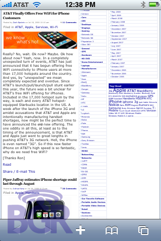
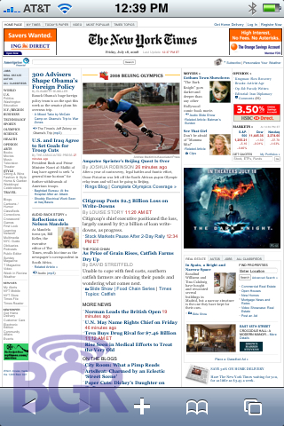
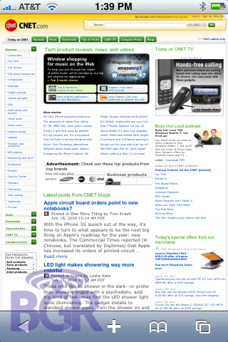

Want us to test some more sites? Let us know in the comments and we’ll update this post with them!

