Google Unveils A Fresh New Look For Search On Mobile Devices
Google unveiled a new look and feel today for the way it presents Google Search results on mobile, and the update has been regarded in a few corners now as somewhat News Feed-like.
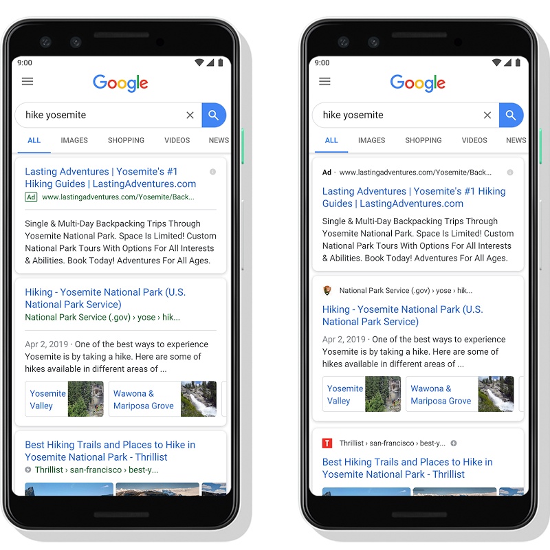
It's easy to see why that's the case, as the search giant's changes include putting emphasis on a website name and favicon above the search results. Whereas the source of results had previously not been so clearly emphasized, which makes the new design for showing results feel a little like scrolling through a feed of posts from publishers and the like.
"With this new design, a website's branding can be front and center, helping you better understand where the information is coming from and what pages have what you're looking for," explains Google Senior Interaction Designer for Search Jamie Leach in a company blog post today. "The name of the website and its icon appear at the top of the results card to help anchor each result, so you can more easily scan the page of results and decide what to explore next."
The post notes that the refreshed look for what's arguably Google's most important product will start showing up to users over the coming days. As part of the changes, Leach continues, when you search for a product or service and Google feels like it's got a relevant, "useful" ad that would be worth including in the results, you'll now see an ad label in bold at the top of a search results card. The web address will also be included, so you can quickly determine where the information you're seeing is coming from.

The other important thing to note about the Google Search refresh on mobile is that this also lays the foundation for Google to add more action buttons and information previews to search results cards, with Google wanting you to be able to now do everything from buying movie tickets to playing podcasts right there from within the results. "Our goal with Search always has been to help people quickly and easily find the information that they're looking for," Leach says. "Over the years, the amount and format of information available on the web has changed drastically — from the proliferation of images and video to the availability of 3D objects you can now view in AR." Which is why the company thought a "visual refresh" of Search on mobile would do a better job of helping people find the information they need and quickly determine where it came from.
