
Late Apple co-founder Steve Jobs famously vowed to destroy Android because it is a stolen product. “I don’t want your money,” Jobs is said to have told Google’s Eric Schmidt during a meeting. “If you offer me $5 billion, I won’t want it. I’ve got plenty of money. I want you to stop using our ideas in Android, that’s all I want.”
Whether or not you agree with Jobs in a broad sense, there is simply no denying that these two mobile platforms are very different in a number of key areas. And according to one mobile expert, a single screenshot shows that Android is years ahead of the iPhone and iOS when it comes to usability.
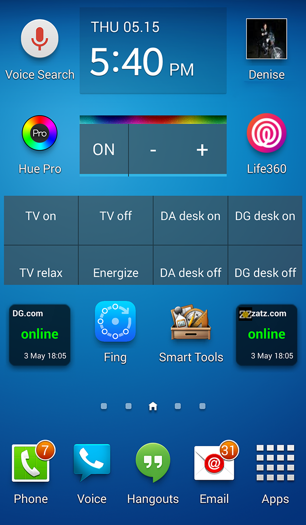
First things first. Here’s the screenshot in question:
The image above is a screen capture of the home screen on David Gewirtz’s Galaxy S4. Writing at ZDNet, Gewirtz explained that he regularly uses Android devices and iOS devices, so he is better positioned than most to see disparities between the two platforms.
One of the biggest disparities, he says, is usability.
“Take a look at the screenshot above,” Gewirtz wrote. “What do you see? What you see is information and control. This is the home screen on my Galaxy S4. I’ve been tweaking it on and off over the past year, until I got it to be exactly the way I want it.”
He continued, “What you’re looking at is a combination of widgets and icons. The iPhone doesn’t have widgets. The iPhone presents simply page after page of icons. Even worse, you can’t scale the icons, so if you happen to be over 40, you’re forced to squint at your home screen to get anything done. It’s even worse for those damnable folders, with their incredibly teensy icons — and you can’t even set a folder icon.”
Gewirtz goes on to explain that Android’s home screen is designed with usability, flexibility and utility in mind. It can be all things to all people. The home screen on the iPhone, however, is merely a grid of app icons that are static, for the most part.
“When it comes to home screen flexibility, the iPhone is even less flexible than the Palm handhelds were back in the 1990s. By comparison, the iPhone is positively regressive,” Gewirtz wrote.
His full post is an interesting read, and it’s linked below in our source section.


