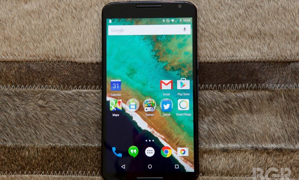
One of the most interesting things to watch over the past few years has been to see Apple and Google try to make their platforms more alike by adopting one another’s strengths. So while Apple has been working on making its platform a little bit more open to things such as third-party keyboards, Google has been pouring resources into Android’s overall design to make it more visually appealing. Android 5.0 Lollipop and its Material Design UI are the results of all this work and so far both have been earning wide praise from early adopters.
RELATED: The dirty secret that Apple and Google don’t want you to know about iOS 8 and Lollipop
A Reddit user who goes by the name mrcrassic has just switched over from an iPhone 6 to a Nexus 6 and he’s posted some very interesting thoughts about the strengths of both devices. What really stood out to us, though, was his praise for Material Design on the Nexus 6, which he described as “gorgeous” while also saying that he loved the new UI’s animations and the way it makes updated apps look vastly better.
The user also praised by Google Now and Google Maps as fantastic software applications, although he said that Apple Pay with Touch ID was a significantly better mobile payments platform than Google Wallet.
Check out the user’s full comparison of the iPhone 6 and the Nexus 6 by clicking the source link below.


