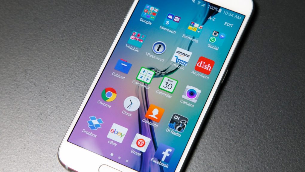
Samsung’s Galaxy S6 and Galaxy S6 edge flagships come with a significantly improved TouchWiz user interface on top of Lollipop (even though bloatware levels are still as high as ever), as Samsung seems to have finally understood what users want to see in their devices. But TouchWiz could have been better than that, even before Google came up with Material Design.
DON’T MISS: How to access the secret hidden menus on your iPhone or Android phone
Designer Gerald Mark Soto, who says he worked with Samsung on experimental user interfaces “to explore new says of interactive with your phone,” has posted online a couple of videos highlighting some of his smartphone UI design concepts, as SamMobile noted.
If the user interface elements presented in the videos look familiar, that’s because a distant rumor from early January 2014 said this particular user interface had been created for the Galaxy S5.
As it turned out, Samsung’s TouchWiz choices for last year’s top phones were not based on these concepts. Samsung decided to use a different UI design for the 2014 flagship handsets, including the Galaxy S5 and Galaxy Note 4, and then further refine its UI and transition it to Material Design in preparation of the Galaxy S6.
The two videos showing this would-be TouchWiz redesign follow below, offering a sweet taste of what Samsung’s Android customization could have looked like on Galaxy devices including the Galaxy S6 models.


