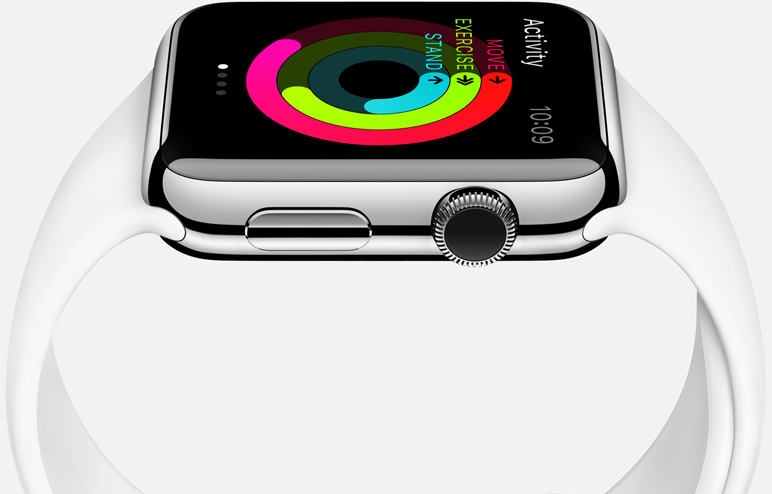
Apple went to great lengths to ensure its Apple Watch is as close to perfection as possible, a new report from Wired indicates, as the company remained faithful to an old design concept inherited from Steve Jobs – focusing on the smallest details, even though not all customers may notice them. The publication talked to Apple’s human-interface chief Alan Dye about the watch faces in the device, and he revealed many interesting hidden design details about the thorough work behind them.
DON’T MISS: Apple Watch review roundup – what the critics are saying about Apple’s newest device
For example, the Motion watch faces have all been shot using a sophisticated camera. “[The] butterflies and the jellyfish and the flowers for the motion face, it’s all in-camera,” Dye said. “And so the flowers were shot blooming over time. I think the longest one took us 285 hours, and over 24,000 shots.”
For example, each time you’ll raise the Apple Watch, you’ll see a different flower on the screen, in a different color. Even more impressively, for the jellyfish shots, Apple created its own tank, taking pictures of a variety of species at 300 frames-per-second using slow-motion Phantom cameras – the 4096 x 2304 pictures were then shrunk to fit the Apple Watch display.
“[When] you look at the Motion face of the jellyfish, no reasonable person can see that level of detail,” Dye says. “And yet to us it’s really important to get those details right.”
The same level of detail went in other watch faces as well. The Mickey Mouse watch face has a toe that taps once per second “in perfect time.” No matter how many Apple Watch units you’d gather together, they should all tap at exactly the same time, a detail Apple focused on even though many Apple Watch owners won’t even appreciate it.
Similarly, the Astronomy watch face that offers a view of Earth, the solar system and the moon is equally impressive, as Apple customized it to offer a user experience relative to the wearer’s location on the planet.
“When you tap on the Earth and fly over the moon: We worked really hard with our engineering team to make sure the path you take from your actual position on the Earth to where the moon is and seeing its phase, is true to the actual position of the Earth relative to the moon,” Dye said.
Even the design of the fitness-related concentric circles that show you goals for the day took quite some time. Ultimately, Apple chose circles as they seem to be quite motivational when it comes to convincing users to reach their daily fitness goals.
“I couldn’t tell you from a design perspective the number of iterations we did on those three rings,” the exec said. “We spent a year, and did far more studies… enough studies to kind of fill this [Caffe Macs cafeteria] wall, probably. Different ways that, at a glance, someone could understand that information, and easily assess where they’re at in their day, and hopefully in a really simple and visceral way feel like they accomplished something when they fill them up.”
Some of the watch faces from the Apple Watch follow below, with more close-up images of the amazing pictures Apple took available at the source link.


