
The look of Google’s new Material Design is regularly praised by users and tech bloggers alike. In fact, we can’t remember the last time a user interface has received such universal acclaim right off the bat. Android 5.0 Lollipop and the new graphic elements it ushers in are fantastic though, and Google has already confirmed that it plans to use Material Design across its mobile and desktop properties as it continues to unify its user experiences.
But, what might Google’s core end-user product, the search engine at Google.com, look like with Material Design? In a word, amazing.
DON’T MISS: Here’s how to give your Android phone a huge speed boost, just like Apple sped up iOS
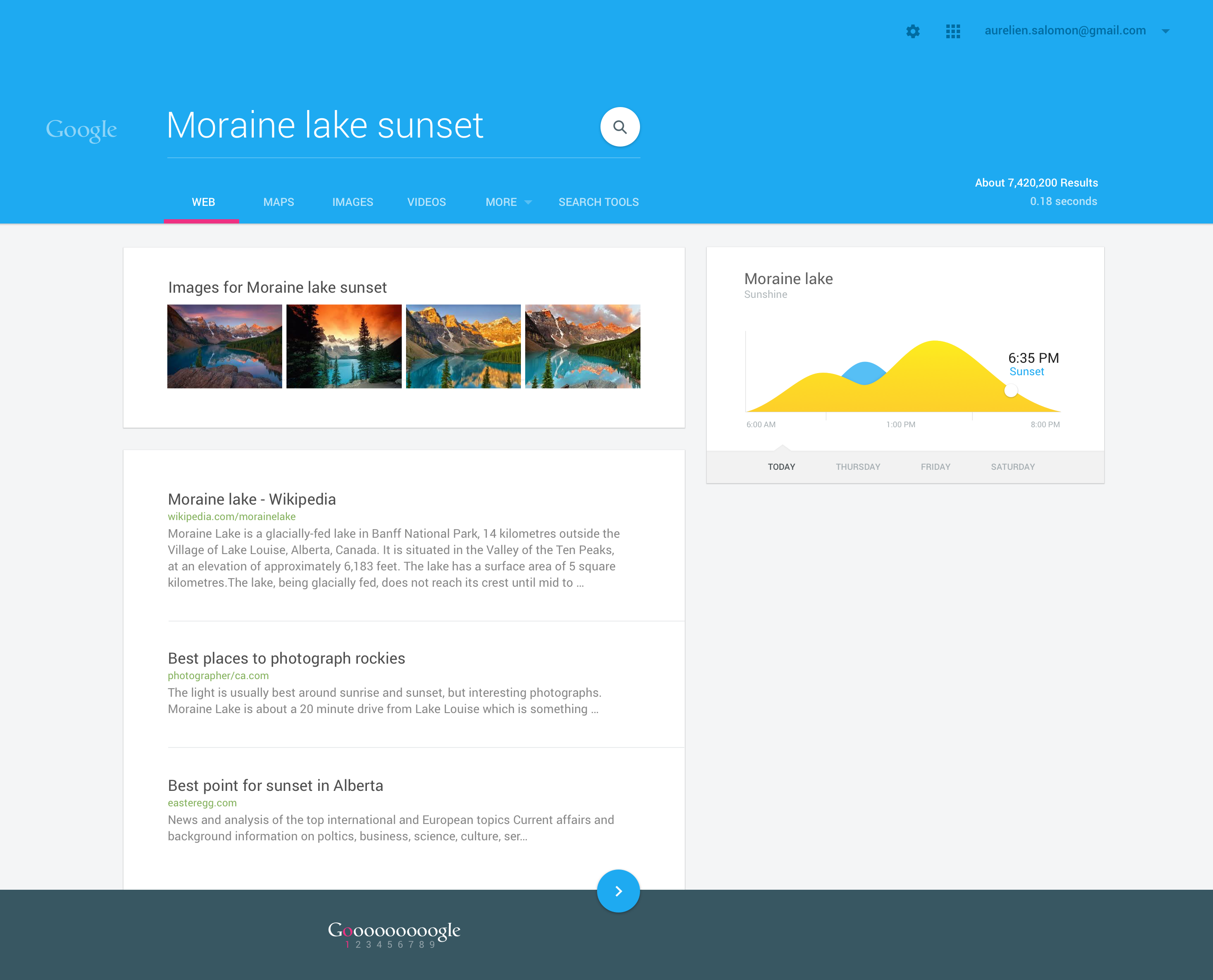
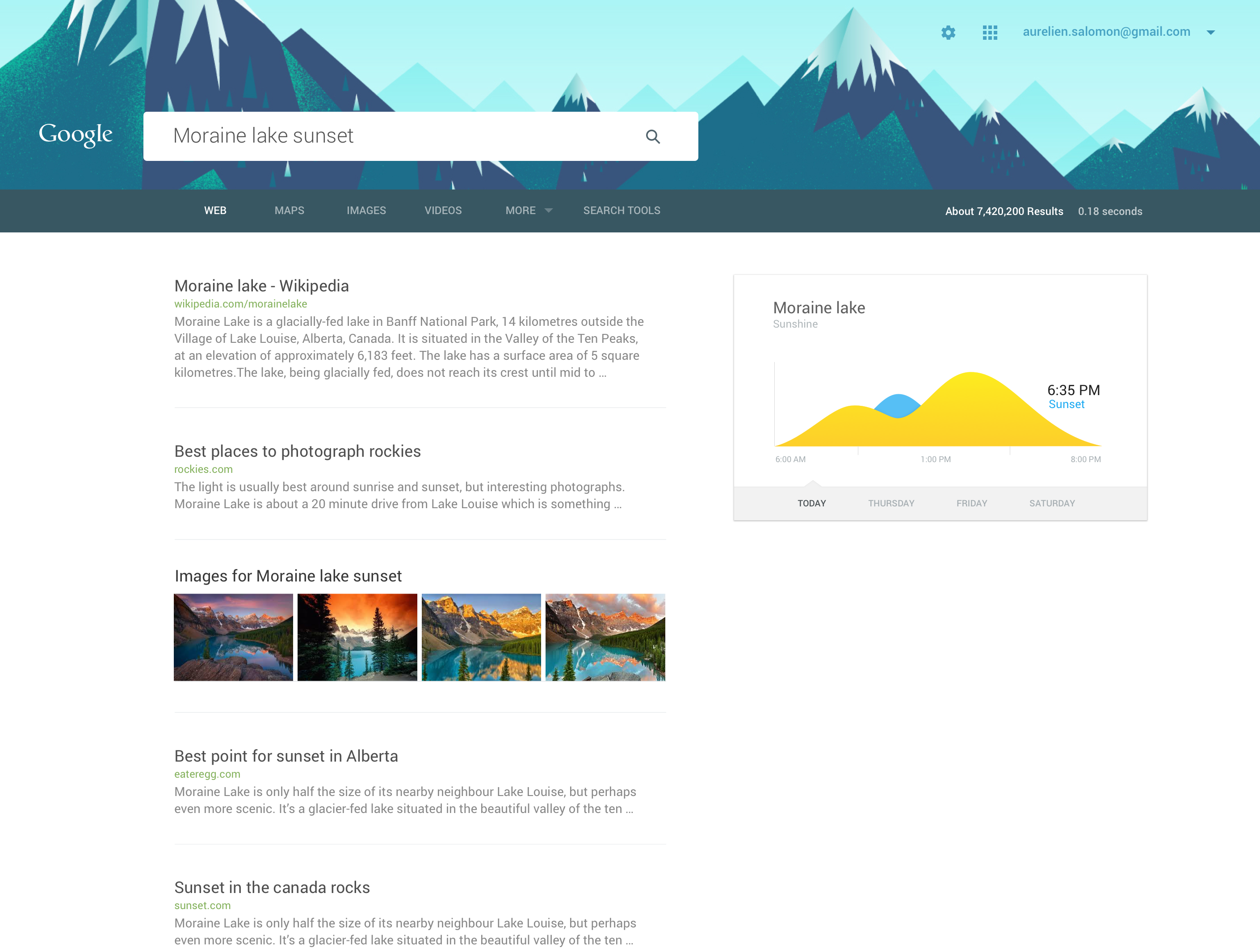
Via Co.Design, graphic designer Aurélien Salomon recently took the time to reimagine Google’s wildly popular search portal, making use of the graphic elements and design principles laid out by Material Design.
For those unfamiliar with it, Material Design is a new design style introduced by Android 5.0 that uses bright colors and subtle shadows to create a simplified user interface that modernizes Android and other Google apps and products.
We discussed Material Design at length and shared a few videos with further explanations in our in-depth review of Google’s Nexus 9 tablet.
Users tend to go crazy when Google makes even the slightest interface changes to its search portal at Google.com, but we have a feeling that a Material Design redesign like the one Salomon has envisioned would be well received. Why? We’ll let his design do the talking.
Salomon’s Google.com redesign can be seen at the top of this post and in the three additional images that follow below (click to enlarge).


