
While Apple is yet to reveal details about its bigger iPhone plans, analyst Ming-Chi Kuo – who has a good track record reporting on Apple unreleased products – last week revealed many details about a 4.7-inch iPhone 6 including its screen resolution. According to him, the bigger iPhone will have a strange 1334 x 750 Retina display with a pixel density of 326 pixel per inch density. In new reports, MacRumors and a The Verge forums user explained why that resolution makes sense, showing how the home screen and apps could look like on such a display.
Taking into account the fact that Apple has always tried to offer developers a seamless way to adapt to bigger displays when it comes to app design, MacRumors says that the 1334 x 750 resolution, while not found on other competing devices, makes sense for apps.
“If Apple were to adopt a 1334 x 750 4.7-inch display as predicted by Kuo, it would preserve the same pixel density (326 ppi) as the iPhone 5s,” the publication writes. “That means that all existing user interface elements, such as icons, would be the same size but would allow for more screen space.”
With help of a designer, the publication found that using the “exact same icons and spacing them out to fill the screen, 1334 x 750 pixels allows Apple to fit exactly one extra row of icons onto the iPhone home screen.” The image above shows how the home screen of a bigger iPhone 6 with such a Retina display would look like.
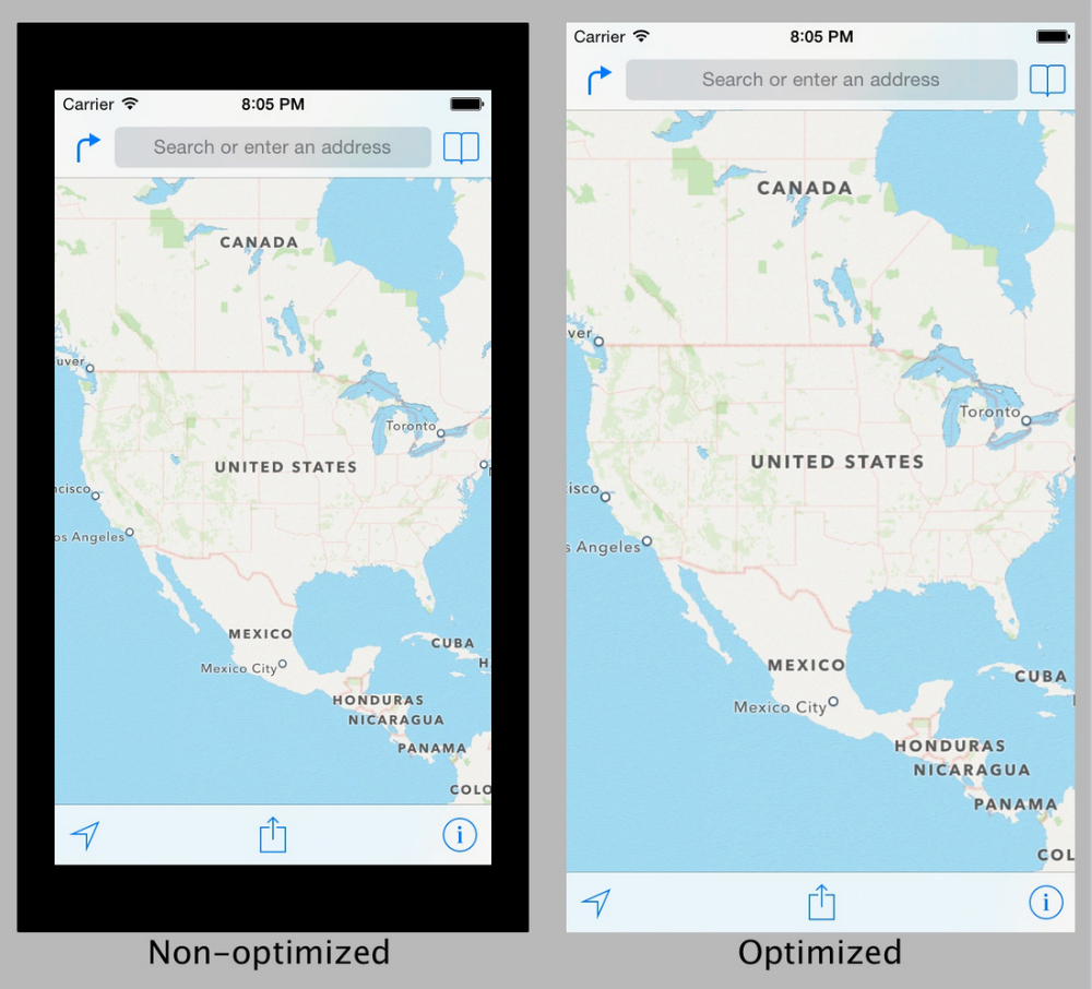
App developers could optimize their apps to fill the bigger 4.7-inch display, or run them in a letterbox with a black border without changing a thing. “Apple has been not too subtly pushing developers to use auto-layout when designing their apps,” user Pi is exactly 3 wrote on The Verge forums, analyzing Apple’s potential move to such a weird resolution. “Properly used, auto-layout can adapt an app’s layout to various screen dimensions based on rules and priorities set by the developer. By only changing one dimension with the 4-inch screen, Apple seemed to force a half step on developers to use this system full time.”
Images showing what non-optimized vs optimized apps would look on a 4.7-inch iPhone 6 follows below.


