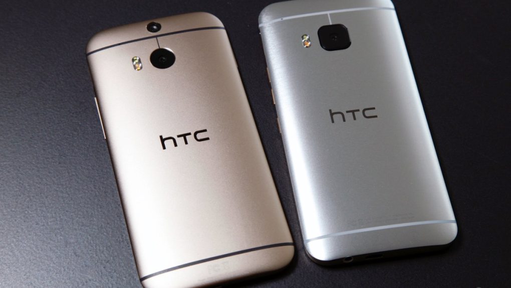
The HTC One M9 is one of the best Android phones you can buy right now, just like its predecessors. But unlike in previous years, HTC has the misfortune of fighting against completely new iPhone and Galaxy S designs while the HTC One M9 looks too much like last year’s HTC One M8.
In fact, last year’s model and this year’s M9 are so similar that not even HTC’s social networking team can tell them apart.
FROM EARLIER: Galaxy S6 first impressions: Why can’t I find anything to complain about?
Next to a picture posted on the company’s Facebook page (see below), HTC advertises one of the main features of the phone, its BoomSound speakers, clearly identifying the device pictured with a #HTCOneM9 hashtag. However, the phone in the image is not the HTC One M9, it’s the M8.
The one thing you have to look for when checking the front of a HTC One phone is the standby button’s placement: on the HTC One M8 it’s placed on the top, while on the new handset it’s found on the right side under the volume rockers (which are also different from last year’s buttons).
When looking at the back of the handset, which isn’t the case in the Facebook image, the telling difference is the camera: on the HTC One M9 there’s only one camera lens, while the HTC One M8 has two of them.
Apparently the company’s social team didn’t get the memo. “What is the picture about?,” one fan asked on Facebook, to which the team replied that it’s “just having a little fun showing off the #HTCOneM9.” Maybe too much fun.
The small blunder reveals a big problem HTC might have to face when selling the handset: Convincing inexperienced users they’re looking at a brand new device rather than a minor update or even last year’s model.
For more details about the new handset check out BGR’s full review, and the best and worst thing about the HTC One M9.
Meanwhile, a picture of HTC’s Facebook blunder follows below.


