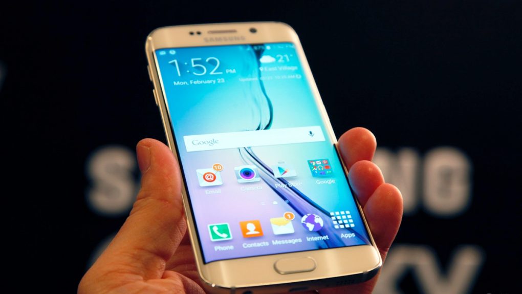
One thing we’re looking forward to with the Galaxy S6 and Galaxy S6 edge is the newly toned down TouchWiz UI that will hopefully be much more intuitive and more responsive than previous versions of Samsung’s Android overlay. Some new pictures posted by AndroidCentral of the Galaxy S5 and the Galaxy S6 show how Samsung has been slowly working to refine TouchWiz to give it a cleaner look that fits in better with Google’s Material Design in Android 5.0 Lollipop.
FROM EARLIER: Pro photographers deliver the final word on which smartphone has the best camera
Here, for example, is AndroidCentral’s comparison of the Galaxy S5 and Galaxy S6’s contacts lists. We should note here that the Galaxy S5 in the picture has been updated to the Lollipop version of TouchWiz, which already brought some significant improvements to the overlay’s overall look. Nonetheless, we can see the new version of the contacts page is much less cluttered.
We can also see that Samsung has made the TouchWiz dialer a lot less busy by getting rid of the dialer icons and instead using only text to let you know where your log, favorites and contacts are located. Note that the call button at the bottom of the dialer has also been shrunk significantly.
And finally, here’s a picture that shows a revamped Quick Settings page that seems to make better use of available space.
AndroidCentral has a bunch more pictures that show many of the differences that Samsung is making to TouchWiz with the Galaxy S6. Check them all out by clicking here.


