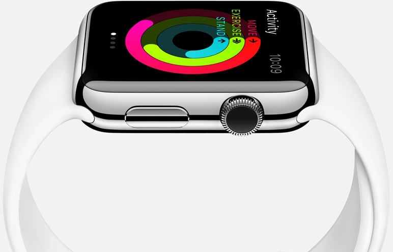
Apple often prides itself on simplicity. Rather than overwhelming the consumer with options, Apple tries to keep things as simple as possible and keeps customization options to a minimum. Of course, the watch market is a completely different story and choice is crucial. As a result, buying an Apple Watch is more complicated than buying any other Apple product.
Of course, that’s where this handy flowchart from The Joy of Tech comes into play.
DON’T MISS: Why the Apple Watch is different from all the other garbage we’ve seen so far
The Joy of Tech has an uncanny ability to poke fun at tech companies and keep things light, and on Monday it put together a nice little flowchart that could help consumers narrow things down and decide exactly which Apple Watch model is right for them.
Or not.
The full graphic is embedded below.


