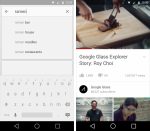
Google’s main I/O 2014 announcement was the new Material Design language that covers not only the next major release of Android (Android L), but also Google’s apps across platforms and screens. Material Design is what Google wants developers to use for their apps as well, whether they’re for Android, iOS or the web, and ArsTechnica has put together a great collection of screenshots, shared by Google during its I/O sessions, via its online Material Design guidelines or leaked online.
The publication has images for various apps including Gmail, Google Search, YouTube, Google Maps, Google Play, Google Play Music, the Chrome browser, Calendar, Contacts, Google Keep and others. While many images can be linked to Google apps for Android, they could very well fit other apps that would respect the same Material Design lines and offer the same new user interface elements.
In addition to Ars’ report, Android Police also offers an extensive look at what the Google Play Store will look like on the web and on Android, once Material Design has been applied.
Google’s Material Design apps should be finished by fall, when Android L is supposed to launch. Meanwhile, developers and not only, can already try out Android L on the Nexus 5 and second-generation Nexus 7, but also on other devices, at least unofficially.
Images showing what Android L’s Material Design looks like across apps and screens follow below, with more screenshots available at the source link.


