More Stories
-
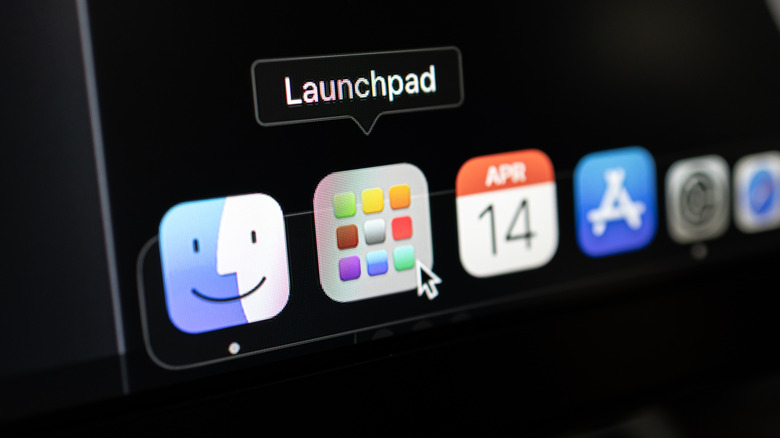
How To Restore The Launchpad On Your Mac In macOS Tahoe
macOS Tahoe adds several new features, but the new AI-powered Spotlight also removes Mac's Launchpad. Here's how to bring it back.
Read More -
iOS 18.6 Beta 4 Now Available As Official Launch Nears
iOS 18.6 beta 4 is now available to download for developers.
Read More -
Is Charging Your Android Phone To 100% Actually Hurting The Battery?
If you're always charging your Android phone to 100%, you might want to adapt your charging habits to help to maintain optimal battery health.
Read More -
TCL TVs: Here's Who Owns Them And Where They're Manufactured
Although it's most well-known today for its televisions, TCL offers high-quality items at the mid-price range, and sells its products all over the world.
Read More -
The 'World's Deadliest Spider' Is Only Found In One Country In The World
Like most spiders, it's the females of this species that are larger than the males. However, it is the males most responsible for bites to humans.
Read More -
How Many Meteors Actually Hit Earth Every Year?
Meteors can light up the sky in the form of shooting stars, but they often burn up in the atmosphere. Some are able to make it through, however.
Read More -
What Nintendo's Orange Screen Means (And How To Fix It)
Nintendo's dreaded orange screen explained. Here's what it means and how to fix it if you're struggling to get back to your game.
Read More -
Apple's Upcoming iPhone Lineup Is The Most Exciting We've Seen In Years
Apple's upcoming iPhone lineup, which includes the iPhone Fold and iPhone 17 Air, is the most exciting we've seen in years.
Read More -
Copilot AI Can See Your Entire Display On Windows 11 - Mac Should Copy It
Microsoft is rolling out an exciting Copilot feature for Windows 11: The AI can now see everything on your screen.
Read More -
The 5 Streaming TV Series Dominating Our Screens This Week
The top streaming TV series dominating platforms like Netflix, Prime Video, and Apple TV+ this week, according to new Reelgood data.
Read More -
Volcanic Eruptions May Be Caused By Mysterious 'BLOBS' Under The Earth
New research suggests that mysterious "BLOBS" under the Earth could actually be driving volcanic activity.
Read More -
iPhone 17 Air Leak Might Have Revealed The Model's Biggest Flaw
According to a new iPhone 17 Air leak, the ultra-thin iPhone model will feature one of the smallest iPhone batteries in years.
Read More -
Two Big Fantastic Four Spoilers Confirmed Right Before The Premiere
Fantastic Four director Matt Shakman confirmed that a famous actor was cut from the movie and shared a shocking Avengers spoiler.
Read More -
Galaxy Z Fold 8 And iPhone Fold Models Could Ditch The Crease, Analyst Says
The upcoming iPhone Fold might have a crease-free design, and Samsung could match it with the Galaxy Z Fold 8.
Read More -
Figma Debuts Glass Effect Playground To Help Developers Prep iOS 26 Apps
Ahead of the launch of iOS 26 this fall, Figma introduced a new Glass effect playground to give developers a leg up on Liquid Glass apps.
Read More -
Our First Look At Season 2 Of Platonic, Seth Rogen's Other TV Series For Apple TV+
Apple TV+ just released the trailer for Platonic Season 2, starring Seth Rogen and Rose Byrne. Here's everything to know.
Read More -
The Odyssey IMAX Tickets Are Selling Out A Year Before The Premiere
Tickets for Christopher Nolan’s The Odyssey in IMAX went on sale a year before the release, and they’re already sold out.
Read More -
Pokémon Unite Tackles Major Complaints In Long-Awaited 4th-Anniversary Update
To celebrate Pokemon Unite's fourth anniversary, the developers decided to finally listen to some of the users' most common complains.
Read More -
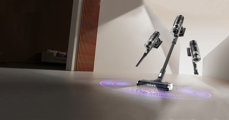
The Search Is Over: This Smart Stick Vacuum Is Just What You Need For A Cleaner Home
The Eureka ReactiSense Stick Vacuum punches way above its weight class with powerful suction, smart features, and more.
Read More -
Netflix Used AI In A Hit Show And Didn't Tell Anyone Until Now
Netflix admitted to using generative AI in one of its TV shows, but only after it became widely popular - here's why that's a problem.
Read More -
iPhone 17 May Have A Surpring New Color That's Like Nothing We've Seen Before
A leaker believes Apple's white iPhone 17 Pro color option could be even more interesting than what we currently expect. Here's why.
Read More -
Demand For ChatGPT Agent Is So High, Plus Users Can't Even Try It Yet
ChatGPT Agent is OpenAI’s newest AI innovation, but demand from Pro users is so high that Plus and Team tiers need to wait.
Read More -
Apple Sues iPhone Leaker For Revealing iOS 26 Secrets
Apple filed a lawsuit against noted leaker Jon Prosser, alleging that he conspired to break into a iPhone in order to leak iOS 26 features.
Read More -
Check Out The 8 New Emoji Coming To Your iPhone In iOS 26
8 new emoji characters are coming to iOS 26, including an apple core, an orca, a treasure chest, ballet dancers, and Bigfoot.
Read More -
This New Study Challenges Long-Standing Beliefs About Autism
New research challenges long-standing beliefs about how the human brain interprets body parts and intentions in those with autism.
Read More -
New On Disney+: August 2025
Everything new coming to Disney+ in August 2025, including Eyes of Wakanda and The Proud Family: Louder and Prouder season 3.
Read More -
The Best iPhone 17 Display Feature Is Still Coming, Despite Reports To The Contrary
Apple suppliers were able to improve the iPhone 17 display with a scratch-resistant anti-reflective layer for some of the new models.
Read More
