iPhone 14 Pro Review: Welcome To The Dynamic Island
The 2022 slate of new iPhones is a little strange. Usually, the standard iPhone gets a new chipset and at least some of the design changes as the Pro model — but this year the iPhone 14 keeps the same chipset and design as last year. The only major change is the fact that the mini iPhone is gone — replaced with an iPhone 14 Plus. But the iPhone 14 Pro is a little different.
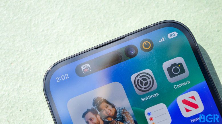
For the iPhone 14 Pro, Apple did design a new chipset. It also added a range of new camera features. Oh, and one more thing. The notch is gone — replaced with the new, so-called Dynamic Island.
It's easily the most hyped new feature on offer by the iPhone 14 Pro and Pro Max. But to be determined is how big of a change it actually represents. Here are my thoughts.
Apple iPhone 14 Pro

The iPhone 14 Pro boasts an upgraded camera, improved processor, and does away with the notch in favor of the Dynamic Island.
- Dynamic Island is cool
- Cameras are excellent
- Amazing performance
- Excellent display that's always on
- Great build
- Battery life is slightly worse
iPhone 14 Pro design
A few years ago, for the iPhone 12 series, Apple introduced a new design, with flat edges and a flat display. It was lauded at the time for changing things up a little — and definitely breathed new life into the iPhone, despite clearly being inspired by the iPhone 4 and 5. These days, the flat edges are still here — and while they're not as new-feeling as they were a few years ago, I still like the overall look and feel.
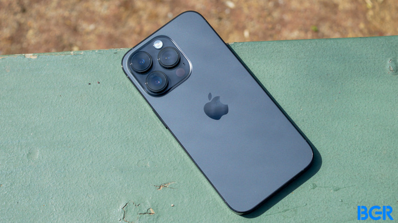
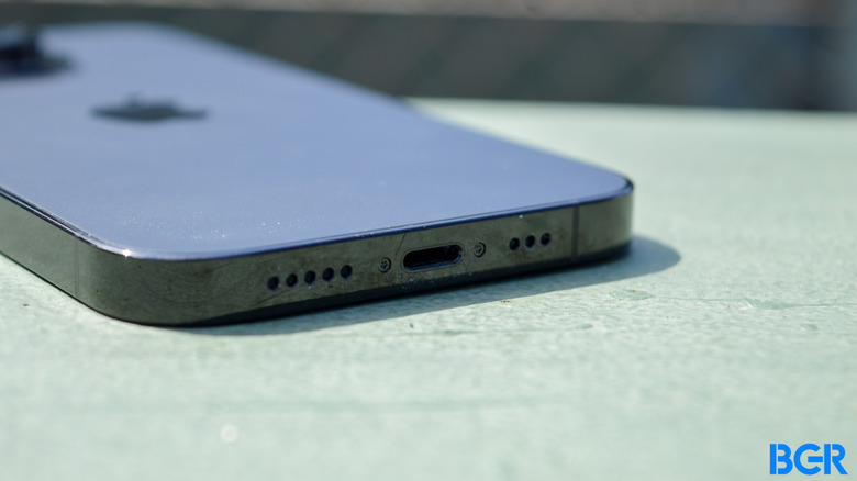
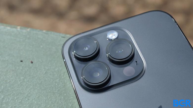
Other aspects of the design are similar too. You'll get the power button on the right side, the ringer switch and volume buttons on the left, and the Lightning port and speaker grille on the bottom. If you buy your iPhone 14 Pro in the U.S., there's no SIM card slot — Apple has fully moved to eSIM for this year's models. On the back, the device mostly looks the same, except the camera module is a little larger.
Then you reach the front of the device, and that's where the biggest design changes are. For the iPhone 14 Pro, Apple has finally gotten rid of the notch, in favor of a cutout for the front-facing camera and for the TrueDepth camera sensors. I definitely prefer this over the notch. It's still intrusive, and you'll notice the fact that it's there when you switch to it. We'll get into the concept of the Dynamic Island in the software section, but I'm glad that the display intrusions are shrinking on the iPhone, even if it's happening relatively slowly.
Generally, the iPhone 14 Pro looks and feels great. As you would expect, it's built from premium materials, and offers some great colors. I'm reviewing the Space Black model, and like it a lot — even though I cover it up with a case.
iPhone 14 Pro display
The display got a big upgrade last year with ProMotion, and the iPhone display continues to get better with the iPhone 14 Pro. The device still has the high 120Hz refresh rate that we got last year, but now it can refresh at an even lower rate too — down to 1Hz, from 10Hz last year. Why would you want that? Well, to save on battery when the display doesn't need to refresh much — like when using the new always-on display.
Before diving into the always-on display, it's important to note that the screen is bright, colorful, and vibrant. It feels incredibly smooth, and easily gets bright enough to use in all situations. The display, which is built by Samsung Display, is one of the best on the market. It's a 6.1-inch display with a 1,179 x 2,556 resolution. It supports Dolby Vision, and images captured on the device look excellent on the screen.
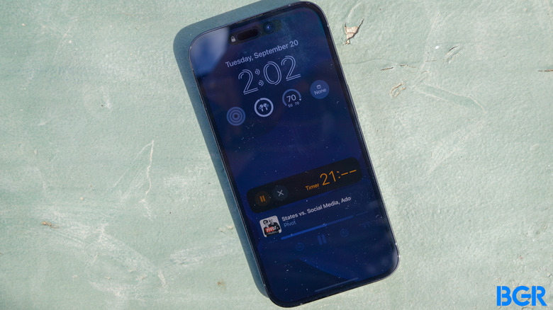
But the always-on display is the headline feature here. Basically, it means that you can see the time, your lock screen widgets, and Live Activities all the time, without having to manually turn on the screen. It's full-color, and basically looks like a dim version of your lock screen when it's working.
It's not perfect, though, and it takes some getting used to. When rumors began circulating about an always-on display on the iPhone, I assumed that it would basically be black and white, with the screen off except for the lock screen widgets and the time and date. That's what most Android manufacturers do, and that helps better signal that the screen wasn't accidentally left fully on. With color, telling the difference is a little harder to distinguish, and you'll find that you have to remind yourself that your phone is off.
Not only that, but, the display doesn't show seconds on a timer or in music or podcasts. It seems as though this is for battery life reasons — but I wish Apple had found a more elegant solution than just showing "–" where the seconds would be.
Regardless, the always-on display is definitely a step forward for the iPhone. I hope it comes to the lower-end models soon, and I hope it gets more customizations, like the ability to have it in black-and-white instead of full color.
iPhone 14 Pro performance
Unlike the standard iPhone 14 and iPhone 14 Plus, the iPhone 14 Pro gets a new chipset, in the form of the A16 Bionic chip. The A16 Bionic is built on a 4nm process, down from 5nm on the A15 Bionic. That essentially helps Apple fit more transistors on a chip the same size. Apple says that the A16 Bionic offers up to 40% better CPU performance, plus it now has a new display engine to help power the always-on display, a new image signal processor, and better efficiency.
In day-to-day use, the iPhone 14 Pro performs flawlessly. It's able to handle multitasking like a champ, loads games like Genshin Impact relatively quickly, and never froze up or even stuttered a single time. Sure, apps still crash every now and then — but that likely comes down to a software glitch than a performance issue.
The incredible performance shows in benchmarks too. The device scored 1874 in GeekBench 5's single-core score, and 5422 in its multi-core score.
These are excellent results. They beat every Android phone out there, including flagship devices with a Qualcomm Snapdragon 8+ Gen 1 chip. And, they show a clear improvement over the A15 Bionic chip too — the iPhone 13 Pro achieved a GeekBench 5 single-core score of 1720, and a multi-core score of 4789.
Apple remains the king when it comes to smartphone performance, and it doesn't seem like that will change any time soon.
iPhone 14 Pro battery and charging
One of the biggest concerns about the always-on display was battery performance, but so far, I have not been disappointed. As a moderate user, the iPhone 14 Pro consistently ended the day with at least 30% of its battery left, even with the always-on display enabled. I don't think the device quite reaches the heights of the iPhone 13 Pro, but it's still more than good enough for my needs.
The device can charge in a number of different ways. You can charge it through the Lightning port, though unfortunately you're still limited to 20W wired charging. Or, you can charge it at up to 15W with MagSafe, or up to 7.5W with a standard Qi wireless charger. Many high-end Android phones can charge faster through wired connections, and I would like to see Apple step things up for the next-generation iPhone, if it keeps wired charging as an option at all.
iPhone 14 Pro camera
As has become a yearly tradition, Apple has improved on the camera in the iPhone in a number of meaningful ways. For the first time in years, for example, Apple has given the camera a higher pixel count — with the main camera on the device coming in at 48 megapixels.
The main camera is actually what's called a quad-pixel sensor, which actually means that the phone uses the light information from four pixels, combines them into one pixel, and outputs a 12-megapixel image. The result is that you'll get more detail and better low-light images.
You don't always have to combine four pixels into one though. You can enable a ProRAW mode, which allows you to output full-resolution 48-megapixel photos, which is pretty cool. Not only that, but Apple is using the full sensor in some other smart ways. For example, it's bridging the gap between the main camera and 3x optical sensor by using the middle 12-megapixels of the 48-megapixel sensor to create a 2x "optical-quality" zoom, which basically means that there's no digital zoom involved. It's a neat trick, and far better than the digital zoom that you would have had to use to get 2x zoom on previous-generation iPhones.


There aren't just more pixels on the iPhone 14 Pro's main camera — the pixels are bigger too. That's a good thing. It means that the iPhone is able to collect even more light. That's helpful in low-light situations.
Of course, the iPhone 14 Pro has an uphill battle ahead of it — considering the fact that the camera on the iPhone 13 Pro was already excellent. In edge cases, the iPhone 14 Pro does seem to perform a little better. In normal situations, photos seem to be that extra bit brighter, too.
Generally, I find images captured by the iPhone 14 Pro to be excellent. Because the device has larger sensors, there's a slightly better depth of field than previous-generation models. Images are colorful and vibrant, and they beat the vast majority of the competition out there.
If you have an iPhone 13 Pro, upgrading will get you slightly better photos — but the improvements are minor enough that most people should wait at least another year before upgrading.
iPhone 14 Pro software
So far, we've only really talked about the Dynamic Island as a hardware feature, but it's much more of a software feature than a hardware one. There are hardware cutouts, around the front-facing display and the TrueDepth camera sensors, but around and in-between those cutouts, Apple has developed an expandable area that it now calls the Dynamic Island.
The Dynamic Island basically shows the same information that will also be shown in Live Activities. That's to say, you can see information about any podcasts or music that you're playing, timers, game scores, and so on. If there are multiple Live Activities running, Apple will split them up and prioritize them — and the Dynamic Island can show up to two at a time. Tap the Island, and you'll go straight to the associated app. Press and hold, and you'll get expanded information and controls.
I really like this approach. It basically means that you can always see information about a timer or music, without having to pull down the notification shade or jump into the app. Sometimes, however, I do wish more information was included. For example, the Podcasts app only shows cover art and a little waveform. It's cool, but information about how far into your podcast you are would have been more helpful than a waveform. On the Apple Watch, you get a little play/pause button with a ring around it showing your progress — and that would have made sense to include here. I'm sure Apple will continue to build on the Dynamic Island and how it works though.
Conclusions
The iPhone 14 Pro is a step forward over the iPhone 13 Pro, and much more so than the standard iPhone 14 over the iPhone 13. I like the Dynamic Island more than the notch, plus the camera has improved, and as expected the device is more powerful. It's probably not worth upgrading from the iPhone 13 Pro, or perhaps even the iPhone 12 Pro. But those with anything older will love what's on offer by the iPhone 14 Pro.
The competition
Some may be deciding between the iPhone 14 Pro and iPhone 14 Pro Max, and thankfully, this year you can make that decision solely based on whether you want a big phone or not. In previous years, Apple has added better features to the Pro Mac model — like an improved camera — but this year that's not the case.
If you're deciding between the iPhone 14 and the iPhone 14 Pro, I recommend springing for the Pro model, or saving your cash entirely and buying last year's iPhone 13. The iPhone 14 is barley an upgrade over the iPhone 13, and the iPhone 13 is still an excellent phone.
Should I buy the iPhone 14 Pro?
Yes. If you're due for an upgrade, the iPhone 14 Pro is an excellent choice.
Read: Our iPhone 14 and iPhone Pro guide with the latest news here
