Former Employee May Have Leaked Apple's Big iOS 26 Redesign
WWDC 2025 is just a few days away. As we expect Apple to announce a big iOS 26 redesign, it seems as though a former Apple employee might have leaked what the new UI language could look like.
Of course, former Apple design employee (and Halide creator) Sebastiaan de With isn't pulling this iOS 26 concept out of thin air. He based it not only on his early work with iOS, but also on Bloomberg's report from Mark Gurman on what Apple's so-called "Project Solarium" redesign might look like.
As previously reported by Gurman, iOS 26 "will fundamentally change the look of the operating systems and make Apple's various software platforms more consistent." According to him, Apple aims to unify the design across iOS, iPadOS, and macOS to deliver a more cohesive experience, drawing inspiration from visionOS.
With that, Apple will update icons, menus, apps, windows, and system buttons. This could be the most significant redesign for the iPhone since iOS 7 and for the Mac since Big Sur. The main goal behind these changes is to bring more consistency across Apple's different platforms.
iOS redesign journey
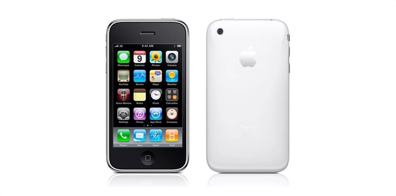
In a detailed article, de With explains how iOS (or rather, iPhone OS) began with a design language similar to Mac OS X Tiger. Apple relied heavily on detailed gradients and shadows in simple interface elements to make the experience feel familiar, as if users were interacting with real objects on the iPhone screen.
From the first version of iPhone OS through iOS 6, Apple kept refining the design: "Deleting a note or email did not simply make it vanish off-screen, but pulled it into a recycling bin icon that went as far as to open its lid and close it as the document got sucked in," says de With.
Then, with iOS 7, everything went flat. The designer explains why Apple made that choice: "iOS 7 embraced a notion of distinct visual layers and using adaptive or dynamic effects to distinguish depth and separation. Why render flat highlights and shadows that are unresponsive to the actual environment of the user when you can separate the icons by rendering them on a separate plane from the background? Parallax made the icons 'float' distinctly above the wallpaper. The notification center sheet could simply be a frosted pane above the content which blurred its background for context."
From iOS 7 through iOS 18, a lot changed. iOS got rounder, and more interface elements began blending with content using different types of blur. With visionOS, Apple had to rethink what an operating system should look like in the era of spatial computing. That's where iOS 26 comes in.
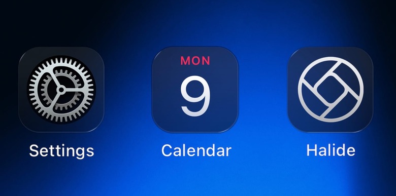
Everything is glass: This is iOS 26's big redesign
If you've been following BGR, we already suggested that iOS 26 (then referred to as iOS 19) might be heavily inspired by Apple Invites and the Apple Sports app. Some existing UI elements haven't blended well with the overall design, like the Action Button settings page and the iMessage menu.
Still, it could all come together once iOS 26 is revealed. If Apple is planning to go with a visionOS-like theme, we might see interactions that feel like they're made of glass.
De With hints at how this visionOS-inspired redesign might land in iOS 26: "I find it likely, then, that there will be more than a mere static visual style from visionOS brought to iPhone, iPad and Mac (and potential new platforms). It seems likely that a set of new fundamental principles will underpin all of Apple's styling across products and expressions of its brand. It would have to be more subtle than on Vision Pro. After all, interfaces do not have to fit in with the 'real world' quite as much. But dynamic effects and behavior essentially make the interface come to life."
This is why Sebastiaan de With believes Apple will introduce something he calls "Living Glass."
Just like the back of your iPhone is a frosted pane of glass with a glossy Apple logo, UI elements could get different material treatments or colors. Maybe those treatments even react to nearby elements emitting light or shift slightly with the device's orientation, similar to how VisionOS elements behave when viewed from different angles.
Controls might also transition as they begin to overlay content. Imagine animated states where buttons lift and emerge from the background as they move through the hierarchy.
The system could render these effects subtly and dynamically. Compared to that, traditional static interfaces might start to feel lifeless and dull.
Wrap up
De With's full concept is worth reading, and it could be a great starting point for anyone excited about WWDC 2025. Apple will reveal everything about the iOS 26 redesign on Monday, and we'll make sure to cover all the details as they emerge.