iPhone 14 Pro Has A Brilliant New Feature Hiding In Its Display Cutout
A big iPhone 14 bombshell dropped on Wednesday, as various reports detailed Apple's newest decision regarding the iPhone 14 Pro's new pill-and-hole notch design. Rather than showing both cutouts, the iPhone will simply darken the tiny space between the pill opening and the hole. The result will be an elongated pill similar to some of the Android designs that followed the iPhone X.
It turns out that Apple might have figured out a very smart use for the space between the cutouts. It'll reportedly display the privacy indicators you normally see when apps access the camera and microphone.
You're probably used to seeing those tiny glowing privacy indicators in the top-right corner of the screen whenever apps access the camera (green dot) or microphone (orange dot). The green dot is always shown for apps that access the camera and microphone. For example, Face ID video calls would require access to both of them, but the privacy indicator would only light up green.
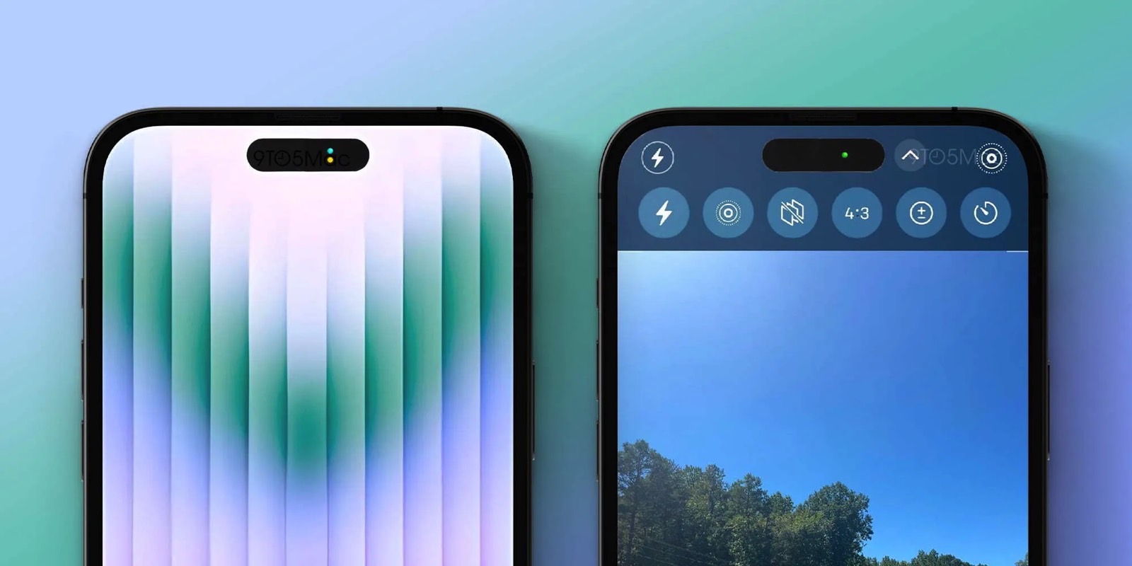
The iPhone 14 Pro's elongated pill cutout will reimagine these indicators in a very cool way. According to 9to5Mac, Apple will position the indicators inside the tiny space between the cutouts, as seen in the following image.

That's one way to use a display space that can't have any other meaningful purpose. But it's not necessarily a must-have feature.
Personally, I prefer the i-shaped pill-and-hole cutout over the larger pill that Apple seems to be going for. But, just like with the iPhone X's notch, debates will follow after this display design change is announced.
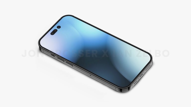
Here's what the i-shaped design was rumored to look like prior to this new report:

iPhone 14 Pro render: Apple's rumored new display design.
The new report notes that users will be able to tap the space where the indicators show up to bring up a privacy menu. That's a very cool addition. The new menu will supposedly list the apps using the camera and microphone.
Aside from the privacy indicators, the area between the pill and the hole-punch cutout will not display anything else, according to this new report. It'll be black when in use to give the impression of a single pill-shaped notch.
Speaking of the Camera app, it looks like Apple is going for a new user interface that it might unveil alongside the iPhone 14 models. The controls for various screen elements will sit in the status bar. Photo and video settings will sit below the cutouts, as seen to the right in the first mockup image above. The result is a larger camera preview than before.
The new Camera app UI will likely be available on other iPhone models in addition to the iPhone 14 series, but that's just speculation. 9to5Mac says the Camera redesign has not been finalized.
More Apple coverage: Check out the best Apple deals online right now.
