Amazon's Prime Video Redesign Makes The App Look More Like Netflix
One of the most frustrating streaming apps on the market is finally getting an upgrade. On Monday, Amazon announced that a redesign for Prime Video is rolling out starting this week. The new app will be available on connected living room devices, such as the Fire TV Stick, and Android devices. The redesign will come to iOS and the web in the future as well.
Prime Video receives a long-awaited redesign
Perhaps unsurprisingly, the new Prime Video experience is a lot like the Netflix experience. Netflix might not seem as invincible as it did a few years ago, but it's still the market leader. As long as that's the case, copycats will be inevitable.
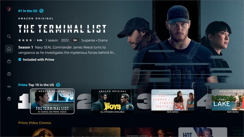
The biggest change in the Prime Video redesign is the navigation menu on the right side of the screen. If you use Netflix, this UI should look rather familiar.
Prime Video's navigation bar has six icons: Home, Store, Find, Live TV, Free with Ads, and My Stuff. Within those pages will be submenus, such as "Movies," "TV shows," and "Sports" on Home, and "Channels" or "Rent or Buy" on Store.
Prime Video is also taking one of Netflix's best features by putting a top 10 list on the Home page. It's surprising that every popular streaming service hasn't done the same, given how much media coverage Netflix's top 10 list receives every week.
A major highlight of the Prime Video redesign is that it does a better job of showing you the content you can watch for free and letting you know which content will cost extra. If a movie or show is included with your Prime subscription, Amazon will mark it with a blue checkmark. If it's available to rent, buy, or through a subscription to another service, Amazon will mark it with a yellow shopping bag icon. This should make navigation far less frustrating.
Other improvements include a new color palette, carousels that make Prime Video "less busy and overwhelming," better search suggestions, and easier access to live TV. All in all, this is a major step up for one of the most outdated streaming apps on the market.
More Prime Video coverage: For more Prime Video news, check out our coverage of the Prime Video movies and series to watch this month.
