9 New And Updated iPhone, iPad, And Mac Features I'll Probably Never Use
Apple's Vision Pro might have been the focus of WWDC 2023, but Apple also announced several updates for its operating systems. That includes iOS 17, iPadOS, macOS Sonoma, watchOS, tvOS, and HomePod Software. These features will reach the iPhone, iPad, Mac, Apple Watch, Apple TV, and AirPods/Beats/HomePods later this year, with some of them available already via beta releases.
As with every major operating system update, there will be plenty of new features I'll hardly use. For some of them, I'm certain I'll never want to use them. That doesn't mean they're bad, and some of the OS features I've highlighted below are brilliant additions to Apple's ecosystem. They might change how you use the iPhone, iPad, Mac, and other devices. I just know I don't want to get my hands on them at this stage.
Contact Posters in iOS 17
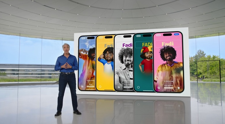
This is one of the first new iPhone features Apple unveiled at WWDC. Available in iOS 17 and iPadOS 17, Contact Posters will let you set up your appearance for calls to your contacts. You can use photos or Memoji as well as text that appears on the screen while you call your family and friends.
I'm not interested in doing any of that. I won't spend time customizing my appearance, just as I don't customize the iPhone's Lock Screen either (more on that later). And I don't really care if any of my contacts do it. Come to think of it, it'll be interesting to see how many of them take advantage of Contact Posters when iOS 17 rolls out this fall.
I won't make my own iPhone stickers
If you're big on using stickers in chat apps, you'll love iOS 17. You can now create unique stickers from your photos, which means your instant messaging experience will get a significant upgrade.
But I'm just not into stickers. Default one or customizable. I won't spend time capturing great stickers from my photos or videos so that I can use them sporadically. Because chances are I'll forget to use them most of the time.
The new Journal app
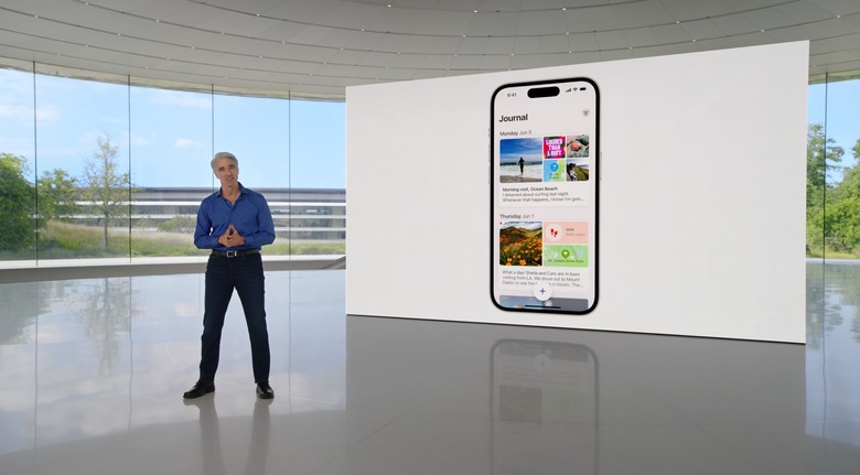
Apple's new Journal app is easily one of the highlights of WWDC 2023. It's a brilliant addition to iPhone, which many people will want to use. The Journal app relies upon on-device machine learning to suggest new journal entries. It'll show you highlights of the day, which might be important things you'd want to remember for later retrieval.
This will also let you jot down ideas and longer accounts of specific days. Journaling can also improve your well-being, as it's a proven therapeutic strategy that can help people.
I just know I'm not interested in doing that on iPhone. Or iPad. I might want to use the app to remember specific details about a day or event rather than taking pics or typing notes. However, that depends on how the app works and what sort of customization it supports. I certainly won't want to have it log each day of my life and prompt me to write.
It's not a privacy issue, either. The Journal app is end-to-end encrypted using. What you write is only available to you.
I'll never use the StandBy feature
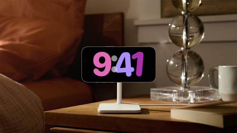
iOS 17 lets you turn the iPhone into a smart home-like device when docked via a MagSafe charger. Called StandBy, the feature lets you access glanceable information with the help of widgets. But I definitely don't want to have the iPhone's screen turned on like that when charging.
First, I'm positive I don't need the information those widgets will present during StandBy. I'd rather pick up the iPhone and check apps or notifications, even if that means disconnecting it from its charger.
Also, my charging habits have changed since I got the iPhone 14 Pro. I rarely recharge the handset overnight. And when I do recharge it, I'm usually on my Mac, and everything I'd need from StandBy is available to me.
Finally, I want the charging to be as efficient as possible. That means no wasting energy on the screen, no matter how efficient StandBy might be.
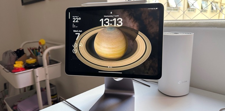
The iPad’s Lock Screen
This brings me to the iPad's iPadOS 17 update, which already feels old. Apple is bringing iOS 16 features to iPadOS 17, like support for customizable Lock Screen experiences. That means setting up the Lock Screen with custom wallpapers and widgets.
I'm already not taking advantage of iPhone Lock Screen widgets, as I explained before. I'd certainly not do that with iPad.
What is Freeform?
Announced last year and available on iOS 16 and iPadOS 16, Freeform is a collaborative app that I've never opened. You get a large canvas where you can write and draw. And it can be a great app for brainstorming. Whether in a team or alone.
I'm not using it now, and I don't think I'll get into it come iOS 17 and iPadOS 17. I'm mentioning it now because Apple is updating Freeform with new features. Like new drawing tools, support for new moves, connection lines, and a Follow Along feature for collaborators.
I'm not saying the feature is useless, or Apple shouldn't have made it. It's just that Freeform isn't for me.
I dislike Stage Manager the most
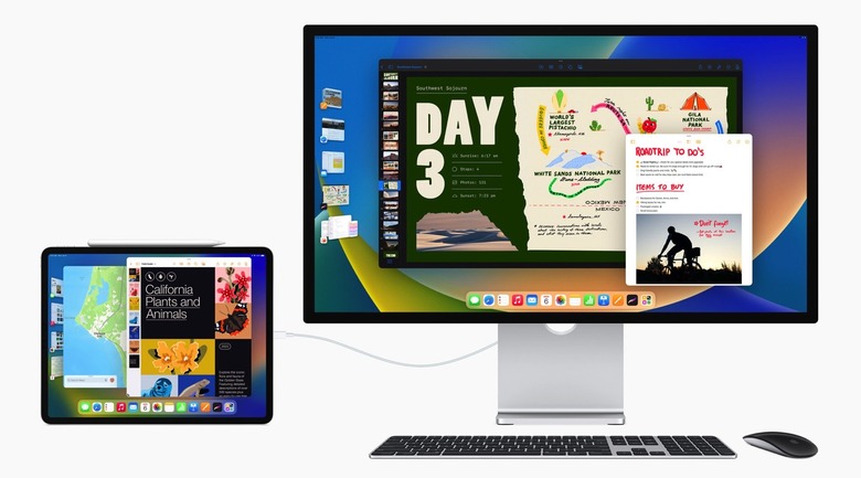
Like Freeform, Stage Manager is a feature that Apple debuted last year. It's a new way to multitask on iPad and Mac that creates a vertical "dock" of open apps to move between them quickly. I've used Stage Manager twice on Mac to determine whether it can improve my workflow.
I don't see any value in it, or I'm too entrenched in the old way of multitasking on Mac. Stage Manager might be an upgrade for iPad multitasking, though I'm still not thrilled with it.
iPadOS 17 will improve Stage Manager, giving users more control over the workspace and more flexibility for positioning and resizing apps. It also supports built-in cameras on external displays. But Stage Manager will remain off on the Apple devices I use.
No Safari web apps for me
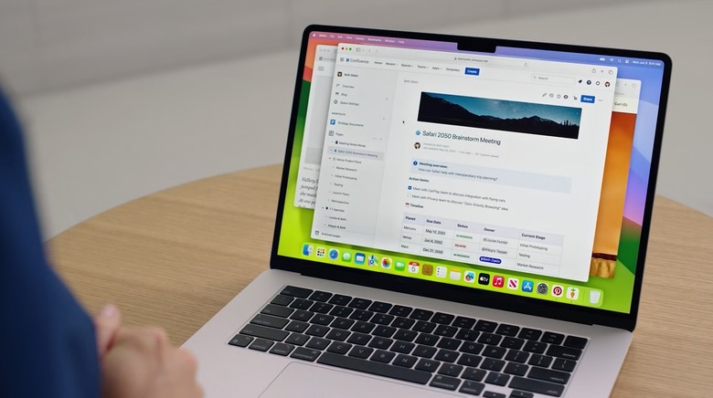
macOS Sonoma brings a Safari feature available on iPhone and iPad to the Mac. You can create web apps on your computer with Safari. That is place shortcuts to frequently accessed websites right in your dock. I've already shown you how to create a ChatGPT web app in macOS Sonoma with Safari.
But my Mac working experience doesn't involve using Safari for those frequently accessed websites. And I wouldn't want to clutter my workspace with Safari shortcuts, either.
The feature might be useful to some Mac users, so it's worth keeping a tab on it.
Presenter Overlay on macOS Sonoma
This is another useful feature in macOS Sonoma that might make those Zoom chats more exciting. You'll be able to overlay the stream from your webcam on top of the presentation you're giving.
But it's another new macOS Sonoma feature I don't see myself using anytime soon. Like with Contact Posters, it'll be interesting to see whether I experience others taking advantage of Presenter Overlay.
