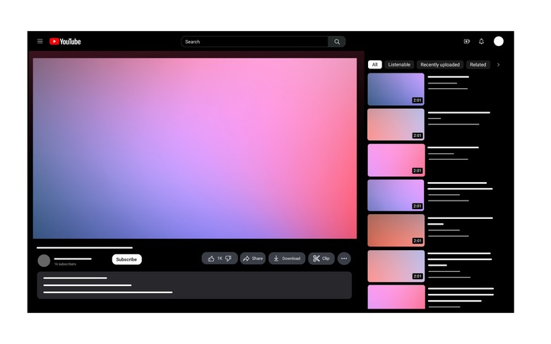
YouTube Is Getting Two New Features And A Huge Redesign
The YouTube team is always tinkering with the look and feel of the video platform, but a true redesign is starting to roll out today. This Monday, UX director Nate Koechley pulled back the curtain on new features and a number of visual updates coming to YouTube. You'll see most of these changes no matter which device you're watching on.
First up, we'll cover the latest features. YouTube is bringing pinch-to-zoom to its mobile app on iOS and Android phones and tablets. The feature allows you to zoom in up to 8x and pan around — perfect for anyone hunting for easter eggs in Marvel trailers.
The other new feature is available on desktop and mobile devices. With precise seeking, you will have an easier time getting to the exact moment you want to watch of a YouTube video. Just drag or swipe up while seeking to display a row of thumbnails in the video player. You can make fine-tuned adjustments to get to specific parts of the video.
YouTube redesign rolling out now
In addition to new features, YouTube is also updating the visual design language of the site and the mobile app. The biggest change is Ambient mode, which "uses a lighting effect that makes the watch experience more immersive by casting gentle colors from the video into your screen's background." This feature will be on by default when you turn on Dark theme on mobile or the web, but you can turn it off in Settings if you want.
Other changes include a darker Dark theme, rounded thumbnails and buttons, unique background colors for the Subscribe button, a new look for the playlist page, easier navigation from links, and updates to the channel membership process on mobile.
YouTube says that these new features and design updates are starting to roll out now. They will roll out to everyone over the next few weeks.
More coverage: YouTube Premium is getting more expensive for families
