The MacBook Pro Notch Has Everyone Freaking Out, But Apple Already Fixed It
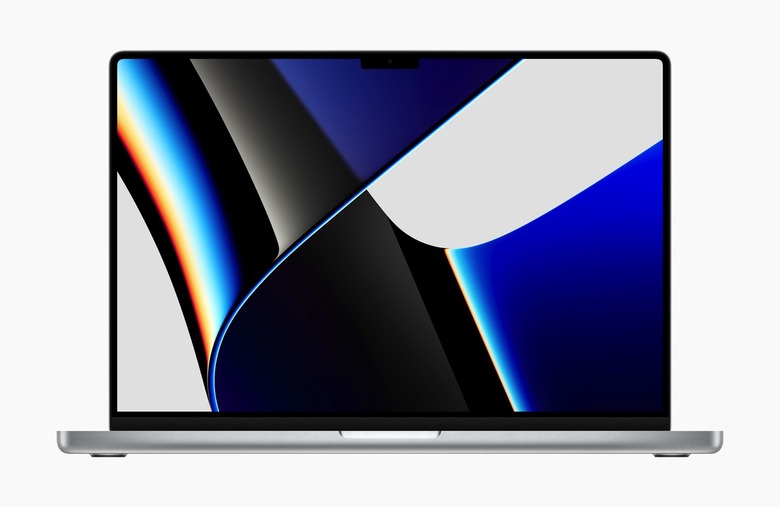
The new MacBook Pro models that Apple launched last week come with an unexpected design "problem." They both feature a notch at the top of the display, which holds the brand new 1080p camera. Apple explained the design is a smart way to increase the display real estate. The menu bar is slightly taller to incorporate the notch. What remains is a 16:10 screen for apps that's just as big as before. It's not just Apple that's bringing the notch to computers. Samsung's upcoming iPad Pro rival will have a notch of its own.
But it turns out the MacBook Pro might have an actual notch problem that some users have discovered during reviews. The menu bar content doesn't wrap around the notch, which is what you'd expect from such a design choice. And it turns out there's already a way to fix the issue, albeit it's not quite the fix you'd want.
The MacBook Pro notch problem
Like the iPhone, the MacBook Pro notch cuts into the screen continuity. On the iPhone, Apple uses the display "ears" flanking the notch to show specific content. You get the carrier name, wireless connectivity indicators, and battery level. App content appears below the notch, which means you'll never have to worry about app UI elements being "stuck" under the notch. They'd be stuck for good as you'd have no way to interact with them.
A YouTuber who reviewed the MacBook Pros discovered that's not the case with the MacBook notch. The operating system doesn't automatically block access to the area under the notch. Because the notch is part of the menu bar, some app menus might be accidentally buried under it. The same goes for the macOS apps that have menu bar items that you can interact with. The more apps you have loaded in the right side of the menu bar, the more likely it is that some of them will be placed under the notch.
Unlike the iPhone notch, you can interact with the UI elements placed under the notch because you use a mouse (trackpad) with the Mac.
Quinn Nelson's demo went viral on social media earlier this week when he demoed this MacBook notch problem. He showed that the menu bar content doesn't wrap around the notch automatically. Instead, menus or menu bar apps can get stuck under the notch, and you can click them. You just don't know what they might be because you can't see them.
Apple already has an official fix
Having macOS automatically prevent UI elements from getting under the notch seems like the simplest fix for the problem. Many people might have assumed that's exactly what happens on the new MacBook Pros. Apple could always issue a macOS update that will ensure that nothing can get under the notch.
In the meantime, Apple has a different fix ready for users. The company released a support document where it explains how to deal with the notch problem for now. Apple acknowledges that some menu bar items "appear blocked or hidden behind the camera housing" because of the notch. If that's the case, you can turn on a "Scale to fit below built-in camera" option for the misbehaving apps.
The fact this option exists in macOS shows that Apple had considered the notch's impact on the menu bar UI.
Apple also notes in the support document that developers can update their apps to take into account the notch. If they do, then the "Scale to fit below built-in camera" option will no longer appear, as the app won't fit any UI elements under the notch.
In practice, Apple's current fix is somewhat annoying. By scaling the app to avoid the notch, the OS modifies both the height and width of the app. That means you'll lose screen real estate on both the vertical and horizontal, as seen in the following video.
Good news for notch haters! If you've got an app (or apps) with menus that collide with the notch, just Get Info on the app, and enable "Scale to fit below built-in camera".
While the app is running (even in the bg), your display is scaled.#Apple #M1Pro #M1Max #MacBookPro2021 pic.twitter.com/nlGqkFkXAH
— Joseph Todaro (@Jatodaro) October 27, 2021
A fix you don't need, but deserve
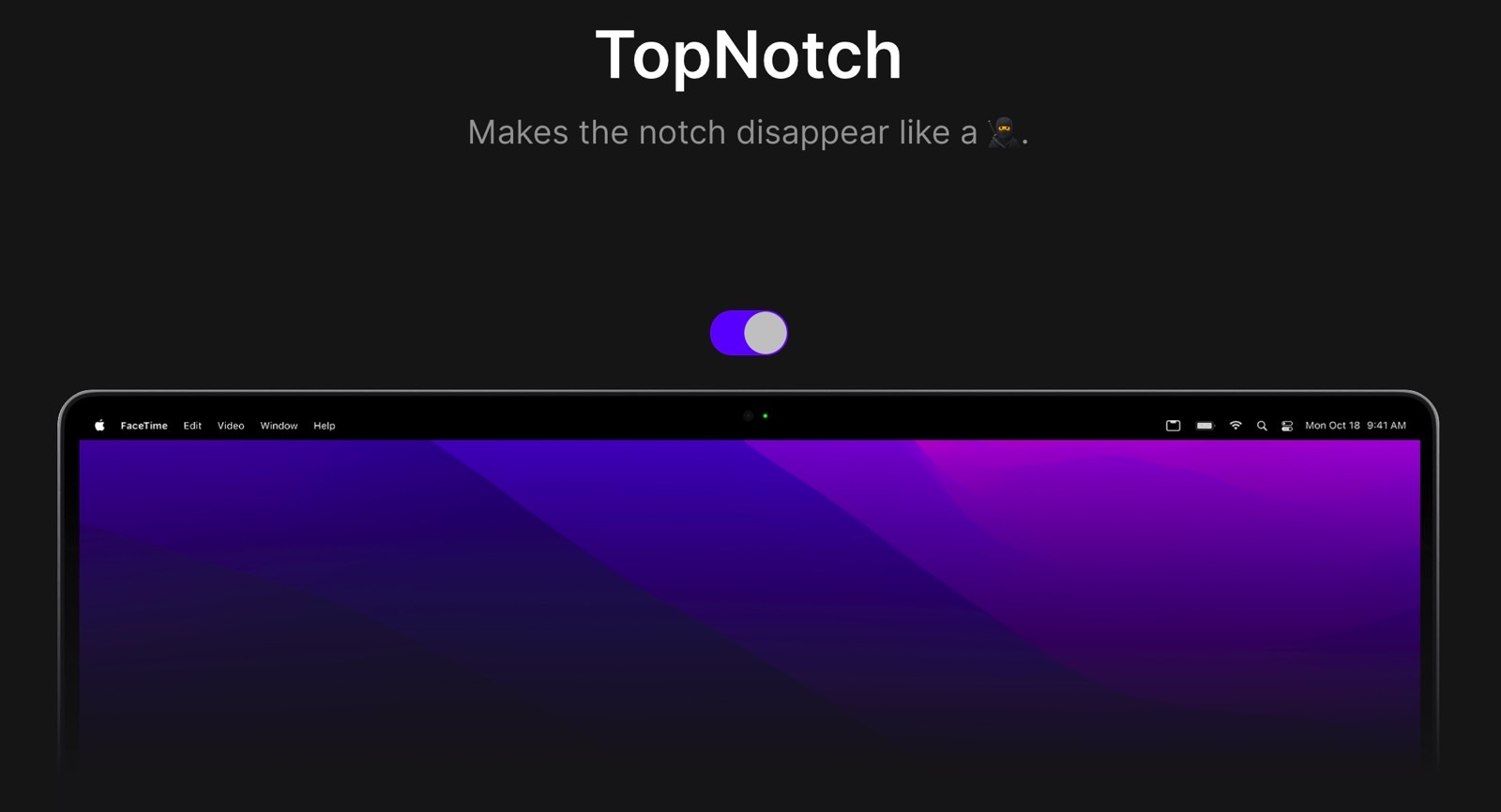
If what bothers you most about the MacBook Pro notch is the way it all looks, then there's a way to fix that problem. Apps like Top Notch, available free of charge from the CleanShot developer, will darken the menu bar. That's a neat trick to hide the notch from you while keeping in place the menu bar.

TopNotch app hides the MacBook Pro notch "problem."
As you can see in the image above, you get a "dark mode" menu bar that masks the notch. Mind you, this trick only "fixes" the notch appearance. The menu bar items that can extend behind the notch will still do so. After all, Top Notch only changes the color of the menu bar, setting it to black permanently.
