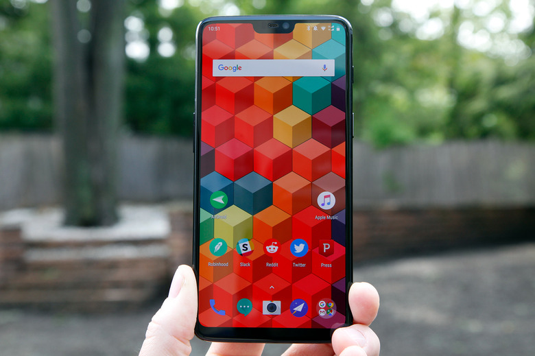
OnePlus 6 Review: 6 Things I Like About The New OnePlus Flagship, And 3 Things I Hate
OnePlus takes a peculiar approach to announcing new smartphones. Most companies tend to wait until their scheduled press conferences before they start sharing details about a phone. This makes sense, of course, because it allows them to tell the exact story they want to tell. Instead, OnePlus chose to reveal its new OnePlus 6 flagship phone in bits and pieces, offering up information about the handset's specs, performance, and design long before company executives took the stage last week to announce the device. It's a peculiar strategy to say the least. One of the reasons most consumer tech companies hate leaks is because they can mischaracterize things because they never paint a complete picture. Yet OnePlus seems to embrace the idea of handing out information piecemeal — it even gave one blog an interview more than a month ahead of the OnePlus 6's unveiling that focused solely on the phone's notch, offering no other details.
Of course, none of that takes away from the phone itself, and the OnePlus 6 is quite an impressive phone. It offers a fresh design that offers a new take on a very familiar look, slick software that stays true to Google's Android vision while still adding some useful and unique features on top, and impressive power that gives the phone blistering speed. There's a whole lot to like about the new OnePlus 6, but there are also some things people might find annoying. In this review, I'll dive into all that and more.
6 things I like about the OnePlus 6
Performance
I'll start out with the most important subject, which is obviously performance. Android smartphones are quite similar where features are concerned, and almost every phone out there looks like an iPhone X right now, so performance is one of the best ways to differentiate between devices.
Well, if it's performance you're after you've come to the right place.
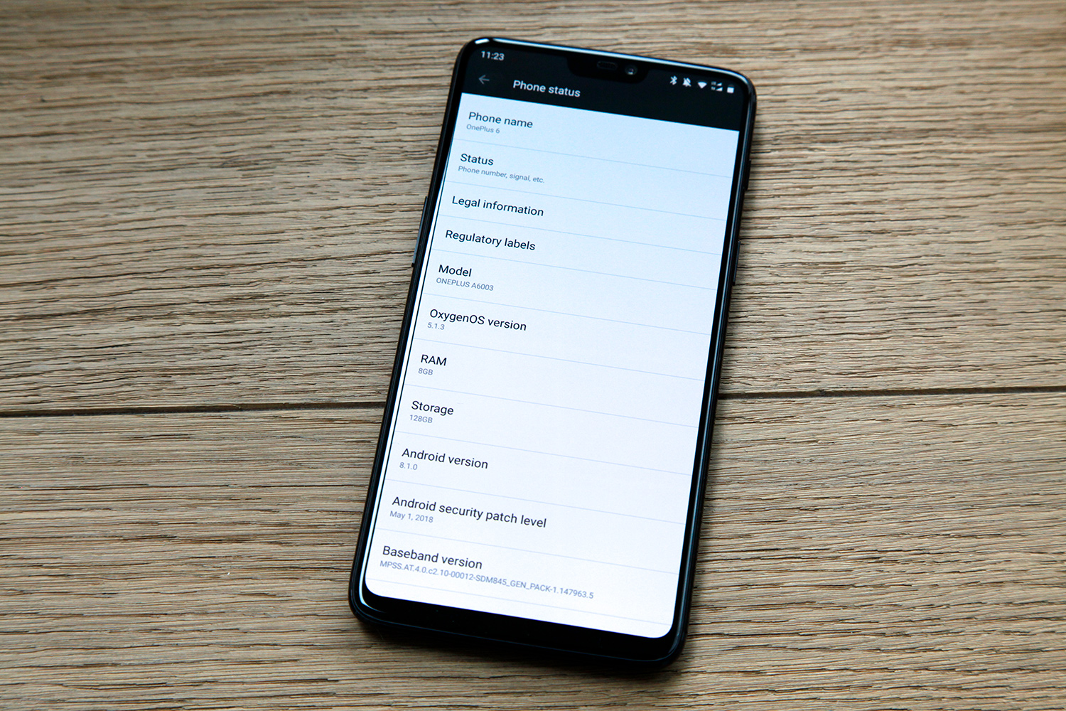
The new OnePlus 6 is a beast on paper and it delivers in real life as well. It's powered by an octa-core Qualcomm Snapdragon 845 chipset that combines four low-energy cores for light duty with four 2.8GHz cores for heavy lifting. The Adreno 630 GPU handles graphics and either 6GB or 8GB of LPDDR4X RAM keeps things running smoothly.
The OnePlus 6 handset I was given to review has 8GB of RAM and 128GB of UFS 2.1 2-LANE storage. There's a more expensive model with 256GB of storage available, but both should offer comparable performance. What kind of performance are we talking about here? First, let's take a look at some numbers.
I ran the latest AnTuTu test a few times on the OnePlus 6 and saw an average score of 269556. In case you're wondering, yes, that is indeed the highest total score of any currently available smartphone. The previous leader was Samsung's Galaxy S9+ with a score of 264638, and you can check out AnTuTu's complete rankings on the company's site.
Moving along to GeekBench4, we've got another impressive showing. The OnePlus 6's single-core score of 2474 wasn't quite high enough to displace the Exynos-powered Galaxy S9 and Galaxy S9+ atop the GeekBench Android rankings, but the phone's multi-core score of 9082 is the highest score any Android phone has managed. The only smartphones in the world that can beat the OnePlus 6's GeekBench scores are Apple's three most recent iPhone models.
That's all well and good, but what does it mean for real-life usage? It means the OnePlus 6 is really, really fast.
In my testing, nothing I did was able to trip up the phone at all. From multitasking and streaming music to watching videos and flipping between all my open apps, the OnePlus 6 took it all with stride. It's the fastest and smoothest Android phone I've tested, hands down.
Display
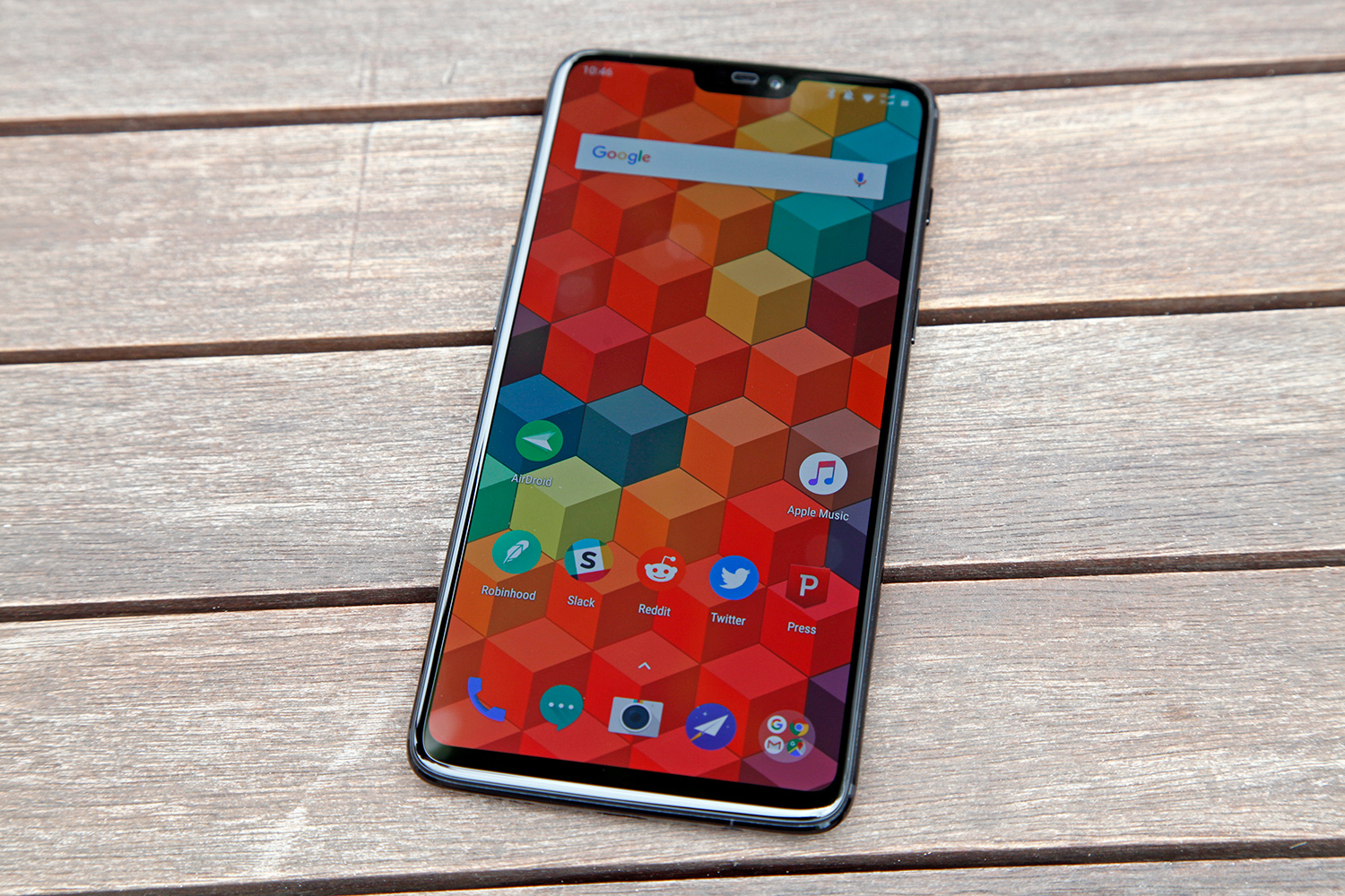
The screen on a smartphone is as important as performance. To some people it's even more important. After all, a user stares at the phone's display constantly while doing just about anything with the device, short of things like making phone calls and listening to music. The smartphone display is a doorway to the user's digital world, and OnePlus delivers once again in this crucial area.
The OnePlus 6 features a 6.28-inch AMOLED screen that displays vivid colors, deep blacks, impressive contrast, and terrific brightness. Some will scoff at the screen's 1080p resolution, but that's just silly. Higher-resolution screens might offer a significantly better viewing experience under a microscope, but to the human eye the difference is negligible on a display so small.
If you're talking about TVs where pixels are spread out across several feet, yes, 4K is in a whole different league compared to 1080p. On a smartphone, not so much. Remember, even the stunning 2K displays on Samsung's latest phones default to 1080p out of the box, and most users don't even realize it. Higher resolutions on smartphones are great for VR applications but most people won't notice a difference anywhere else.
Camera
The cameras on recent OnePlus phones have been pretty good, but "pretty good" simply isn't good enough when the camera is one of the most important things about the smartphone experience.
Smartphones aren't just the go-to camera for most people these days, they're the only cameras people own. Why bother with a dedicated point and shoot camera when you already have a camera that's just as good in your pocket? Professional photographers obviously have a need for dedicated cameras and hobbyists who require decent optical zoom do as well. Just about everyone else uses his or her smartphone to capture images and videos.
In the smartphone camera category, it used to be "the iPhone" and "everything else." Now that's hardly the case. Android phone makers have stepped up their game big time, and it has been a long time since Apple released an iPhone model that reviewers widely agreed had the best camera of a given year. Instead, companies like Samsung, Huawei, and even Google have been looked at as leaders in mobile photography.
For companies like OnePlus, this means the pressure is on. Android phones that don't deliver great photo and video quality are often clobbered by reviewers and early adopters, and it colors the opinions of people who might have otherwise considered a phone. That has been the case for OnePlus in the past, but the company really stepped things up this year with its new flagship phone.
Now, the OnePlus 6 doesn't have the best camera I've tested, but there is no doubt in my mind that it's among the best available right now. The clarity of objects in photos captured by the OnePlus 6 is dramatically better than it has been in the past on OnePlus phones. Color reproduction has been improved as well, and I've found that photos have less noise. The primary sensor in OnePlus' new dual-lens setup has both optical image stabilization (OIS) and electronic image stabilization (EIS), so that clearly helps. That sensor is a 16-megapixel Sony IMX 519, while the secondary telephoto sensor is a 20-megapixel Sony IMX 376K. Both sensors have f/1.7 apertures.
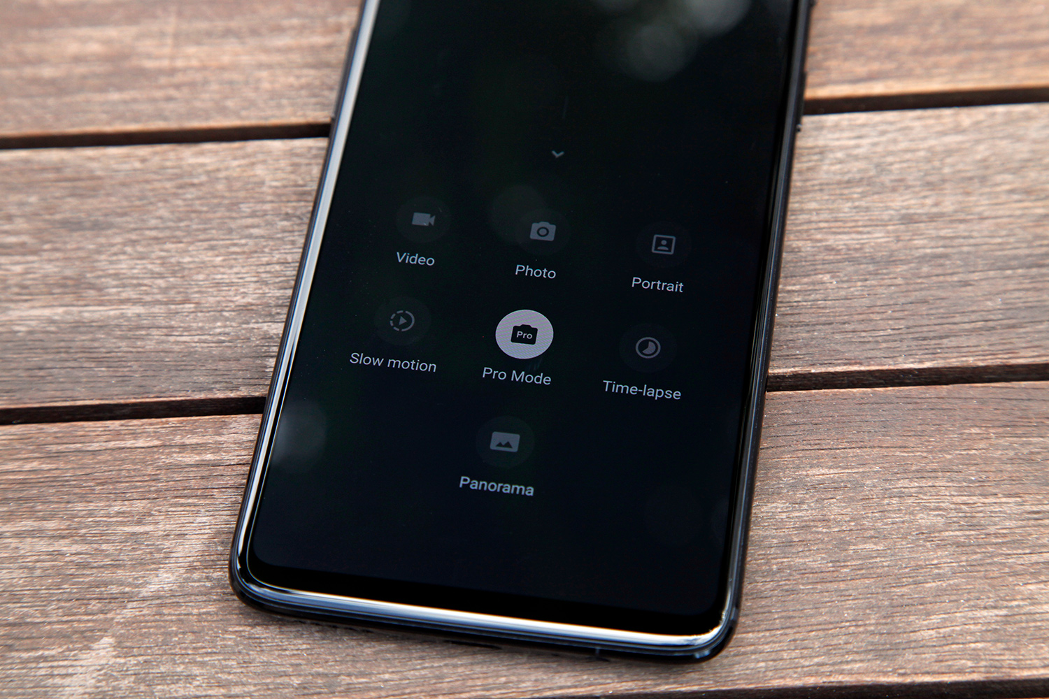
Low-light photography was still a bit of an issue for me, and I wasn't impressed at all with OnePlus' new slow-motion video feature — not that the bar for slow-mo is very high right now on smartphones. The updated camera app is nice though, with several new modes that are all easily accessible. There's also a great pro mode that lets users shoot RAW and fine-tune every setting imaginable.
Optional notch
The notch at the top of the display that Apple popularized with the iPhone X certainly isn't hurting sales. In fact, Apple CEO Tim Cook recently confirmed that the iPhone X has been Apple's best-selling iPhone model since it was released last November.
Apple is still the leader in the smartphone market when it comes to design, so almost every Android phone maker on the planet copied the iPhone X's display design. Like it or not, 2018 is the year of the notch.
Now, many people out there like the notch design. Many more don't care one way or the other. But a small, vocal group of people really dislike the design of Apple's iPhone X display, and you won't be surprised to learn that this group consists mainly of hardcore Android fans. They hate everything Apple does.
For some companies, this wouldn't be an issue since it's a small group compared to the overall size of the smartphone market. But for OnePlus, it's a big deal. Hardcore Android fans are the people who buy OnePlus phones, so the company would have a huge problem on its hands if they were to start complaining en masse about the iPhone X style notch at the top of the OnePlus 6's screen.
Don't worry, Android fans: The notch is optional.
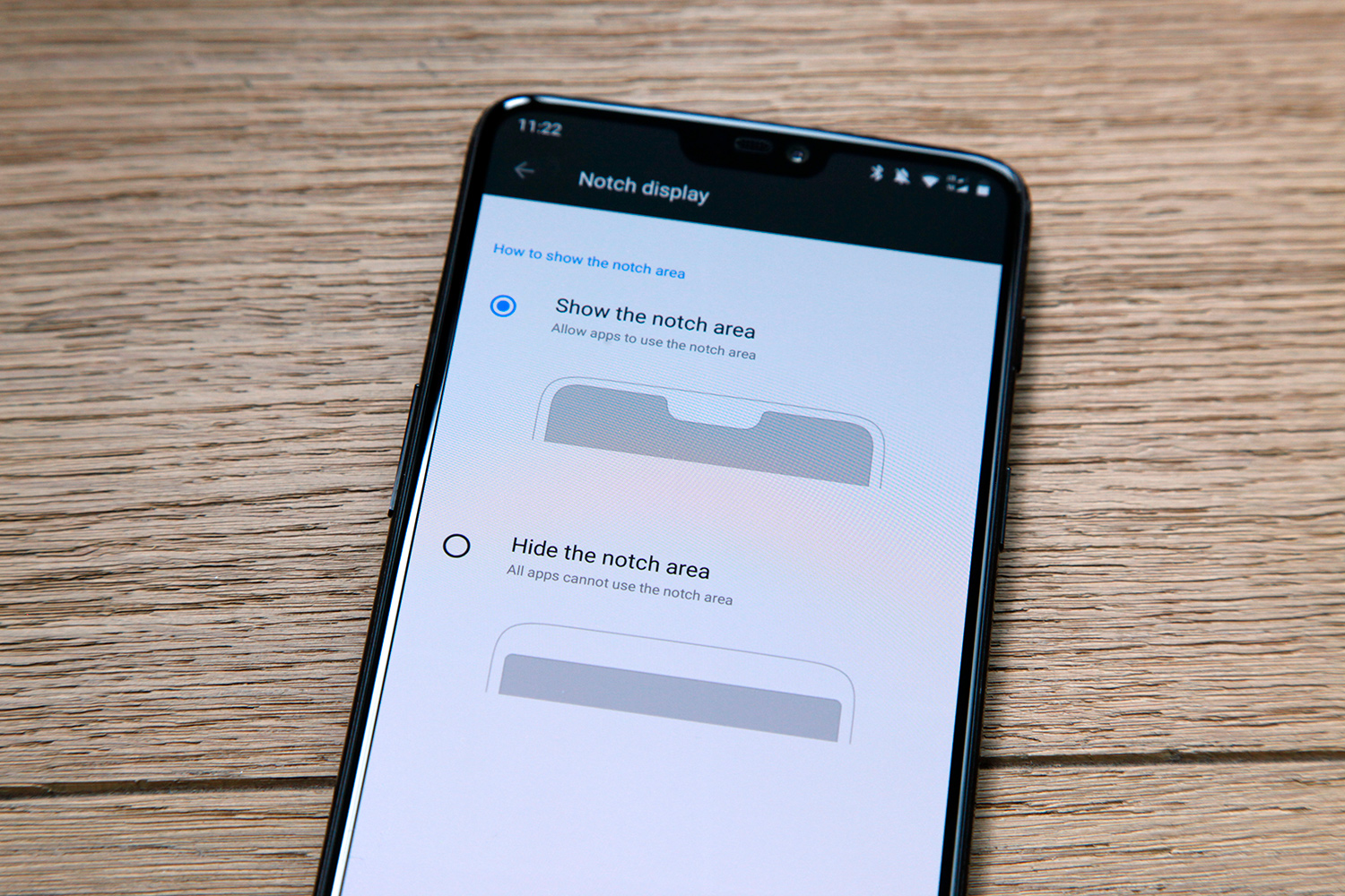
Like a few other Android phone makers who have aped Apple's display design, OnePlus included a setting that hides the notch. In the Settings app under Display > Notch display, there is an option to "hide the notch area." When enabled, the wallpaper and apps will stop short of the notch at the top of the screen. Only status bar icons and notifications will be shown on either side of the notch, and the background will remain black so it looks like the notch isn't even there.
Face Unlock
OnePlus follows Apple's lead quite often, and Face Unlock is another area where the company modeled features after the iPhone. It's nowhere near as secure as Apple's Face ID solution, but it sure is fast. So fast. Lightning fast.
Face Unlock on the OnePlus 6 uses a normal front-facing camera rather than a complex solution like Face ID, which projects 30,000 infrared dots onto the user's face and then reads them in 3D with a special type of camera. OnePlus uses a regular old front-facing camera for Face Unlock on the OnePlus 6, just like it did on last year's OnePlus 5T.
Since Face Unlock isn't as secure as Face ID, OnePlus only allows people to use it to unlock the phone. It can't be used to authenticate payments or to do anything else. But when you unlock the phone with Face Unlock on the OnePlus 6, it's incredible how fast the home screen appears. In fact, most times I don't see the lock screen at all when Face Unlock is enabled.
Price
When the OnePlus 6 is released on Tuesday, May 22nd, it will start at $529 for a model with 6GB of RAM and 64GB. How does that compare to leading smartphones? A Galaxy S9+ with the same sized display and 64GB of storage costs $840. Apple's 64GB iPhone X costs $999.
Last year's OnePlus 5 started at $479 with 64GB of storage, and the OnePlus 5T started at $499. Yes, that means OnePlus phones are getting progressively more expensive. But when you compare the OnePlus 6 with comparable flagship smartphones on the market right now, the value is undeniable. This phone costs $311 less than a comparable Samsung flagship, and $470 less than the iPhone X.
Of note, the OnePlus 6 also comes in two larger sizes that provide equally great value. The 128GB model with 8GB of RAM costs $579 while a 256GB model with 8GB of RAM is priced at $629 — or $520 less than a 256GB iPhone X.
Chin
I have no problem whatsoever with the fact that the OnePlus 6 copies Apple's notch from the iPhone X. But if you're going to copy Apple, at least do it right.
There are two reasons the notch exists on the iPhone X. The first is obviously to make room for the ear speaker, TrueDepth, the standard front-facing camera, and other sensors. The second is so that the bezel around the display is completely uniform the whole way around the display, aside from where the notch is. Here's an image of the iPhone X:
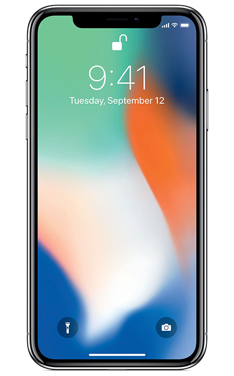
Pulling this off was no small task. In fact, it's nothing short of a brilliant feat of engineering. The reason most phones have "chins" below the display is because there is a controller module at the bottom of each display panel that sits behind the bezel. To avoid this eyesore, Apple used a flexible OLED screen and actually bent the screen back behind itself at the bottom. This way the display controller can be hidden inside the phone behind the screen instead of below it.
Brilliant! Now, let's take a look at the front of the OnePlus 6:
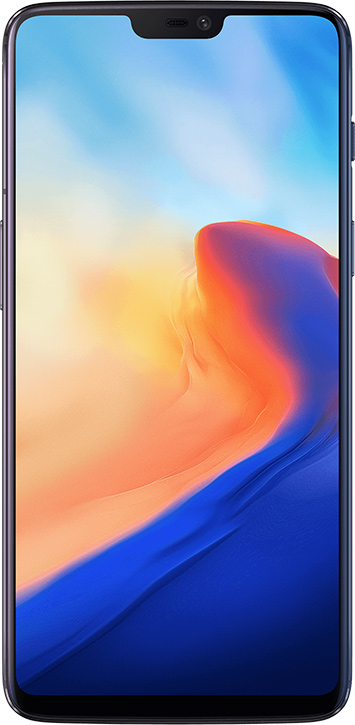
Ugh.
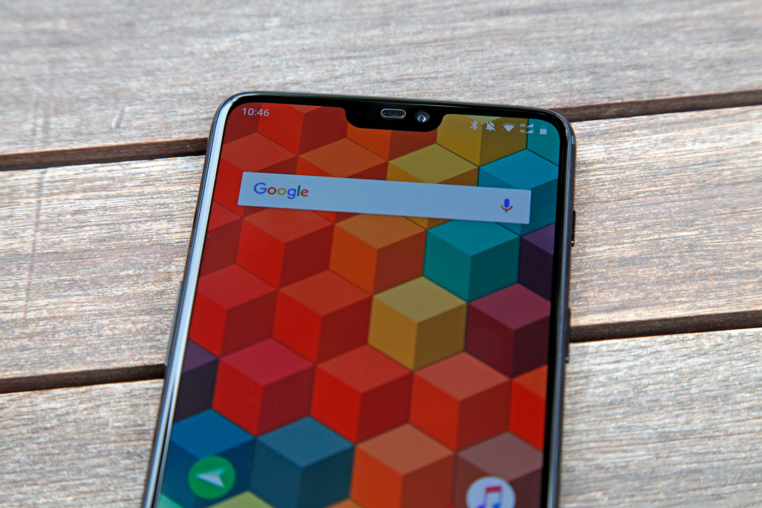
The huge chin at the bottom is an eyesore to say the least. But wait... it gets even worse! When you hide the notch in the phone's display settings, the black space at the top of the phone is even bigger than the chin at the bottom. But wait... it gets even worse than even worse! When the notch is visible as it is in the image above, the bezel along the top of the phone doesn't have a uniform thickness. If you look at the image closely you'll see that it actually gets narrower as you move from the center of the phone to the top-left or top-right corner. If you value attention to detail, this is beyond annoying and you'll never unsee it. Sorry.
Gestures
The notch isn't the only thing Android companies love about the iPhone X.
Google revealed a slew of new details about Android P during the annual Google I/O conference earlier this month, and it released a public beta of the software. Among the new features people get to try out is a series of gestures that can replace Android's traditional button navigation. You guessed it... just like the iPhone X.
OnePlus likes Apple's iPhone X gestures so much that the company couldn't even bear to wait for Android P. Instead, OnePlus baked some of them right into Android Oreo on the OnePlus 6.
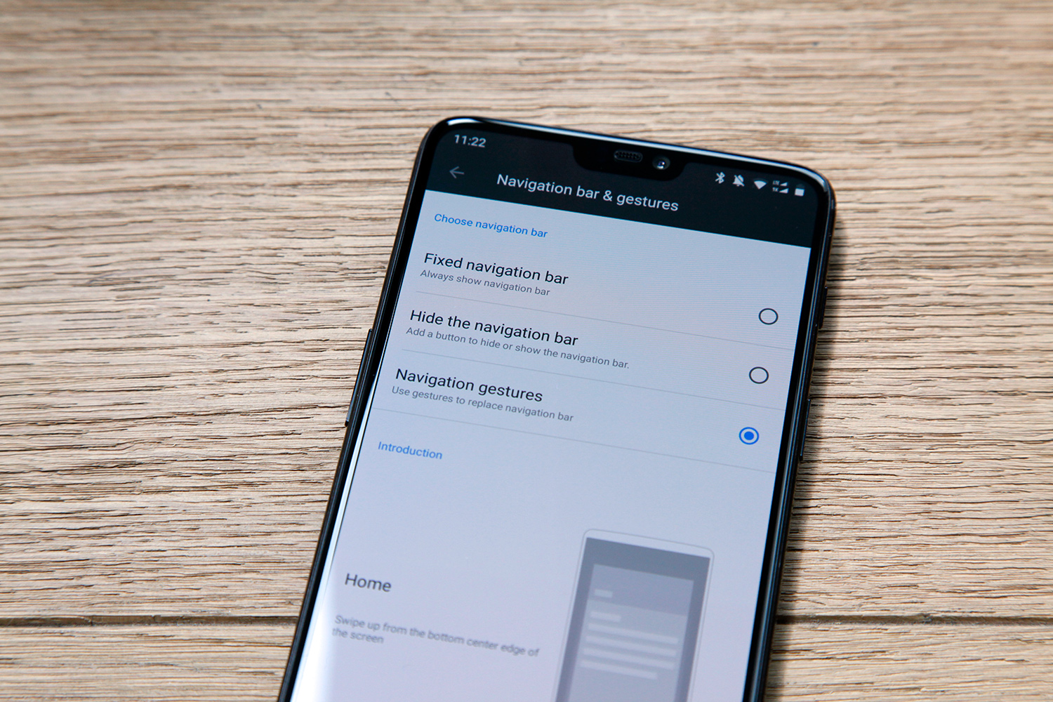
When enabled in the Settings app, the buttons at the bottom of the display disappear and are replaced by three gestures. To go to the home screen from any other screen, swipe up from the bottom of the screen. Just like the iPhone X. To open the app switcher, swipe up from the bottom of the screen and pause. Again, just like the iPhone X.
Here's where things get dicey. Instead of copying Apple's obvious back gesture — swiping to the right from the left edge of the screen — OnePlus decided to make the back gesture a swipe up from the bottom of the screen, just like the home gesture. The difference is that to go back, you have to swipe up from the bottom left or ride side.
That's very annoying. The iPhone X's home gesture isn't just logical, it's convenient because you can do it anywhere on the screen. I've swiped up to go home a view times on the OnePlus 6 and accidentally gone back a screen instead.
But wait, that's not the worst part by a long shot. When you're browsing the web, watching a video, or doing anything else with the phone in landscape orientation, the home and back gestures are no longer performed on the bottom of the display. Instead, you still have to swipe from the bottom of the phone as if it was still in portrait. So if you tilt your phone to the left, your home and back gestures become inward swipes from the right edge of the screen.
I'll say it again: Ugh.
Glass
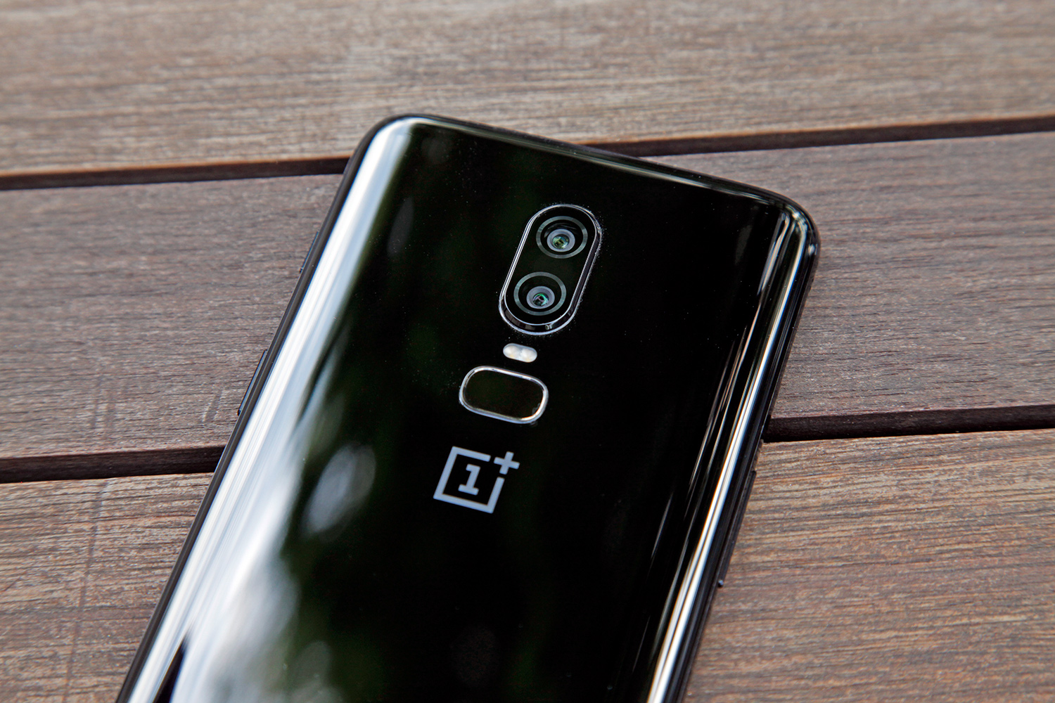
In keeping with the theme, the last thing I hate about the phone is yet another way that OnePlus did a bad job Apple.
Smartphones with all-glass backs have existed for quite some time now, but it wasn't until last year that Apple switched from aluminum to glass on the backs of its new iPhones. Why? Because the iPhone X, iPhone 8 Plus, and iPhone 8 include support for wireless charging. Everyone knows glass isn't as sturdy as metal, but wireless charging doesn't work efficiently through metal.
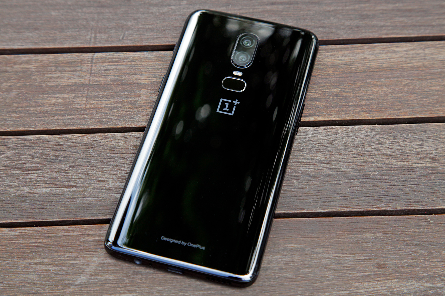
Purely by coincidence, OnePlus decided to switch from aluminum to glass for the back of its phone right after Apple did. I know! I'm shocked too! But there's a problem with the OnePlus 6's glass back: it serves absolutely no purpose. OnePlus didn't even add wireless charging support to the OnePlus 6.
I'll say it one last time: Ugh.
If you read OnePlus 6 coverage on other sites you might come across a blog that regurgitates OnePlus PR's logic that the glass helps improve reception. It is absolutely true that radio waves pass more easily through glass than they do metal. But as anyone with a metal phone will tell you, their phones work just fine with aluminum on the back. In fact, all of OnePlus' previous phones had aluminum backs and they all worked just fine.
The OnePlus 6 is a sleek phone with a great look. Aside from being a fingerprint magnet, the glass back on the phone looks nice. Of course, it would look just as good in metal as it does in glass, and the back wouldn't shatter when you drop it.
–
The wallpaper pictured in this review can be downloaded here. It was created with a free Android app called Tapet.
