Google Nexus One Review
Ah, the Google Nexus One. Google's current "flagship" Android device received an enormous amount of attention in the time leading up to its release. While definitely justified, it also came with a dose of unrealistic expectations. Admittedly, it is one of the most powerful smartphones on the entire planet (no, we won't refer to it as a superphone), and it's packed to the brim with the latest high-end specifications that any true geek would love. But, what's the verdict? Well, you'll have to read on to find out obviously. We've reviewed the phone with an open mind, and have also offered up some personal thoughts following the review. Just remember that violence is never the answer, ok?
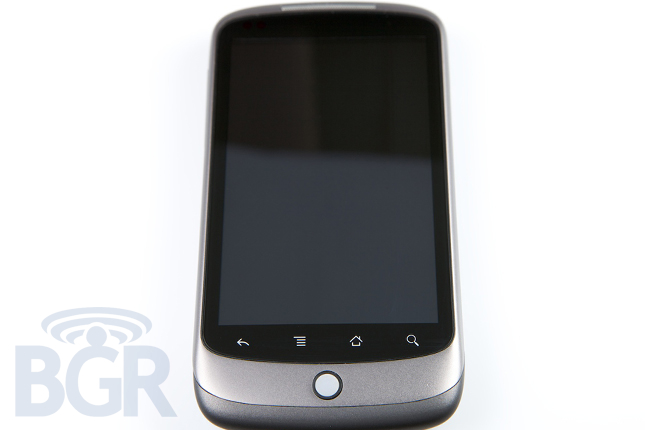
Hardware
It is really remarkable how HTC has so beautifully blended a perfect mix of gigahertz processors, gorgeous and beautiful capacitive displays, and great crafted casings. We've got a big, bright 3.7" AMOLED capacitive 800x480 display, a 1GHz Snapdragon CPU, 512MB of RAM, world-wide 3G, Bluetooth, Wi-Fi, GPS, and a 5 megapixel camera with LED flash among other things, into a tight and slim 11.5mm package.
This time around, the hardware still isn't completely perfect. The capacitive display, while excellent, doesn't have the same response as its largest competitor in the touch screen arena. It's not bad by any stretch of the imagination, but we feel like the 5% or so difference becomes noticeable with everyday usage. It could be a combination of hardware and software (and most likely is) but for the most part, the average user will have no issue rapidly switching through homescreens, flicking through email, or firing off text messages on the large and responsive display.
One other annoyance is the touch-sensitive buttons below the screen, however. They seem to be the exact same as what's on the HTC DROID Eris, and we are having the exact same issues. Their contact point seems to sit a little higher than it should, so if you press the button normally from the bottom half, your touch probably will not register. You have to hit it at exactly the right point — the top 25% — and even then you may hit the screen instead because it's right there, sitting 1mm above, after all. The haptic response also isn't entirely comforting as is on the Motorola DROID, whose touch-sensitive buttons are the most friendly we've ever used.
The trackball as a navigational input device is fine — it's a trackball that's been used on many, many devices for many years. Is it necessary? Probably not, but we gather that some people prefer anything physical they can "count" on in this day and age of all touch, no feel.
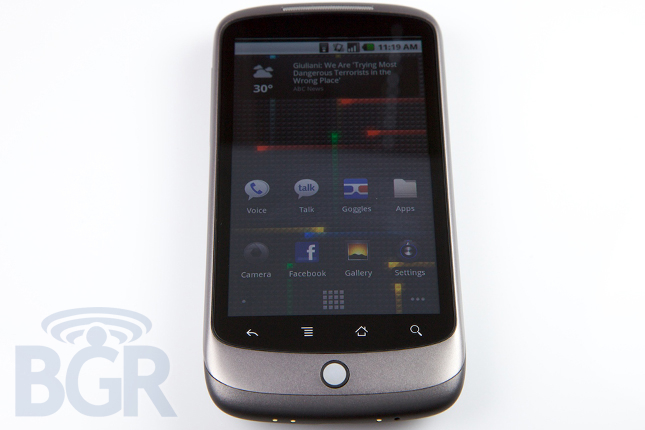
Software
And, unfortunately we have to mosey on to the software side of things.
Android has gone through a pretty big transformation between now and over a year ago. There's built-in Exchange (contacts and email only) support, Facebook, widget support, updated browser with a useless double-tap feature, voice search / commands, and many others. And while in our testing Android 2.1 worked reasonably well, we just can't get over the fact that in addition to software inconsistencies which we'll touch on below, there are still small slow downs and hiccups even with this 1GHz processor. That's not good.
With that said, Android 2.1 doesn't add too much more than what the Motorola DROID offers (that runs Android 2.0). We've got "live" wallpapers which are animated wallpapers for your homescreen that dynamically change based on different events: time, time of day, sound, touch — those are fun, if not a compete waste of battery. Additionally in Android 2.1, every text entry field is voice-enabled (data connection required) so you can practically say what you'd like to type, and Google will try their best to figure out what you are saying. In our limited testing it actually worked quite well in pretty low-noise environments, but your mileage will obviously vary based on your speaking patterns, accent, background noise, and other variables.
The application drawer which used to slide out from the bottom of the device no longer does so. It's just takes a simple tap to engage your application list that beautifully fly in from behind you. Think of it as exactly the opposite transition effect that the iPhone uses. There's also a News and Weather widget/application set which looks great and is pretty customizable. It's definitely the best implementation we've seen on Android in terms of a news/weather widget, but that also speaks to how poorly 3rd party widgets and applications are designed and developed on Android as a whole. The redesigned photo gallery is visually impressive and the 3D effects with accelerometer-injected tilts are enticing. But, we'd have rather Google spent more time on perfecting other applications instead of jazzing up the photo viewer.
Don't get us wrong, Android 2.1 comes with some improvements visually and under the hood as well, but Exchange support is still mediocre at best, and we get this incomplete feeling. Again, a "feeling." You'll see why that's important.
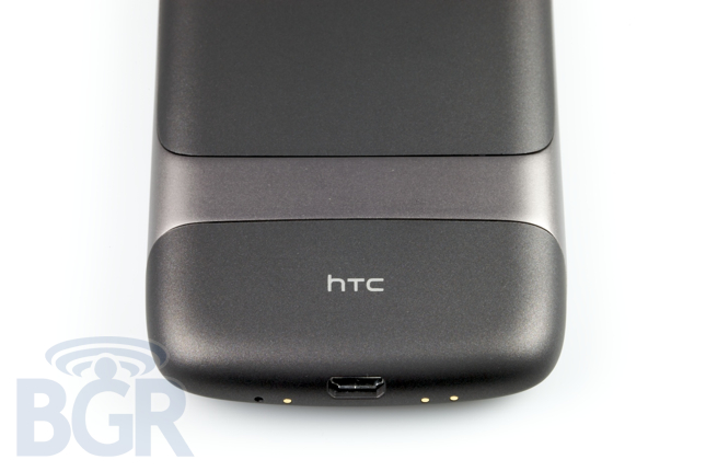
Phone quality
If T-Mobile actually had coverage... Joking aside, the Nexus One, as a phone, is the best phone we've ever used. It sounds so, so great and is really refreshing to be able to have an excellent and smooth voice exchange with another party. In addition to the call sounding great on our end, the call also sounds absolutely perfect for the other person as well. Why, you ask? Because HTC has ingeniously integrated dual microphones for superior noise-cancellation. It's been done before in other applications, in some form or another — Motorola has long had CrystalTalk — but it's the best implementation on a phone that we've ever used. Literally, you could be on the busiest street in New York City with babies crying, cabs honking, wind blowing, and there's a decent enough chance that the person you're speaking to on the other end wouldn't even notice. And oh yeah, it will be supported by Verizon Wireless this "Spring" so you can pair that with "America's Most Reliable Network."
The actual loudspeaker on the phone is decent. It's definitely loud enough, but it's not that clear and can get distorted pretty easily if the volume is raised up enough. With that said, calls with speakerphone enabled still were pleasant enough and both us and the poor test subject on the other end of the line had a clear enough conversation without disruption.
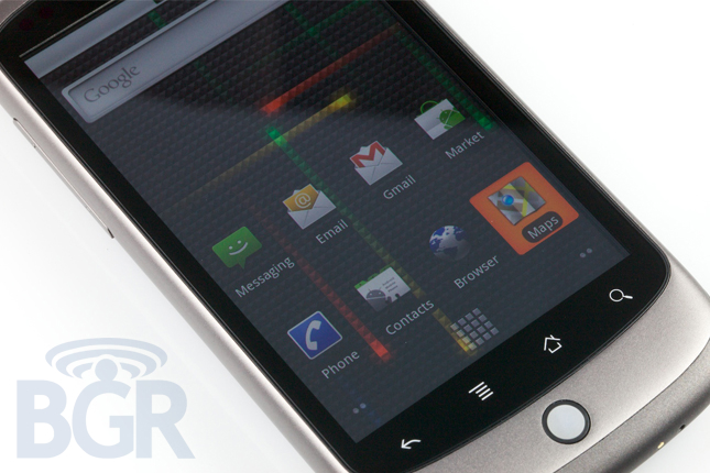
Screen
When you think of an AMOLED screen you probably think bright, beautiful colors, crisp, sharp detailing, and you also probably think, "that might not be the best screen to use at the beach." And, if you thought that last part, you'd be right. The screen on the Nexus One, while gorgeous, is not usable in direct sunlight and it's rather depressing. Getting over the sunlight issue, the screen isn't as rich as the Motorola DROID's display, unfortunately. We didn't miss the actual resolution in terms of having more room, but the DROID's display doesn't show pixelation like the Nexus One does, and just honestly seems like a better product. Now, before you get too worked up, the Nexus One display is in and of itself great, but if you'd like to know the best of the best, it would have to be the DROID's display.
Camera
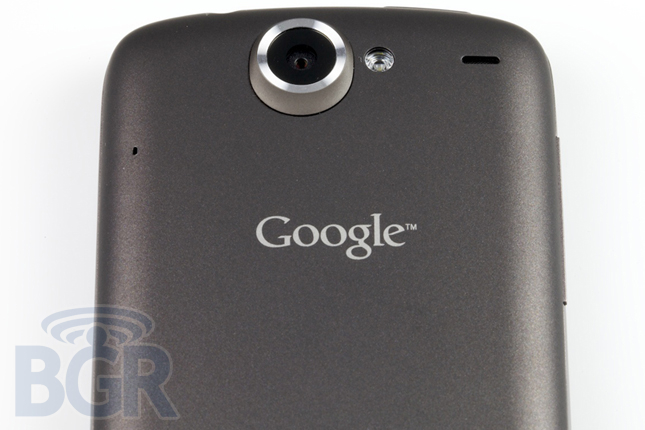
The camera is decent, if not semi-enjoyable to use due to the speedy processor and fast photo snaps. It's worlds better than the Motorola DROID's camera, in both hardware and software partly in thanks to HTC (even though they aren't known for their excellent cameras) and partly in thanks to some refinement with Android 2.1's camera application. Unfortunately since this is a Google Experience (read: not raped by manufacturers), some of HTC's awesome tweaks like tap to focus aren't present. It's such an invaluable feature for a touch screen device with a camera, and it's a shame it's not in here. In general, echoing our thoughts from the DROID review, though, Android's default camera application is mediocre at best, slightly frustrating, and mildly confusing. It's a recurring theme you'll see in Android and in my personal thoughts coming up later later, you'll see exactly why – one of many issues is that there isn't a single amazing application on the Android platform.
Battery:
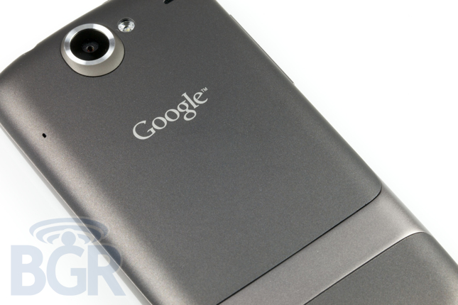
The Nexus One ships with a 1400mAh battery, and while you'd think that 1GHz CPU would run through that battery like a Kenyan track star, the battery actually holds up quite well. Power users are probably going to have to have a charging station visit at some point during a long day, but for regular phone, browser, email, and multimedia usage, the Nexus One actually almost lasted an entire day.
Google services
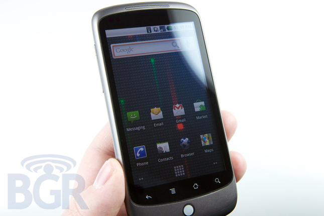
What would a "Google Phone" be without Google's services? Everything is stuffed into Android, and Android 2.1 just as you'd expect. Obviously Google's Gmail app is the best you're going to get if you're a Gmail warrior, and other Google services tightly integrated into the Nexus One (and more Android phones) you can look forward to include: Google Maps, Google Navigation, Google Voice Search, Google Contacts, Google Calendar, Google Talk, Google Voice, Google Market, Google News and Weather, and of course, YouTube.
Conclusion
The Nexus One is the best Android phone to date, and if you love your Android devices, this is the phone that beats them all. There are always going to be new handsets around the corner — HTC isn't slowing down, Motorola is pushing forward, and countless other manufacturers are pumping out handsets — but right now, this is it. Now, if you ask us if the Nexus One is the phone for you, we're not sure. If you're stepping up from another basic smartphone or regular phone, there is little doubt you'll be drawn in by the beautiful screen, the oh-so-easy Gmail and Google service integration, and a solidly built handset with amazing phone capabilities. However, if you're coming from a BlackBerry or iPhone, we're not sure you'll be able to ride it out as Android still feels undercooked to us, and while the "openness" definitely shines through, we feel it might be shining a little too bright.
Personal opinion
For my personal opinion on Android as a whole, head over here!
