Motorola DROID Review
We scooped it, we previewed it, and now we're officially reviewing it. There's a good chance that even if you're not into tech all that much, you've heard of the Motorola DROID thanks to Verizon's big marketing push, and that's a good and bad thing. As you'll see in our review, the DROID is a fantastic device, but does it have what it takes to compete outside the world of the die-hard Android fans and techies in the consumer arena? You'll see soon enough!
Hardware / Design
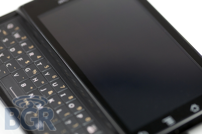
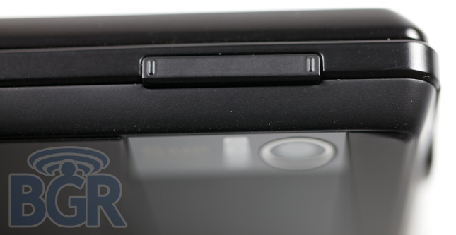
Design is always going to be subjective, but in a world of curves and tapered edges, it's downright thrilling to see a handset that's angular, retro-looking and extremely masculine. Sorry, ladies. You'll always have Droid Eris... We just love the styling of the DROID. It's minimalistic in a lot of ways, not cluttered with useless buttons and switches, and overall is solid as a rock. The slide mechanism is not spring-assisted, but the click is reassuring enough to warrant a comforting feeling when opening or closing the handset. One thing physically we're not thrilled with is the looseness of the volume up and down key. It slides up, down, front and back and generally feels like it's just going to fall off over time. Both the unit we received from Verizon as well as our older unit exhibit the same behaviors.
Contrary to other reports, the Motorola DROID exterior is actually mostly metal. The bezel around the screen is metal as is the mid-plate of the case. The only part that's plastic is the rear back-plate and as we understand it, the reason that little chin exists is because that was the only place Motorola could fit the wireless antennas. They face out towards the plastic back as opposed to being Faraday-caged by the metal front.
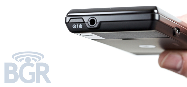
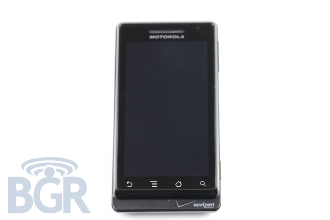
Touch-sensitive keys are a, uh, sensitive area but they're honestly fine at the end of the day. We've been banging on a DROID for many weeks and haven't once had a misfire or accidental key press even though the keys are 100% touch-based. We don't think they're a problem even though some people have been concerned. Plus, you can't beat the Haptic feedback. There isn't a single key on the left side of the unit, just a microUSB port, and on the top there's a 3.5mm headset jack followed by the power / lock /unlock button. On the right side, we've got the shady bi-directional volume key and a two-stage camera shutter key donned in gold. Or as Motorola likes to call it, brown sugar. Mmm, brown sugar.
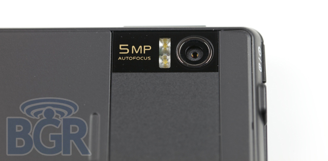
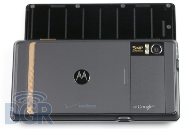
When you turn the phone over, you get a rather simple but concise "brown sugar" speaker grill, battery cover with Motorola and Verizon logos, and that 5 megapixel camera with dual-LED flash. Oh, and the "with Google" logo, too. No, the phone doesn't look like a billboard to us, but hey, you're entitled to your own opinion. Inside it is packing a 550MHz OMAP3 CPU, dedicated graphics processor, 512MB of ROM, 256 of RAM, Wi-Fi, Bluetooth 2.1 + EDR, a digital compass, and accelerometer.
Screen
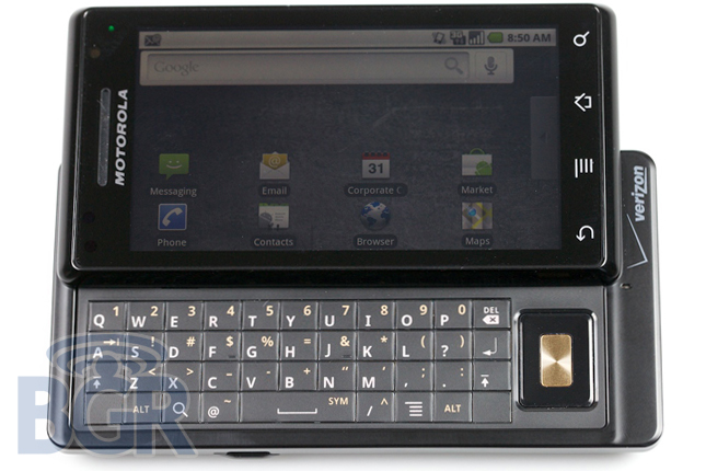
You want one word to describe the screen? Stunning. A 3.7" WVGA 854x480 capacitive high-quality display? We'll take three. Like we said in our preview, it's the best screen we've ever seen on an Android device and possibly in general. Plus it's responsiveness is second to only Apple's capacitive displays, so we're talking about a really, really solid screen here, people. The widescreen proportion might take a little getting used to for some, but all in all, it's roomy and sports a rather nice resolution.
On the screen there is a proximity sensor and also an ambient light sensor. Both work magically to shut off the screen while you're on a call, saving battery and preventing your face from triggering an on screen button, and also adjusting the brightness of the display to match the lighting in your current environment. Some people asked us if the screen on the DROID was dim as it appeared that way in a couple of our photos, and our quick answer would be: absolutely not. It's viciously bright if you ask it to be, and the backlighting is a very assuring white as opposed to a tinted red, orange, pink or blue hue on some other phones we've used.
As we said, it's second only to the iPhone as far as capacitive screens go, and coupled with the rest of the DROID, it's a real winner.
Keyboard
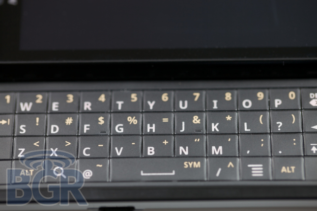
After using the phone for almost a month, I can confidently say the keyboard is fine for most people. It's not a BlackBerry and the actual spacing of the keys isn't great, but it is really livable I think. Each key has a little bubbled-texture which makes it a bit easier to define one key from another, and the tactile feedback, while not perfect, is fine. The spacebar could use a little more tactility though as it's probably the hardest key to press when you're trying to type swiftly and accurately. There are two things that bother us about the keyboard and that's the directional pad stage right, and the fact that two keys haven't quite made it through metamorphosis. Can someone please point out another phone in the entire universe that shipped with two blank keys? Is this a joke? It's not the end of the world but uh, how about a home key and a back key? How about a bigger spacebar? There ars a million things that could have been done to improve the keyboard layout even by two keys and it's pretty hilarious that two keys are blank.
Backlighting on the keyboard is a nice white/teal-ish tint, definitely bright enough, and comes through just the letters and symbols.
The on screen keyboard that Android-lovers are used to for all intents and purposes has not changed. It's the standard Android affair, there are settings to enable vibration-feedback on key press, an audible sound on key press, and the usual configurational options like auto-capitalization, word suggestions, auto-correct and completion. There's virtually no improvement from other Google Experience handsets which is a bit depressing as the keyboard in Android has a bit of a ways to go to compete with that other popular touch-based phone. The landscape on screen keyboard is obviously very, very wide and a tad more forgiving with typing since the keys are obviously larger.
OS
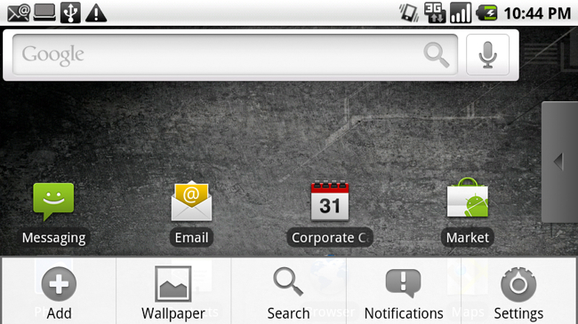
Oh, Android 2.0. It feels like such a huge step forward for Android and it is. It really brings the mobile Google OS into 2009 with support for Exchange, a unified inbox (for non-Gmail), more resolution support, 3D graphics, and a whole lot more. Would we classify it as mostly a face lift? Yes. But that's okay because at the core Android wasn't too bad and most of the open issues in our mind have been fixed in 2.0. Unfortunately, there's no multi-touch support in here which is a major downer. There is multi-touch support in the European version of the DROID, the MILESTONE, though. You might have read in our preview that we said that in the Maps application you can two-finger tap to zoom in. Well, you can also one-finger tap to zoom in. The software was sensing one input, not both simultaneously. Our bad.
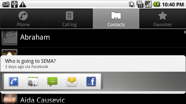
In the new version of Android it seems that we've been given some more fluidity and some nice shortcuts to simplify our lives and not make them more complex. You'll notice you can tap on a thumbnail of a contact photo anywhere in the OS and have a quick-launch list of immediate correspondence options.
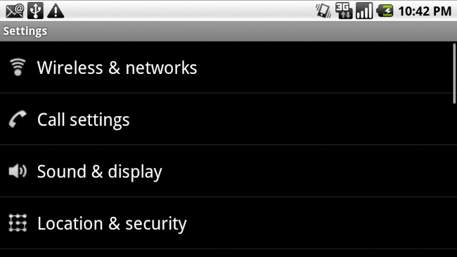
There is still a lot of things Android 2.0 doesn't fix and it's pretty annoying. For one, there's no way to set a real password on the phone. Seriously, drawing lines, shapes and farm animals with your finger to unlock the phone was cute in Android 1.0, but in 2.0? Get it together. It's also inexcusable that there isn't a password timeout interval you can adjust so you're not forced to play tic-tac-toe each time you want to unlock your phone and read your email. Also, there are still no configurable hardware keyboard settings for repeat delay and repeat speed. Openness is great for mostly everyone: consumers, developers, etc. It also, however, brings shoddy code (from some 3rd party developers), fragmentation, and other hurdles. There has been countless times that programs for whatever reason have froze and the standard Google "Wait or Force close" prompt didn't pop up for sometimes over 15 seconds. We don't have a program waiting, but if it does, give us a way to force close something without having to wait for you to tell us it's borked.
Maps is greatly improved, not taking into account Google Navigation. Configurable layers are fantastic as you can overlay what you want (Traffic, Latitude, Wikipedia, Local Search, Satellite, Transit Lines, etc.) when you want to access it instead of having specific modes that only allow you to consume one group of information at a time.
Contacts have now been updated to include sorting and viewing options as you can finally combine multiple contact sources natively (Google, Exchange, Facebook). Visually it looks great and it's functional, too.
Android's biggest issue as a whole is the lack of decent applications in our view. Sure, there are 10,000 but do you really need 25 star gazing applications? Nothing is functional and nothing can be compared to the other mobile OS' apps in terms of quality. It's not a shot, it's just fact. You can't replicate the desktop-class applications on Android yet for one reason or another, and that is a big issue.
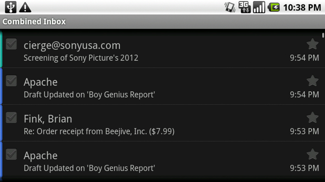
I have a major Exchange issue that basically prevents me from relying on the phone as far as my email is concerned. I get a pretty big number of emails a day (around 500) and it's not that the DROID stutters or can't handle the volume, it's that when I configure the phone to fetch the last day, it fetches the last three days. I've tried to play with settings, delete and re-add the account — nothing.
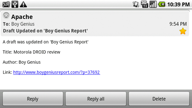
I used another Exchange account on the same Exchange server and that works fine. But, even though the account works and messages come through on time, it still went back and synced the last three days of mail instead of one. There are other glitches and bugs with the Exchange implementation on the DROID, but since it is software and something rather important, we have our hopes that it will be resolved in an OTA update. For now though, mail isn't completely useless, it's just not something we can count on. Well okay, maybe it's useless.
Voice:
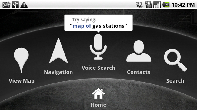
The built in voice recognition is positively top notch. Since Google's voice search OS-wide queries your speech with an online synthesis system, this means that first off, your results should be pretty darn good, and second, that it can always improve and "learn" from more and more users. The downside is that if you don't have a data connection, voice searching and voice control won't work at all.
The scope of what's covered by the voice recognition is pretty amazing. We're talking about getting directions, searching for something like a product online using Google search, locally searching on Google Maps for a store, restaurant or item, and looking up and calling contacts from your address book, all of which are beautifully integrated into the OS.
Music:
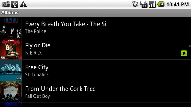
Sadly the music side of things in Android 2.0 didn't get much of an update. Or really any update at all. Look, we get it, you can't do everything and that's fine. Google Navigation as you'll see is fantastic, we've got social networks integrated, a better browser — all that good stuff. But it's not like much had to be done with the music application. Skin it a little bit and we think people would be happy. That's not to say it doesn't work, but the layout is a little tired, playlists and navigation is a little cumbersome and we just think music deserves a little bit more attention then it is getting.
Google Navigation
Uh oh, Google just ate everyone's lunch right? Well, kind of. Google Navigation is amazing at the conceptual level, and even as far as usability goes it's great. It's fast, clean, and hey, it's in beta so don't flip out. We love satellite view for navigating and we love that it's truly an internet-connected navigation app that never needs updated. It caches your route so it's not totally network-dependent, but there isn't any offline maps or anything like that, so some might take issue with that.
We found Google Navigation to be a joy to use and while it lacks some of the features and functionality traditional mobile navigation applications have, we're pretty sure that will come in due time. For a first go, it's very usable and it's probably something we'd buy the damn car mount just to use. Searching for places and locations along the route is great and so is the robotic-sounding lady that will actually read you the entire street name instead of just giving you basic voice readouts like, "make a left in .8 miles." You can also add layers to the navigation program and overlay traffic, parking locations, gas stations, banks, restaurants and more for viewing on the map while you travel along your route.
Browser
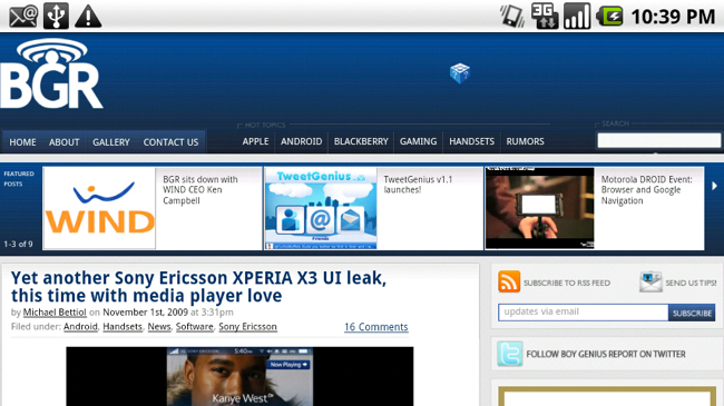
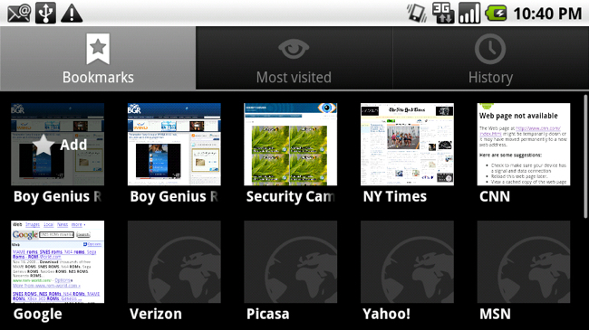
It's amazing how a simple double-tap gesture will dramatically change the usability of a touch-screen-based browser. Literally, it's one thing (besides CPU speed, a great screen obviously, etc.) that makes a big difference. Again, there's no multi-touch and to be honest, a simple pinch-zoom gesture is really missed. With that said, the browser has improved a lot as far as rendering, being HTML5 compliant, sometimes fast, and very, very stable. Visually, as Android 2.0 in general seems to do, there's some spice added. Visual bookmarks are fun, the improved URL bar at the top complete with favicon is also a nice touch. In addition to being HTML5 compliant, there's also support for offline caching for browser-based apps among other improvements. The widescreen resolution and pixel density of the screen really make the browser very friendly to use even without having to zoom.
When you look at speed, the browser is pretty good. Running over the same Wi-Fi network, the DROID performed pretty reasonably compared to our iPhone 3GS. The 3GS we'd say has about 20% on the DROID for straight page loading and rendering, though scrolling speeds are noticeably faster on the DROID. Well, loading is pretty fast. It's an interesting thing because the browser will sometimes be incredible speedy, and other times just get bogged down on really rudimentary sites. Your mileage may vary, but the speed of the browser can easily go from fast to frustrating and we're not 100% sure why. One thing that's annoying about the browser is that there's no shortcut to jump back to the top of the page when the keyboard is closed. Big deal? Nope, just little things that go a long way that Google continues to miss as far as usability and user experience is concerned. Flash support is not built in to Google Experience phones at this time, but is said to be coming in 2010.
Not having a dedicated search box by the URL bar seems to have its advantages as we love performing searches and seeing related results instantly below. It's also great that there are little visual icons like a star, clock, and search icon so you can differentiate between your bookmarks, history and live search data.

Phone calling / speaker
It's a little strange when you ask a group of people about Motorola's phones and their experiences with them. The strange part is that there doesn't seem to be anyone in the middle; it's a love it or hate it affair when it comes to phone performance among other things. Thankfully the Motorola DROID is an amazing performer in the phone calling arena. It's got "the network" sure, but the phone itself also has incredibly accurate audio reproduction when using either the earspeaker or loudspeaker on the handset. Now, there's one weird thing about making calls on the DROID and if you hold it up to your ear and talk, you can sort of hear yourself a little bit more than you can on another phone. The DROID has noise-cancellation built in so we're thinking it might have something to do with that and the audio routing, and it's definitely not cause for concern, just something we've noticed after using it as a phone for a pretty long time.
The speakerphone isn't the loudest speakerphone, but it's delightfully crisp and projects sound very well. When bumpin' some music, we didn't notice a single distortion, crack — nothing, even at full volume. Speakerphone voice calls also exhibited from the same pleasurable and accurate audio reproduction. We love making calls on the DROID.
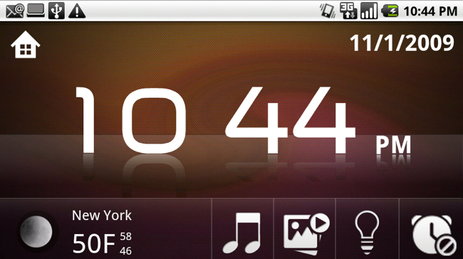
The phone interface has received a little upgrade as far as visuals are concerned, but it's straight forward and damn fast. Dialing has no slow downs or hiccups, calls connect instantly, and there's no fuss. We're also really feeling the upgraded call screen with improved end key, dialpad button, speaker and mute button. These slightly changed icons and new arrangement make accessing the essential calling functions a lot easier and more efficient.
Camera
The camera, a 5 megapixel autofocus dual LED flash, is straight up disappointing. It doesn't seem to be hardware-related as we're almost positive it's a software issue, but man... did Kodak just say peace out to Moto or? This thing couldn't focus on any sort of scene, portrait, landscape, a close-up — nothing — to save its life. On top of pictures not coming out focused properly, the camera application is ridiculously slow, sometimes pausing up to 7 or 8 seconds after you've taken a picture before it will let you snap again. What's worse is that with geo-tagging enabled, delays get even longer.
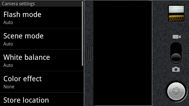
With Android 2.0 there's a brand new camera interface which is much-needed and actually isn't horrible. It's just not that intuitive and adjusting settings on the fly is damn near impossible. This is a common theme with Android and that's because most coders aren't designers and aren't GUI experts. It's pretty simple. For instance, the camera will display the automatic flash indicator in the lower left of the viewfinder, yet you can't click on it. Wait, what? Yeah exactly. The logical among us would expect to tap the indicator and be able to cycle through the options quickly. But you have to slide your finder left to right to bring out the settings drawer, flick down to the flash setting option, tap it to bring the flash setting to the forefront, tap the desired choice and then slide the options drawer back into hiding– all when Megan Fox slipped out from the club while you were fiddling with your camera settings.
There's also no review settings, so it's not like you can take a photo and it will show it on screen for a certain amount of time where you can see that you accidentally sneezed during the photograph and want to delete it quickly. You have to tap the recent photo thumbnail in the upper right of the application and only then are presented with the option to delete, share, or set as (wallpaper, contact icon). Like we said, the optics seem to be fine, the dual-LED flash is perfect, but if the camera doesn't focus properly, takes a long time to launch/shoot, and doesn't allow on-the-go adjustments quickly, it's a pretty useless camera. And in the end, we'd take our 3.2 megapixel Bold 9700 camera with flash and even iPhone 3GS camera without flash any day of the week, month, or year over the DROID's camera.
Battery:
The Drizzy packs a 1400mAh battery, the same one used in the Motorola CLIQ, and there couldn't be a starker difference between the two. Our Motorola CLIQ would run out of battery if we looked at it funny. The DROID on the other hand surprisingly has some of the best battery life on a mobile device we've used in recent memory. It's definitely up there with an iPhone 3GS and BlackBerry 9700 — really remarkable for such a fast-powered handset with huge display, and it's a CDMA phone! Very impressive and like we said before, even though the battery is user-replaceable, we really doubt you'll ever need to with normal daily use.
Conclusion
So, what's the wrap up, you're asking right? We absolutely love the Motorola DROID. It's a perfect storm between awesome hardware, great software, and a great network. That's not to say it's for everyone. It isn't the most consumer-friendly device off the bat and it's going to take some time and a whole bunch of improvements before we think Android can totally compete in the consumer space like others can, but Android is getting there slowly and this device in general couldn't be a better way to show it off. There's obviously some compromises like a pretty flat QWERTY keyboard and a little heft from the inclusion of metal as a design element, but the pros easily outweigh any cons if you're on Verizon. And even if you're not, it's the most compelling alternative to the iPhone we've ever used. What's important is that this phone exists and can easily fill a big void. It bridges a big gap and will be Verizon's star device for the rest of the fourth quarter. Probably.
The price of $199 is a great price point and we can see VZ moving truckloads of these. International roaming would have been something to put a lot of people over the edge, but besides that, (and the fact they couldn't fit in another thing) luckily most of the shortcomings the DROID has are software-based and can be easily rectified in the near future. This isn't the only Android phone coming to Verizon, but from what we've seen it's the best so far and something you're really going to want to try out in the store and get a feel for. It's easily one of the fastest and smoothest phones we've ever used, easily the fastest Android device on the market (as of November 6th), and definitely the most impressive. Motorola's CLIQ, as we confidently told you, is a bottom-feeding device. It's cheap, pretty poorly made physically and software-wise, and the DROID effectively wipes any bad taste out of our mouths. The Motorola DROID is now Motorola's most important device in recent memory, and they've hit it out of the park with this one. We've been told there won't be a USA 3G DROID (GSM) coming anytime soon (or ever), so if you're looking to scoop one up, your best bet is on November 6th from Big Red.
